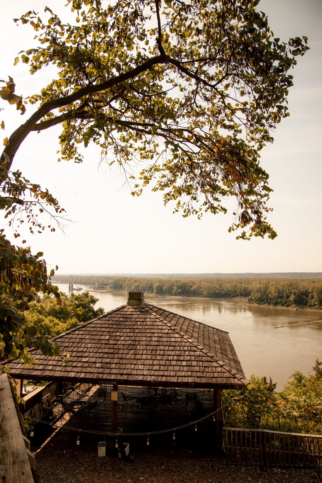
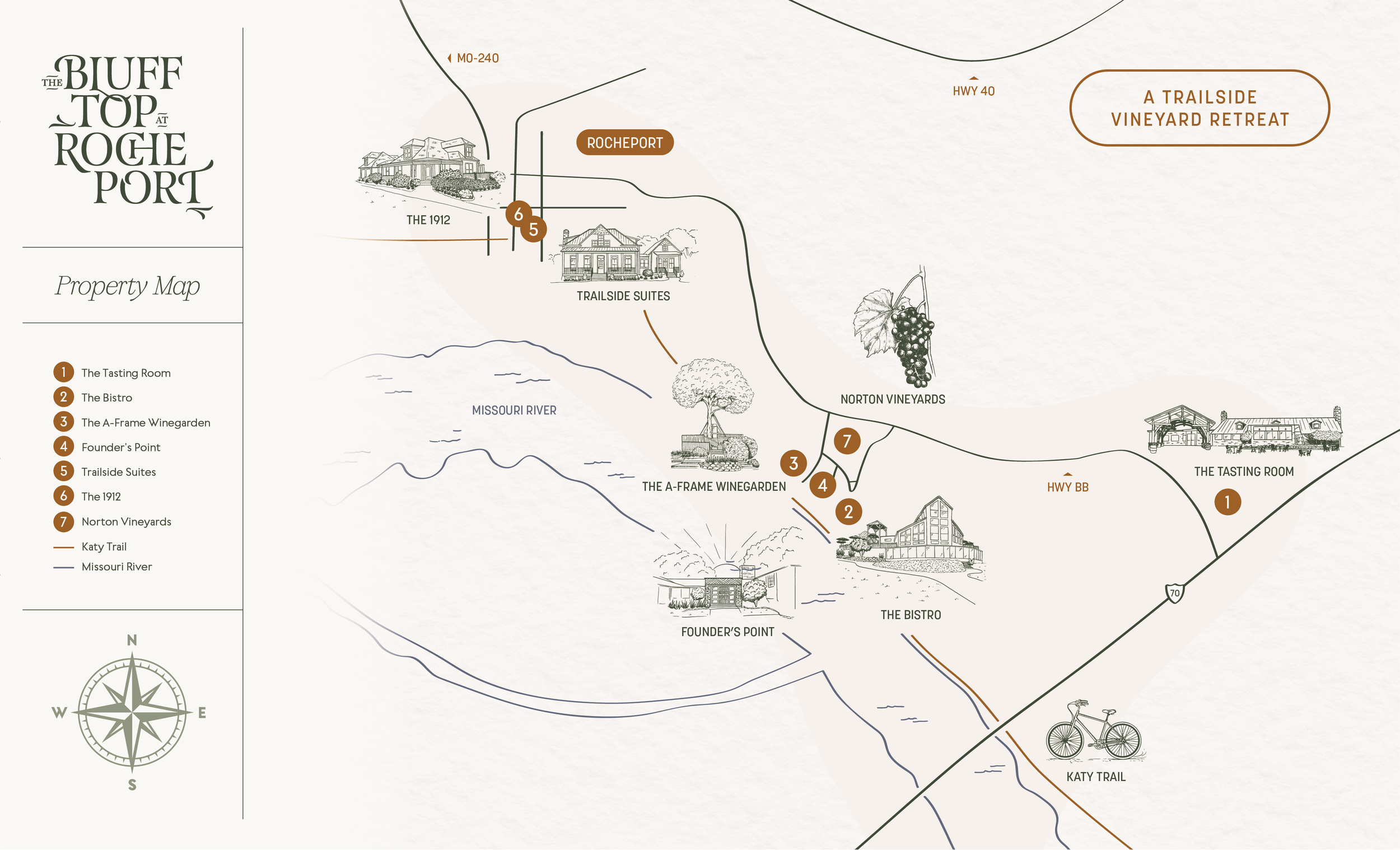
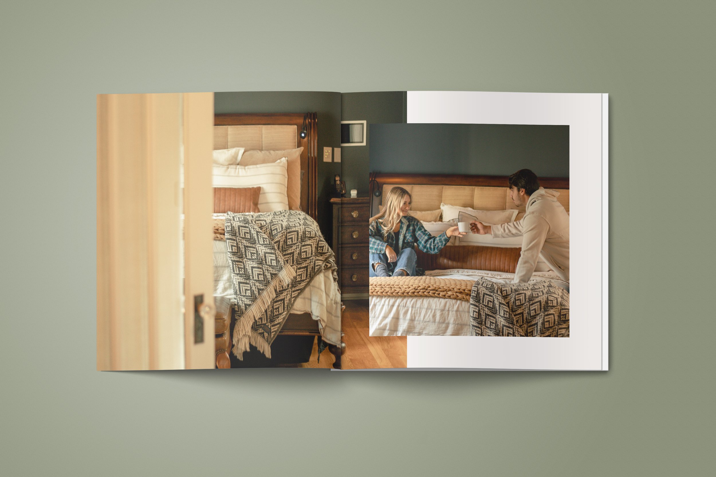
The Blufftop at Rocheport
Creating a Hospitality Brand Experience
Eager for a new challenge, the LBV team was ready to expand its capabilities and create a comprehensive hospitality experience.
The solution? A comprehensive family of brands new and old.

The Blufftop at Rocheport
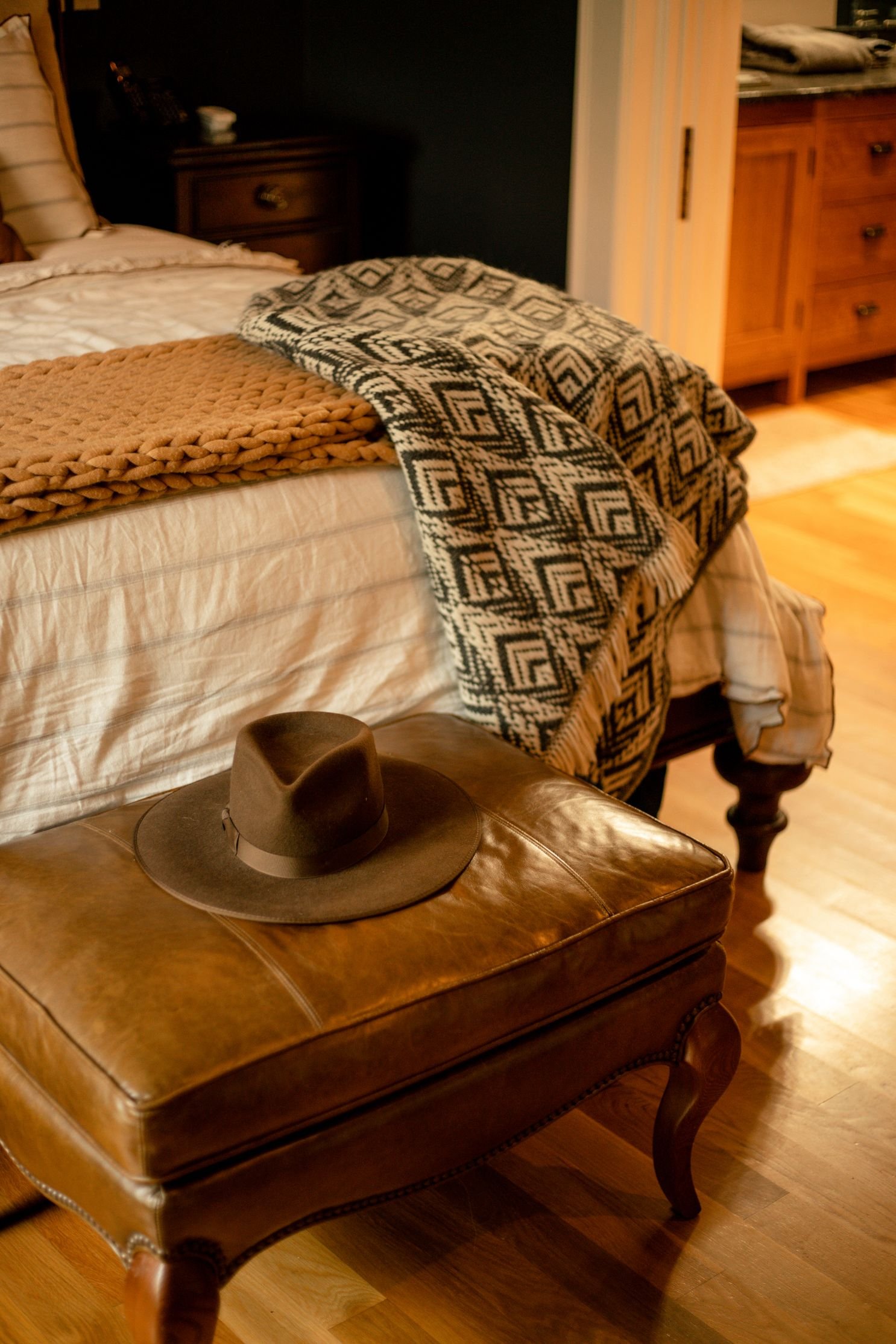
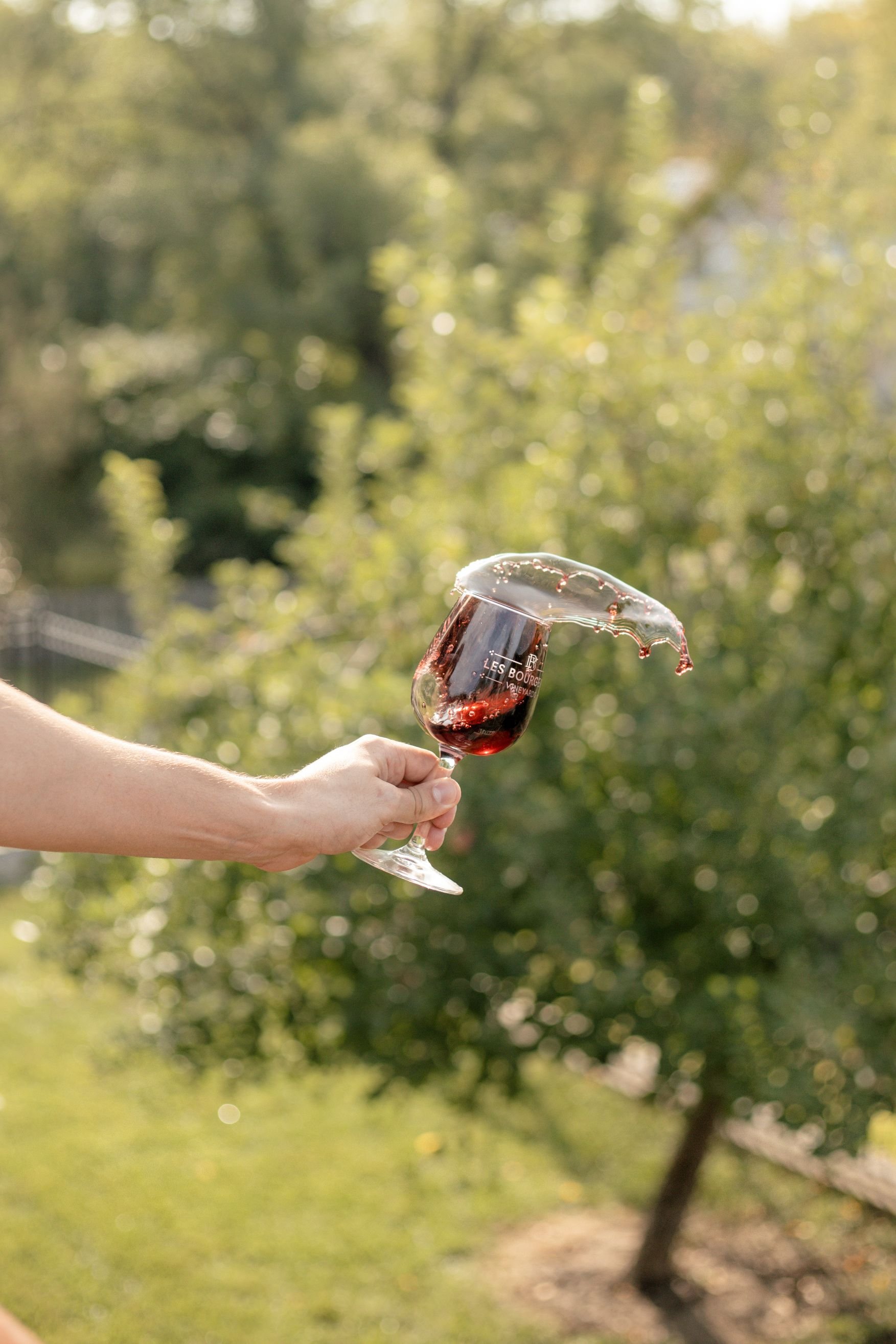
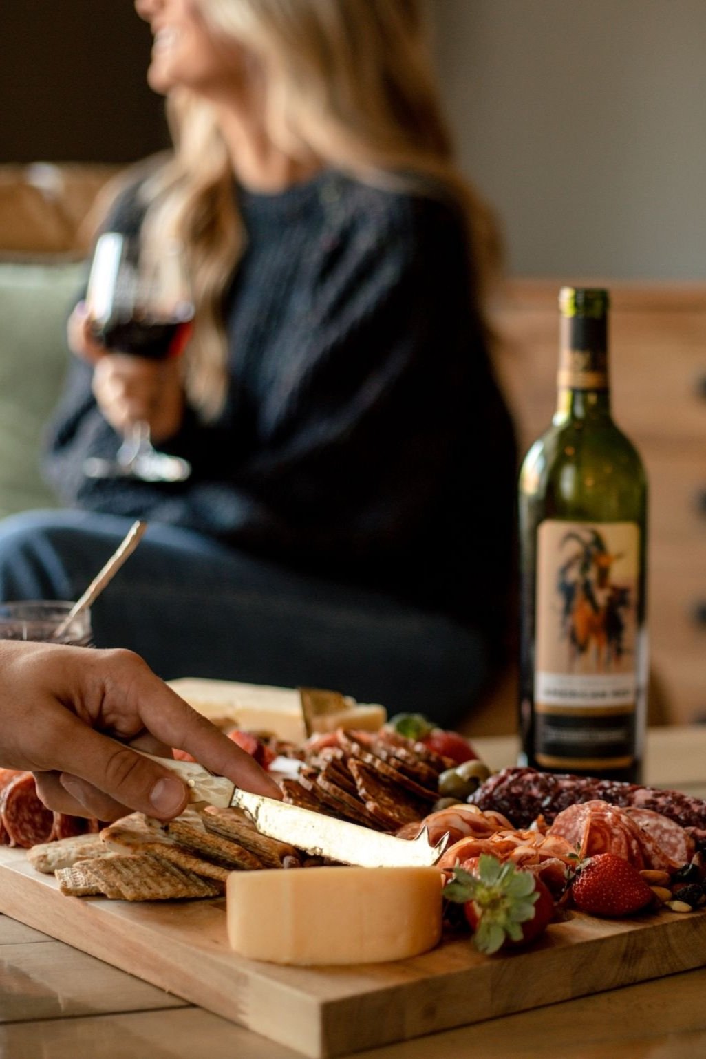
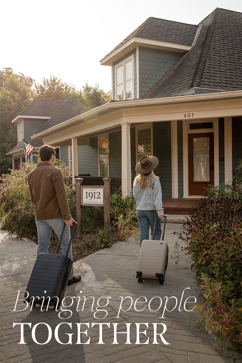
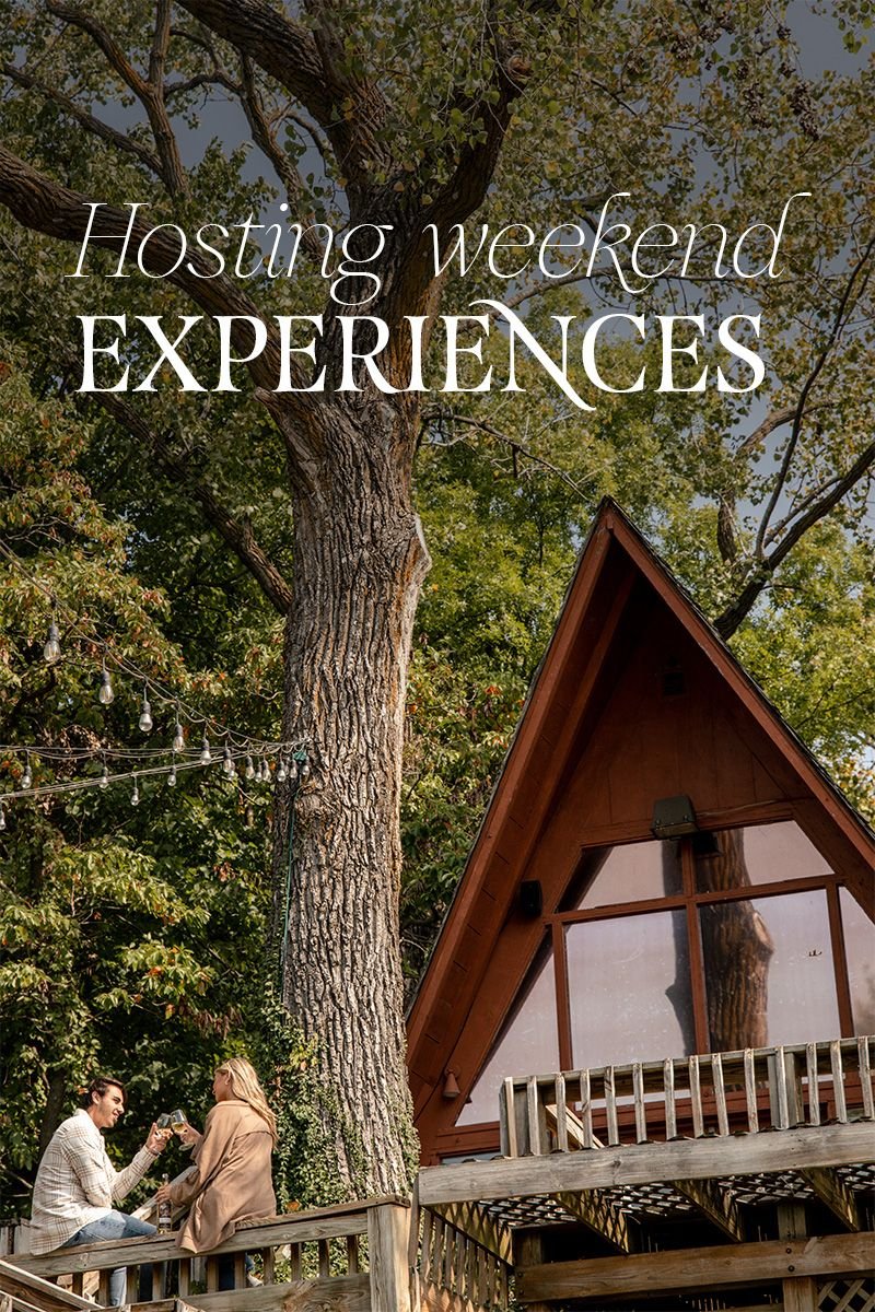
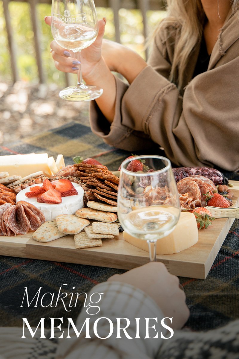
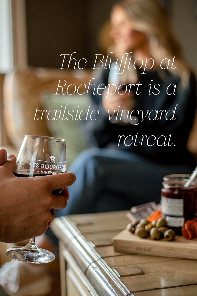
The Blufftop at Rocheport is the parent brand that encompasses Les Bourgeois Vineyards and its sister companies. Nine brands work together to create The Blufftop at Rocheport, which provides dining, drinking, and lodging experiences to mid-Missouri locals and visitors alike.
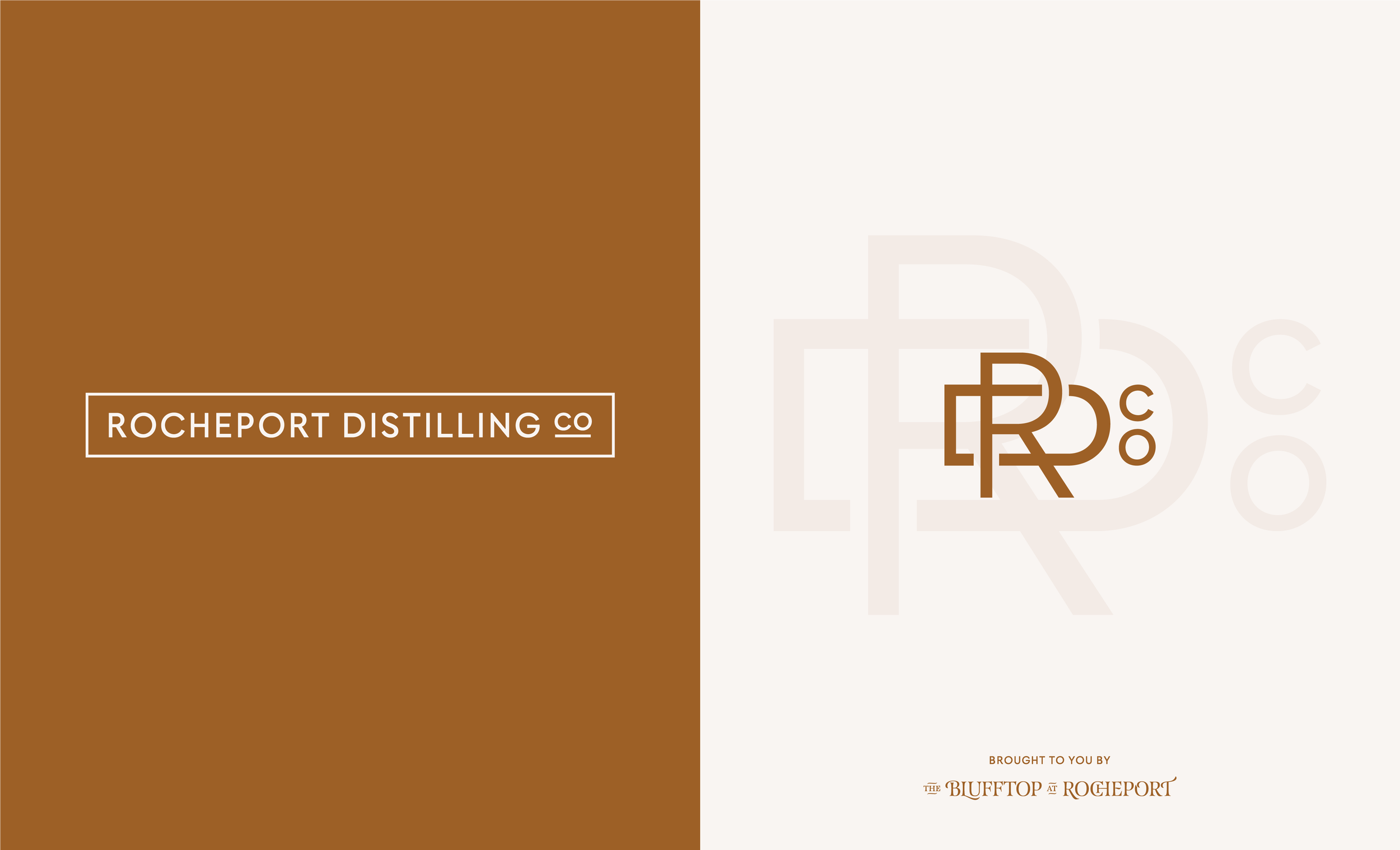
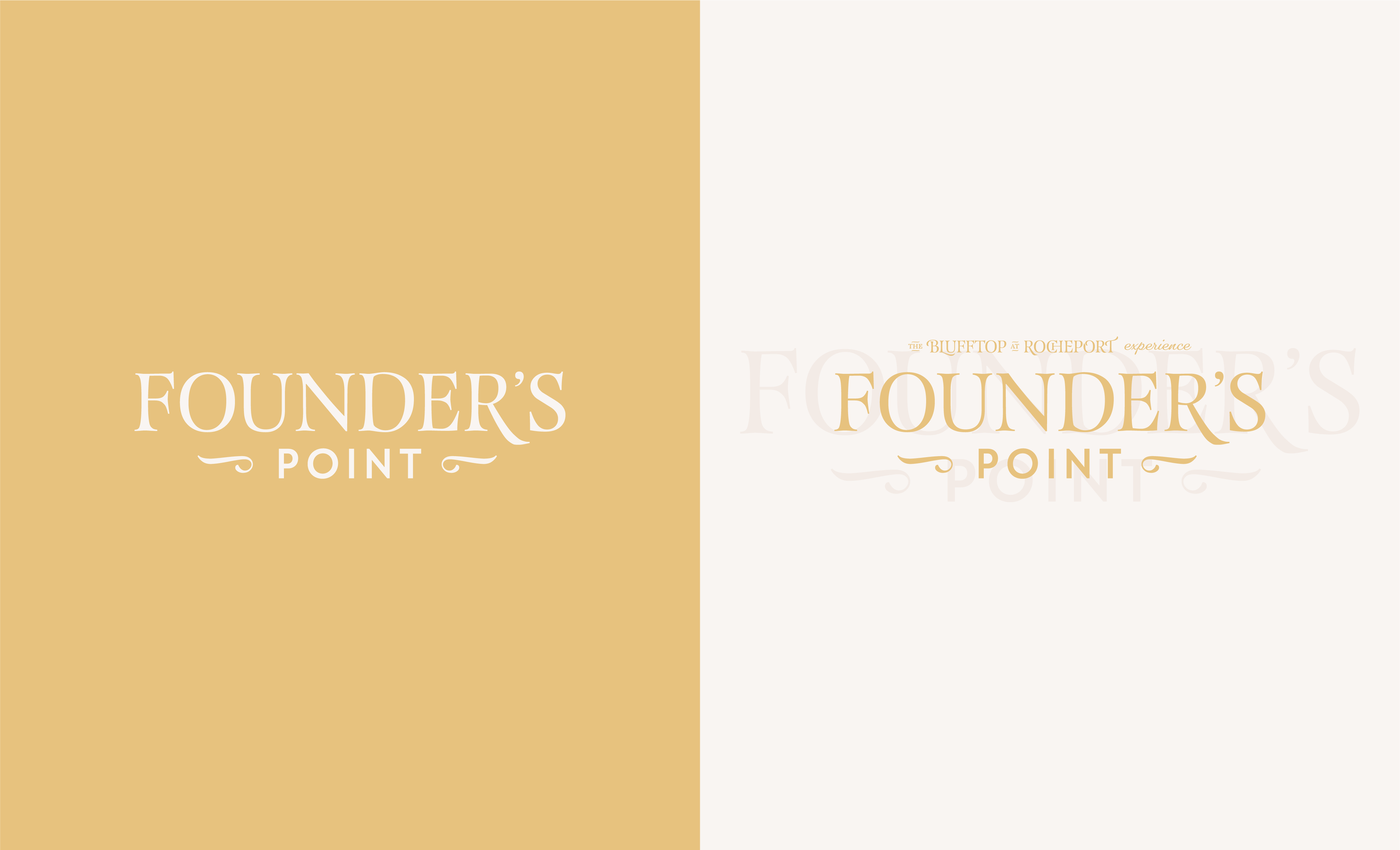
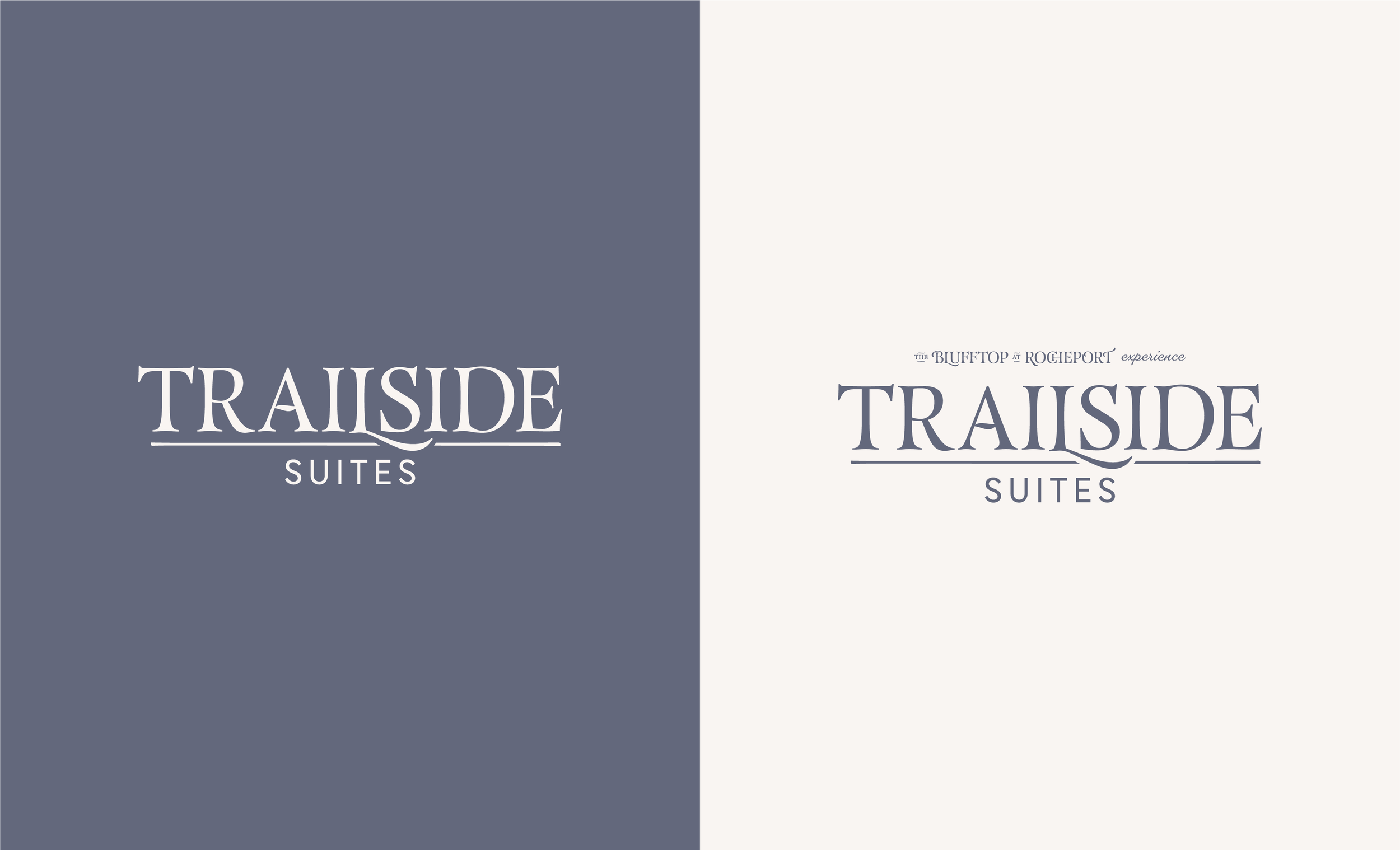
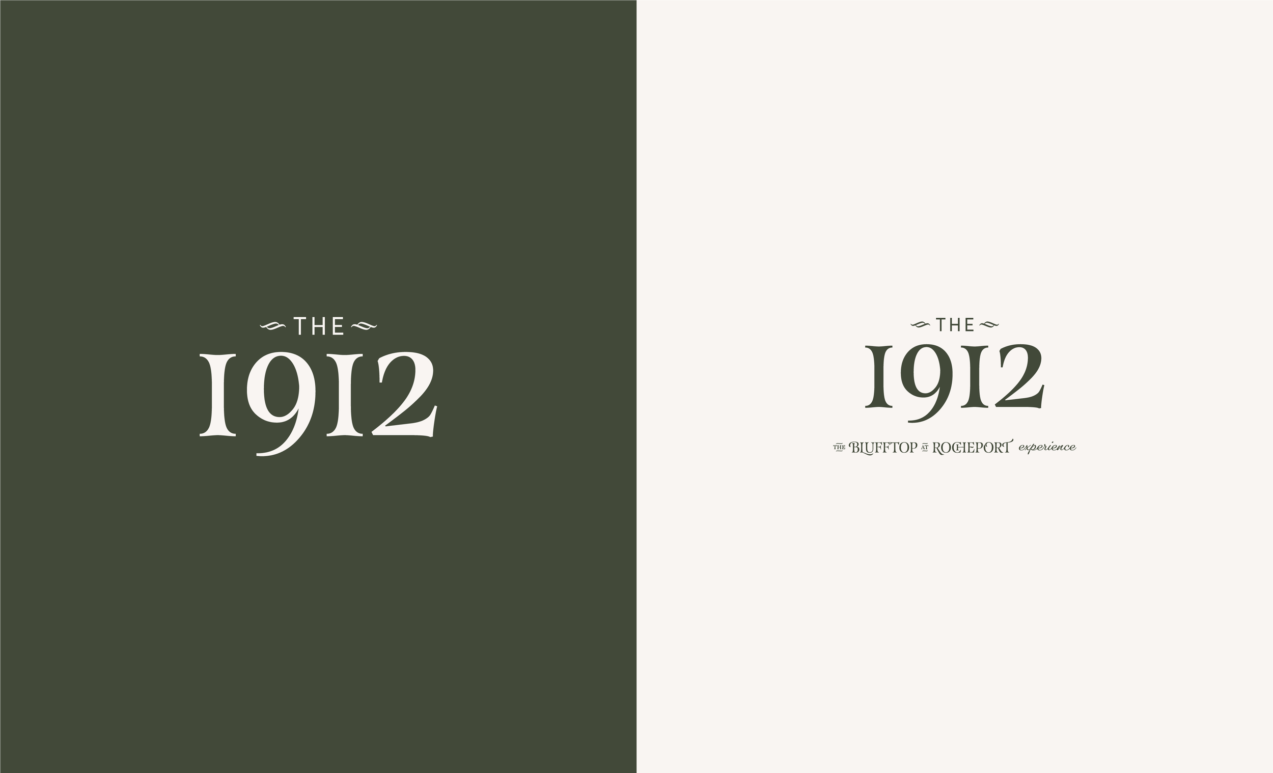
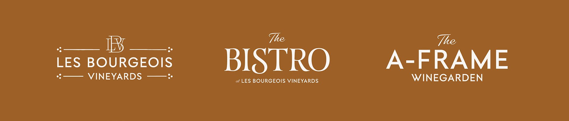
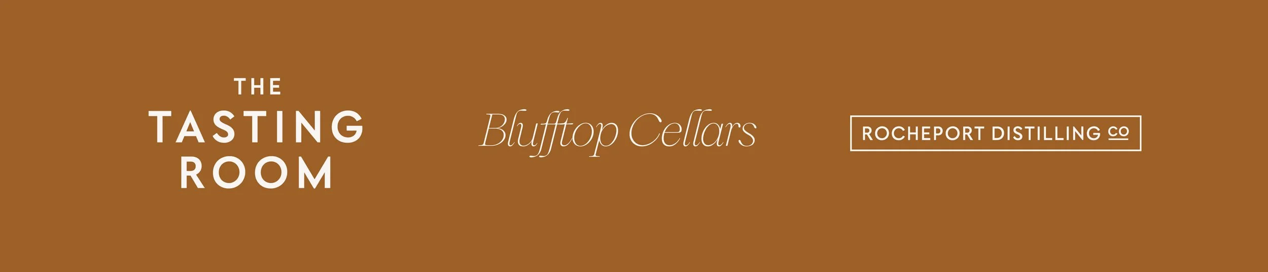
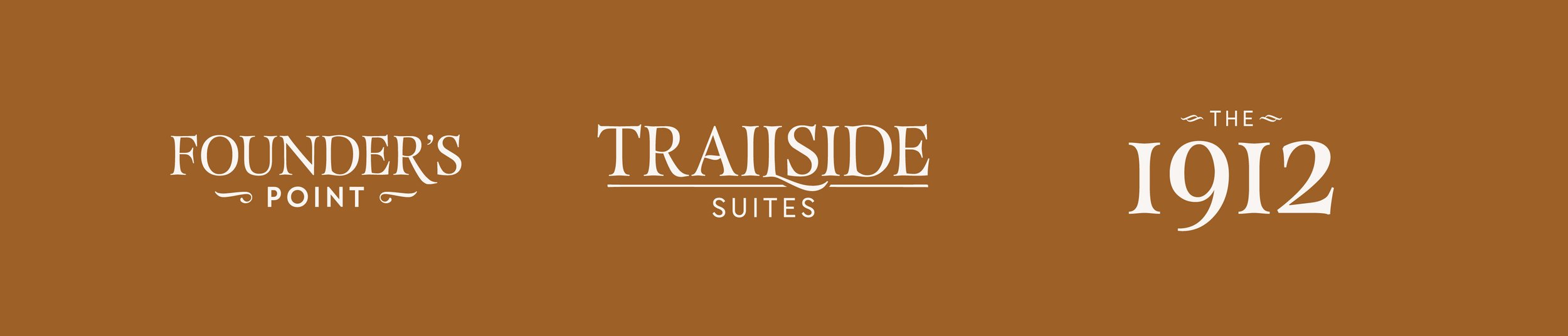
The Blufftop at Rocheport Family of Brands
Some of the brands had been previously established, while others were getting ready to launch for the first time. But with a deep dive on their purpose, point of difference and target audience, we were able to fit them all together.
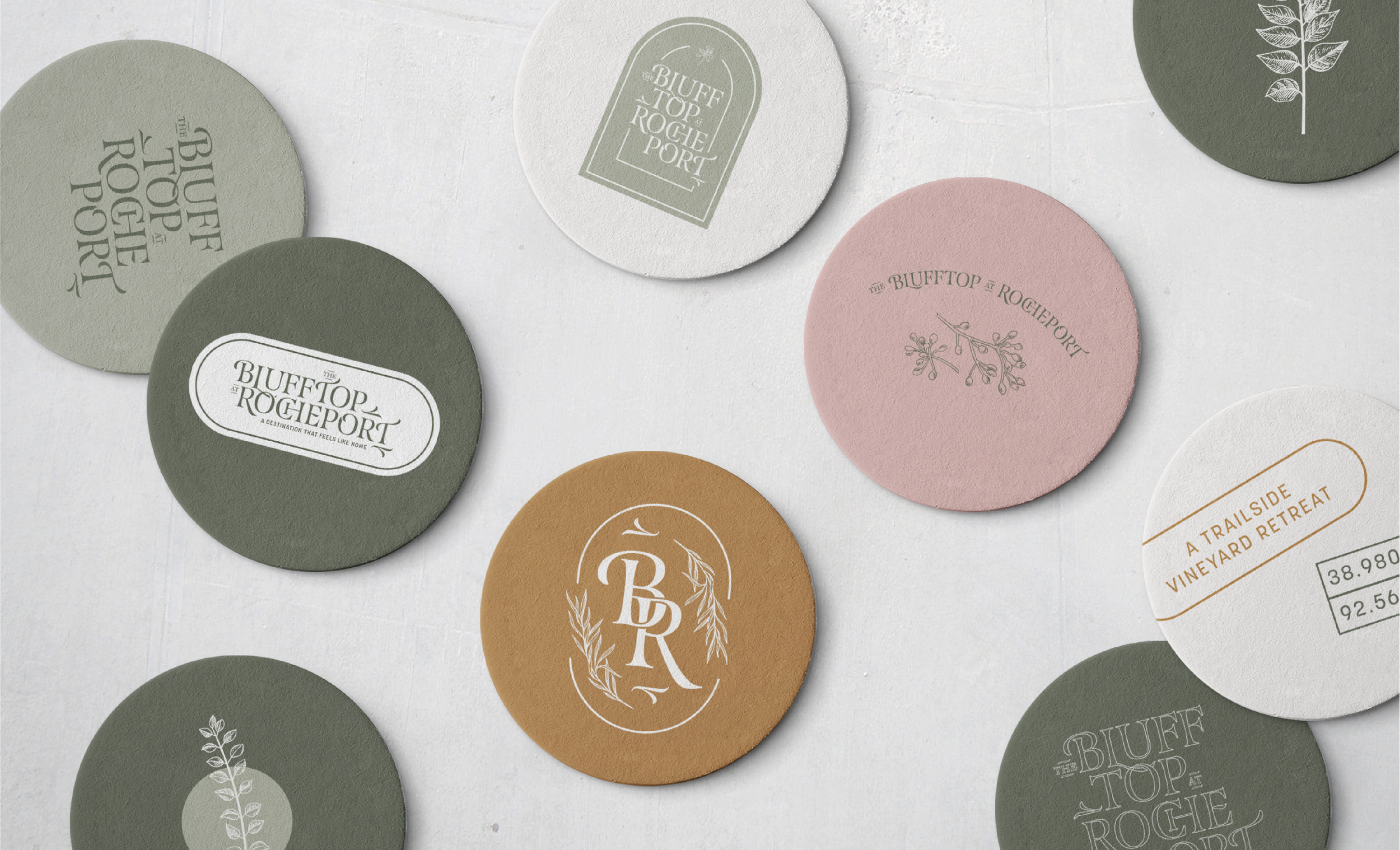
Ten Visual Identities
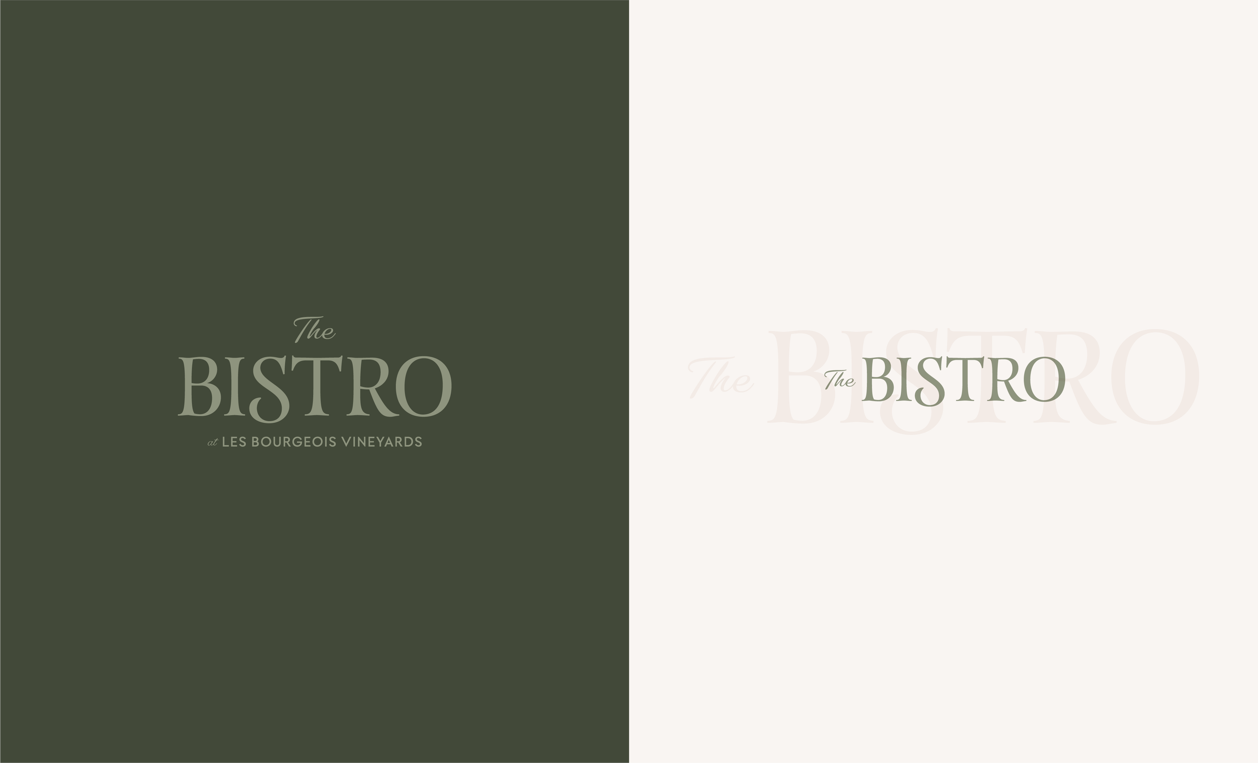
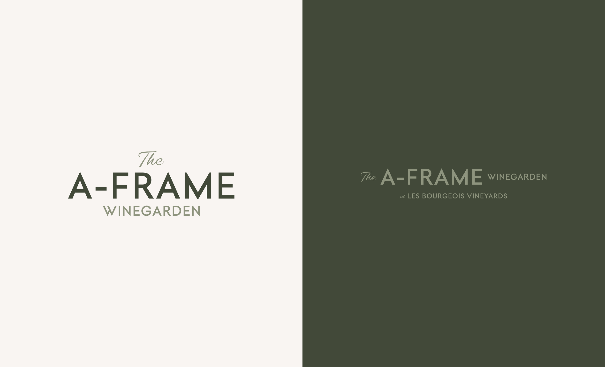
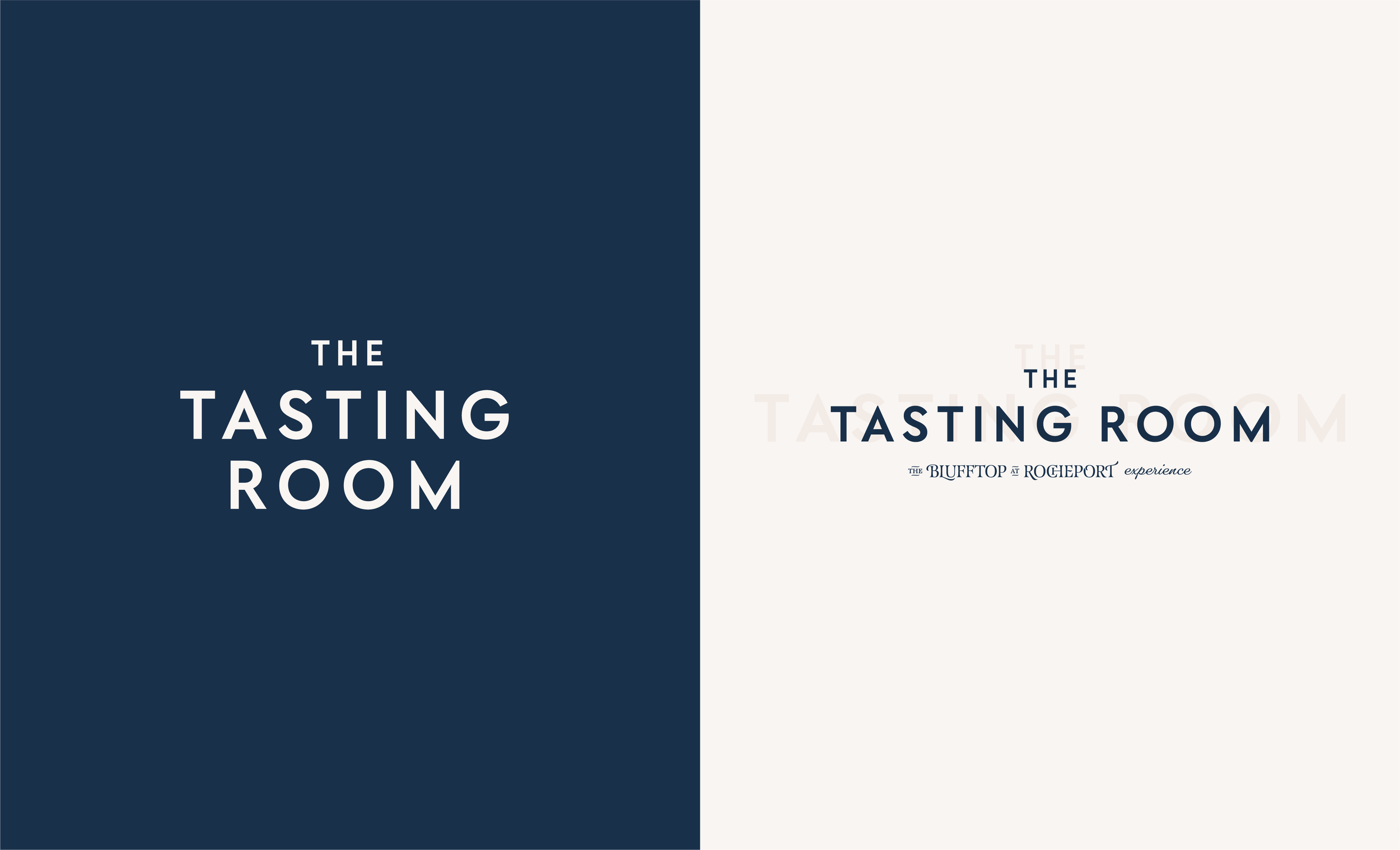
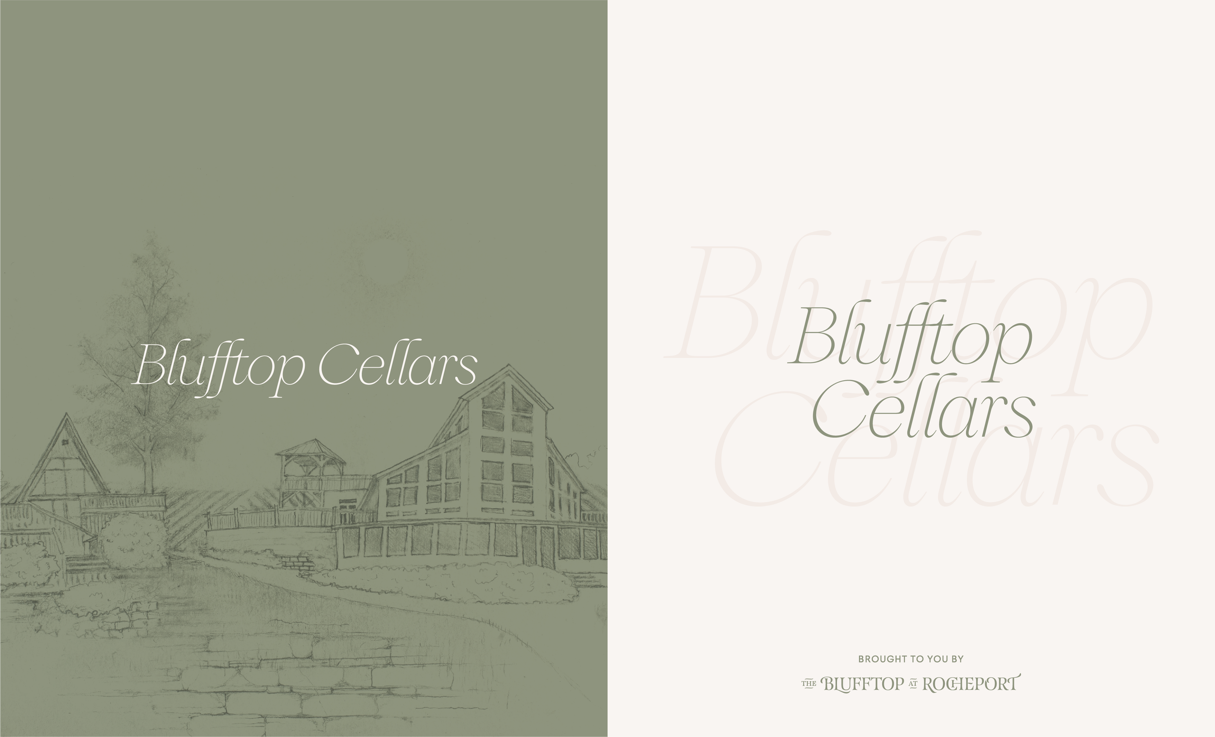
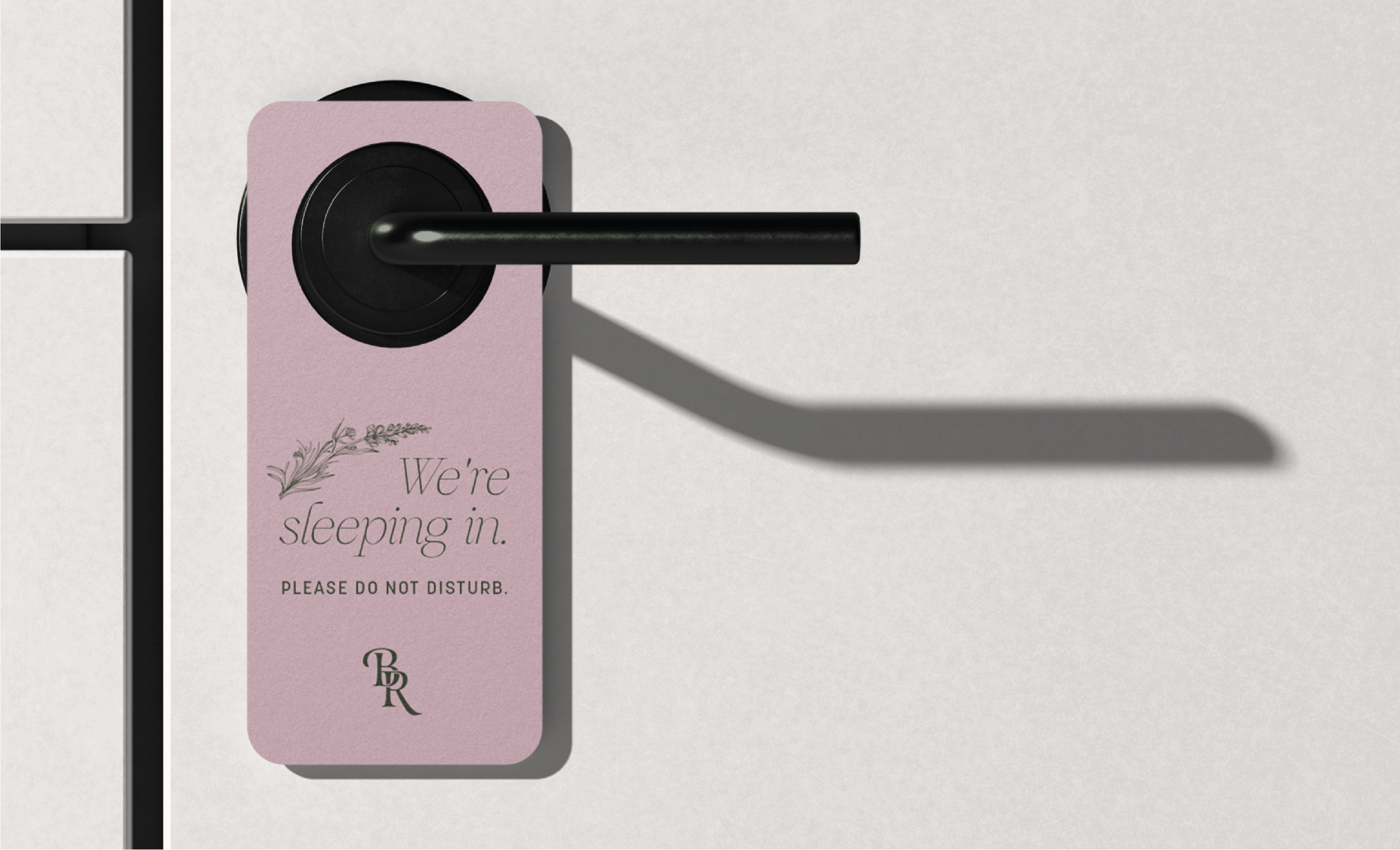
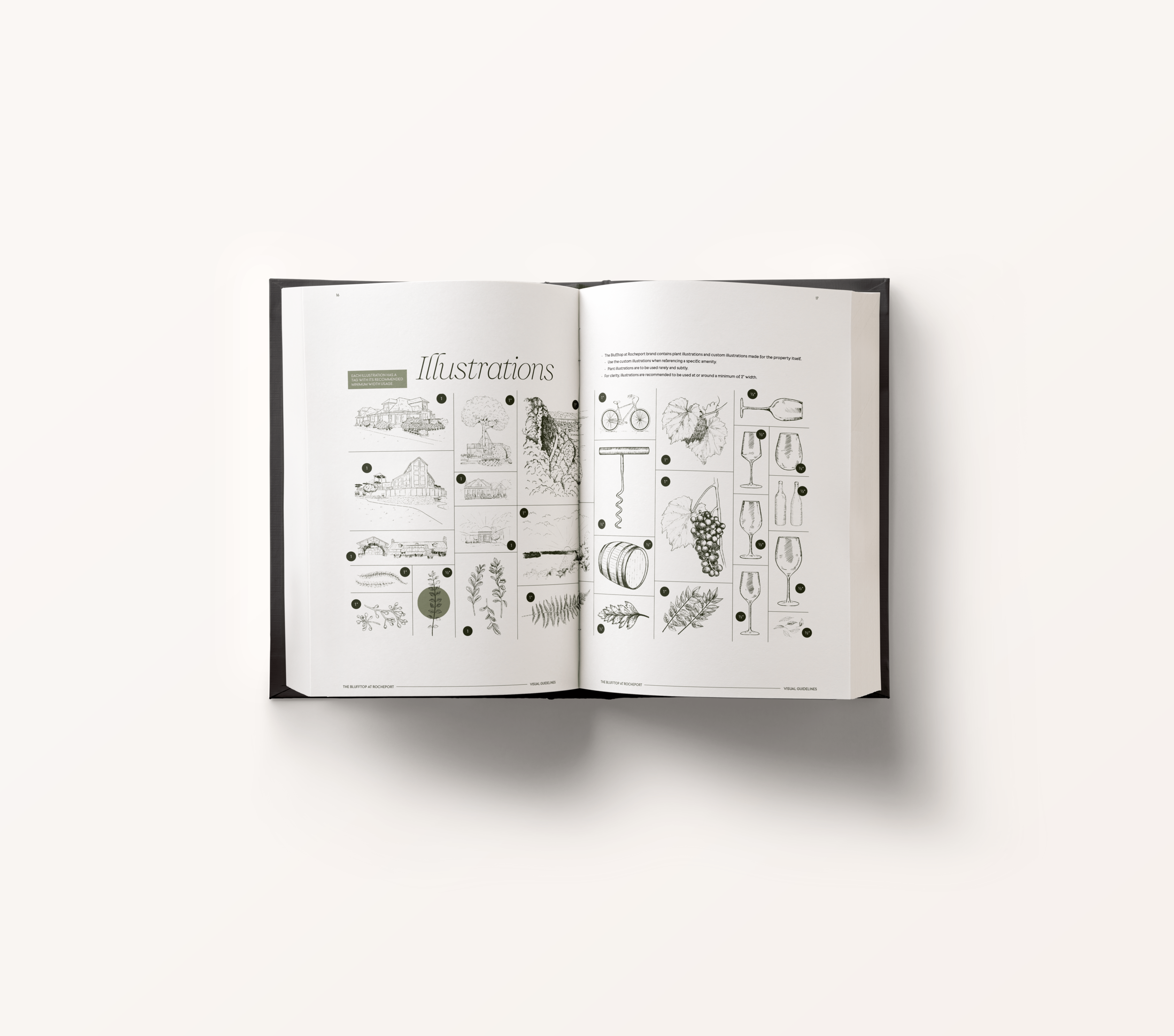
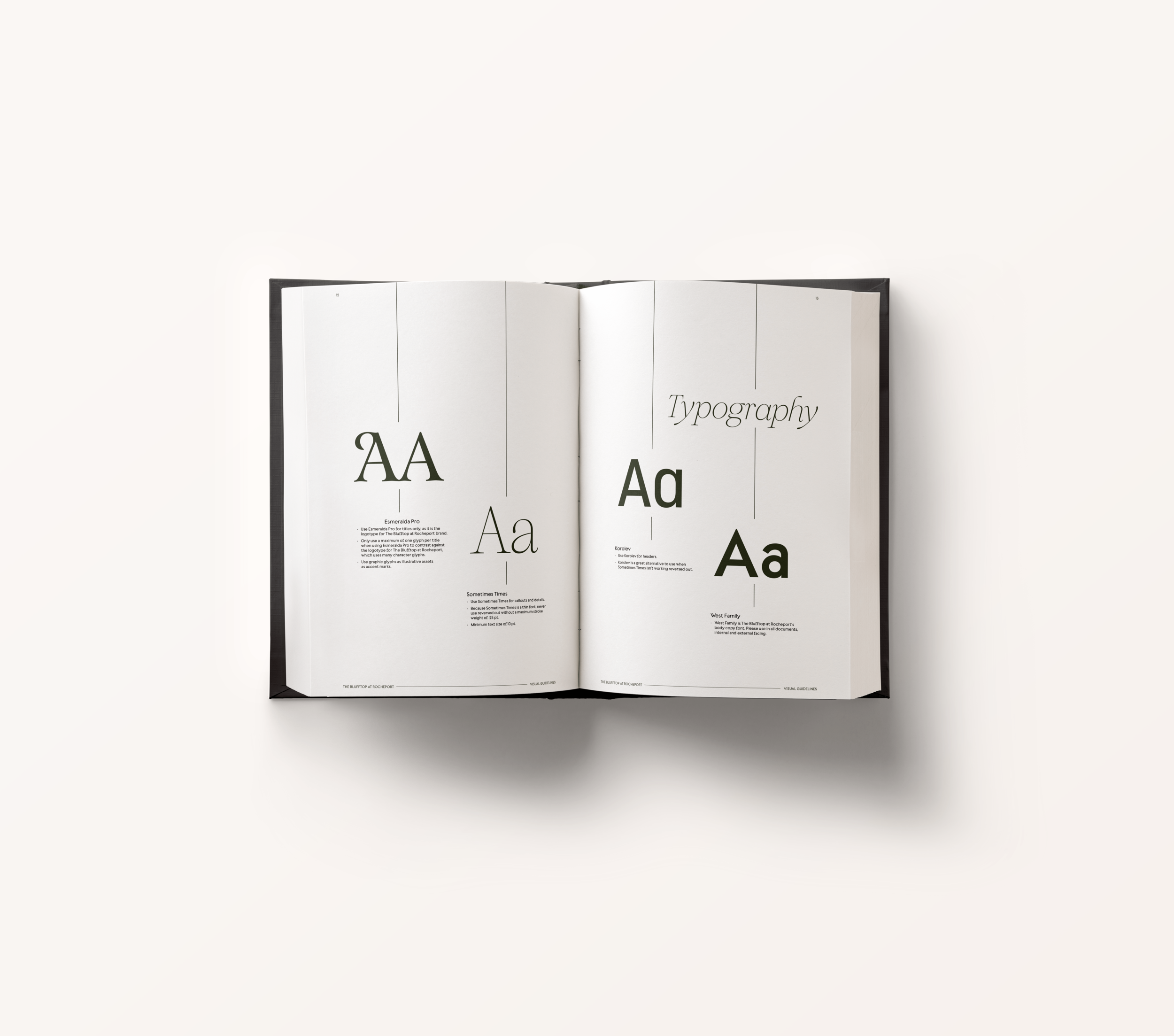
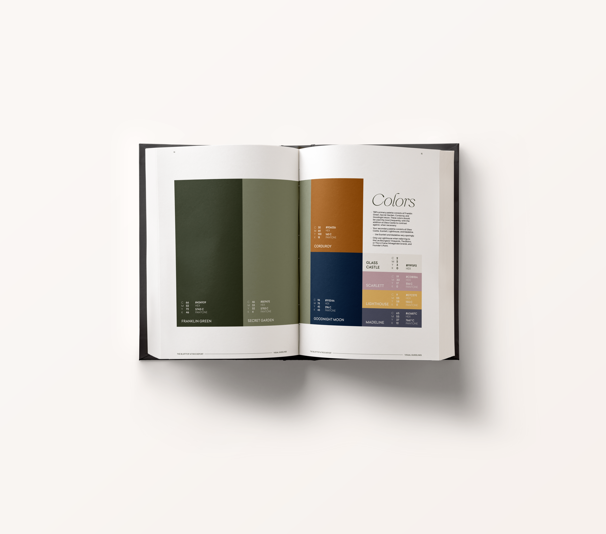
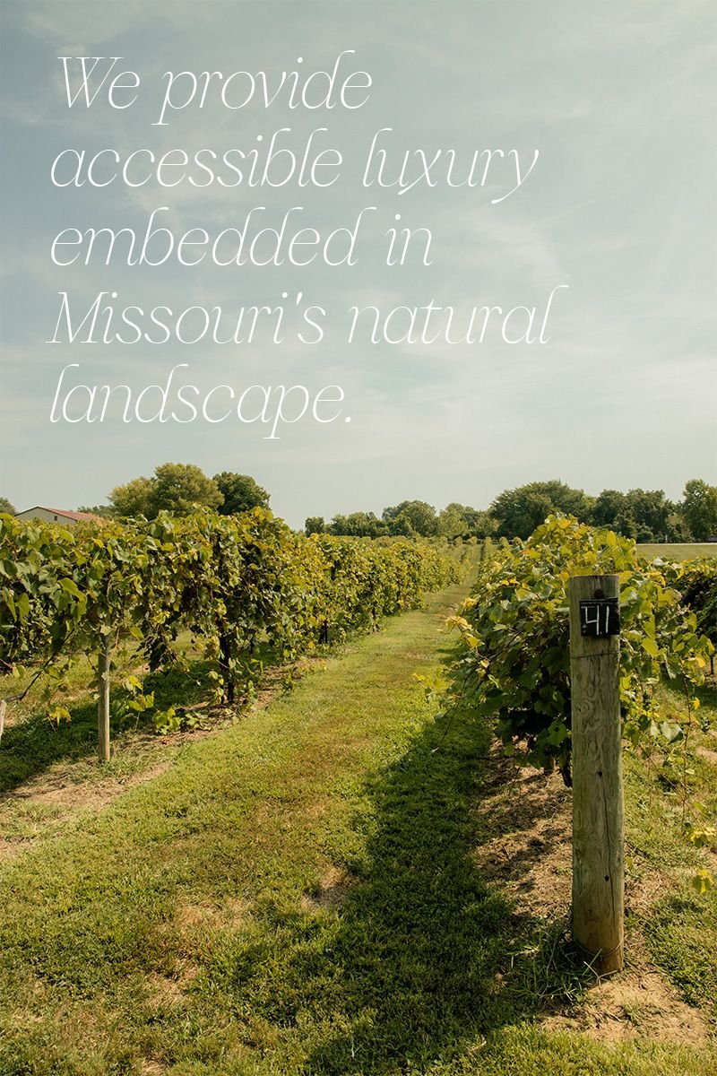
To ensure The Blufftop at Rocheport and its nine sub brands were cohesive, we created 10 visual identities that work seamlessly with one another. With a wide color palette (inspired by Missouri’s natural landscape), custom illustrations, and varied font families, we designed a visual system that is both distinct and consistent.


One Solid Strategy
It took more than creative design to nail the extensive family of brands. Our strategy team identified The Blufftop at Rocheport’s target audience, solidified each sub brand’s name, and clearly defined the brand hierarchy. The result is a brand family that doesn’t just make sense to consumers, but resonates with them as well.

Training a Diverse Team
When we tackle brand initiatives, we don’t close with an external rollout; successful brand transformation starts from the inside. That’s why we built an extensive internal website to be used across all departments for onboarding and ongoing training. Diverse teams might sing the brand song in a different tune, but the lyrics stay the same.

Transforming The Blufftop
When we branded The Blufftop at Rocheport and its sub brands, we didn’t just transform the future for the Les Bourgeois Vineyards team — we transformed the future of Rocheport. With a suite of dining, drinking, and lodging options, the small town is well equipped to bring in visitors from across the region. And armed with knowledge on what constitutes as on-brand with print materials to serve as reminders, The Blufftop at Rocheport team is ready to take on that challenge.