Left Bend
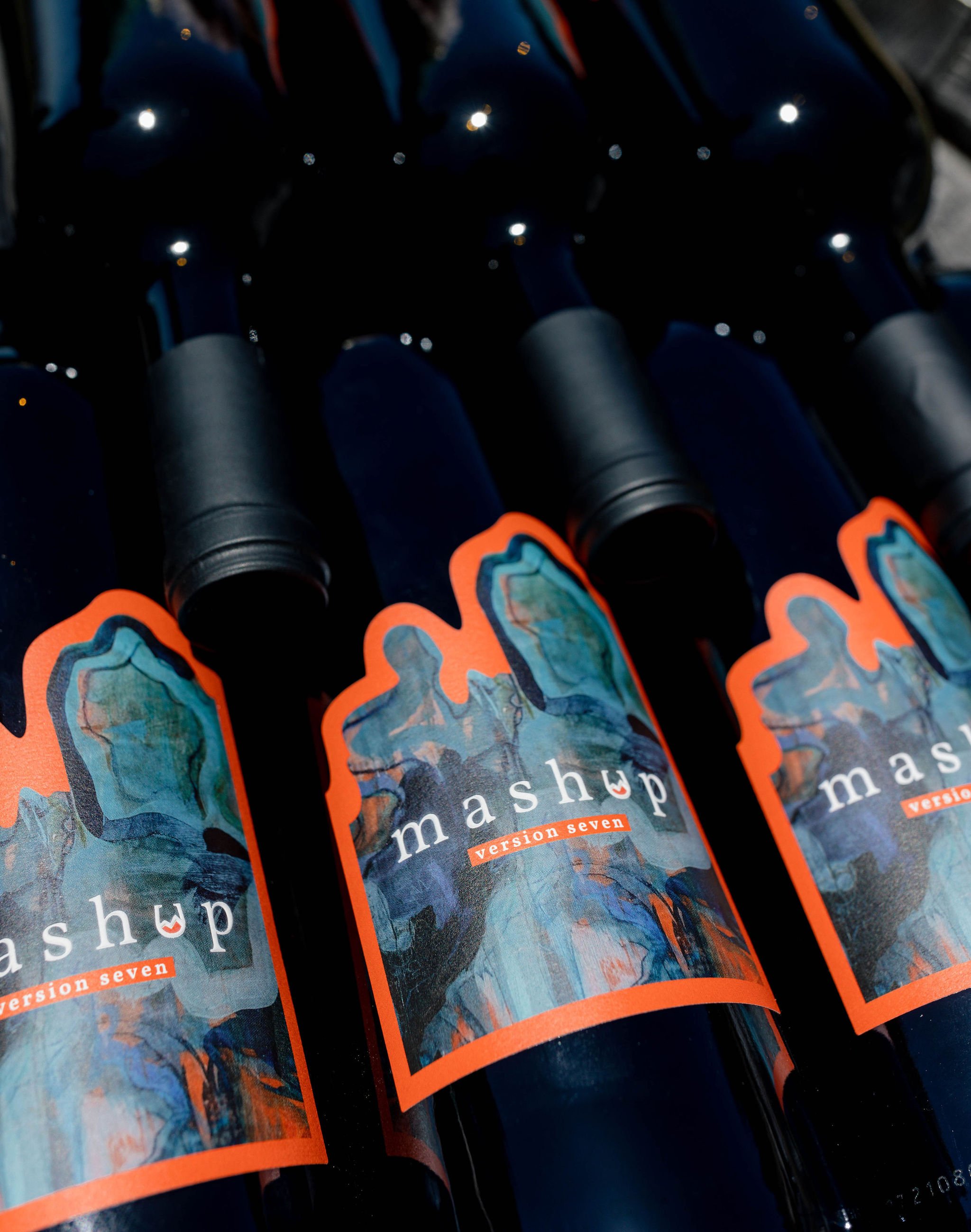
Rebrand & Launch for a Modern California Wine Label

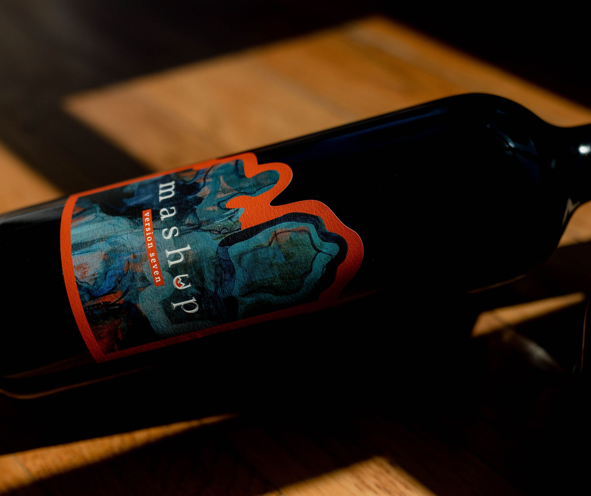
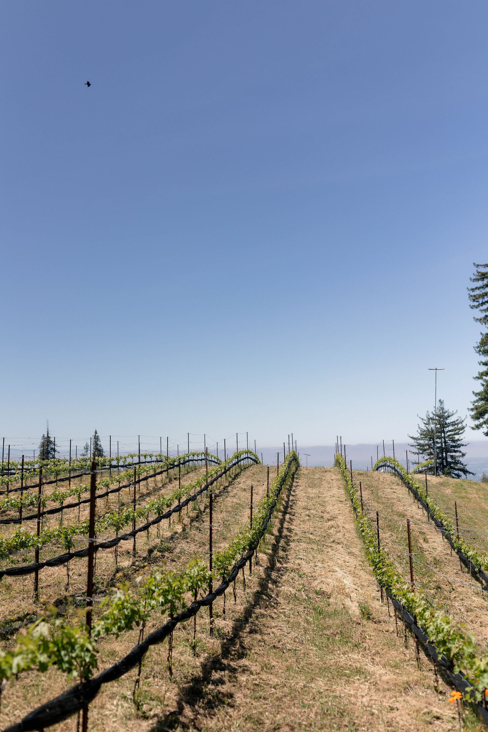
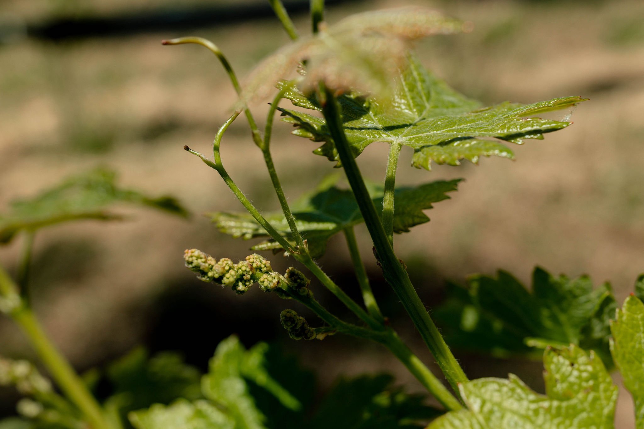
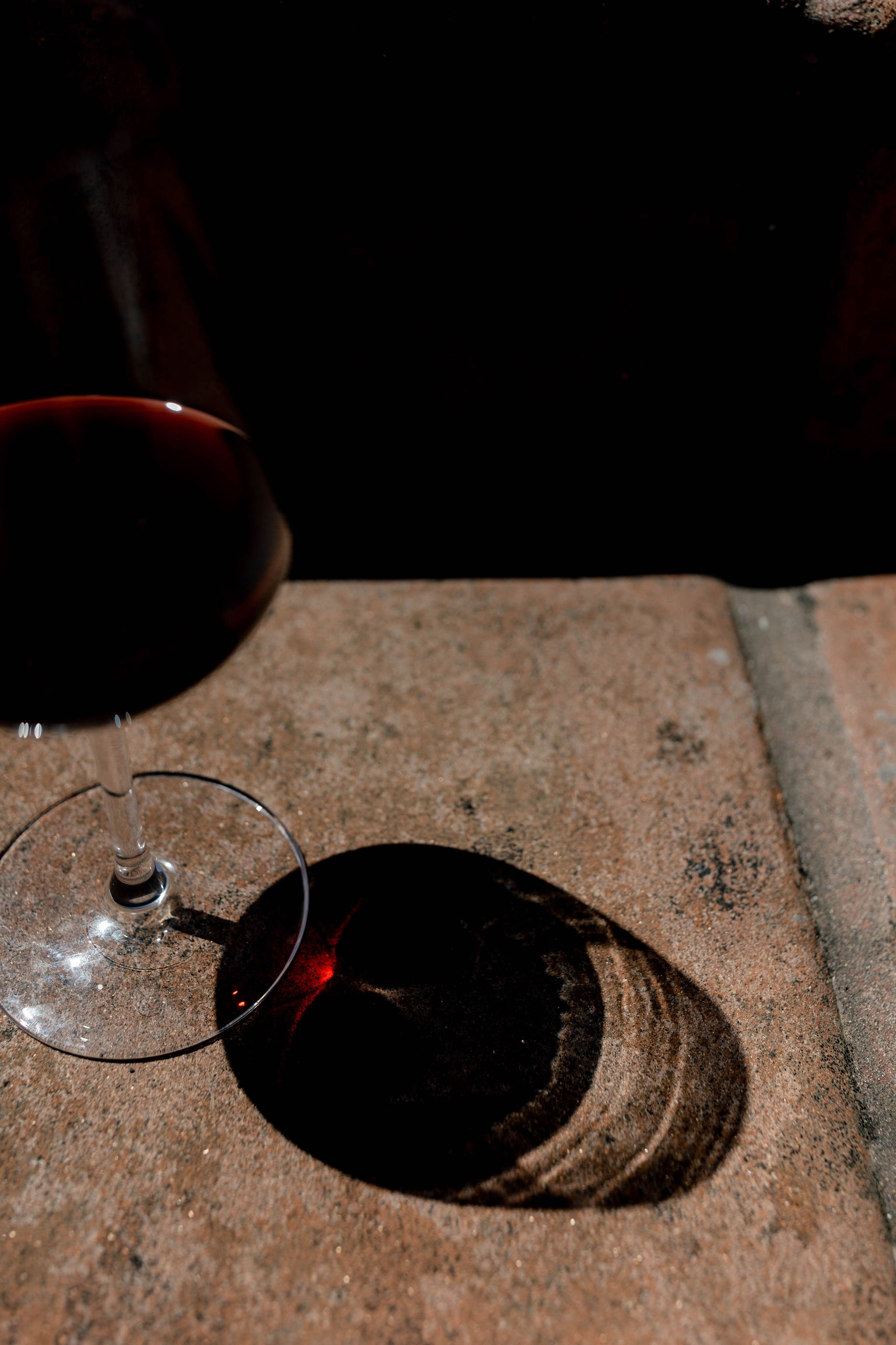
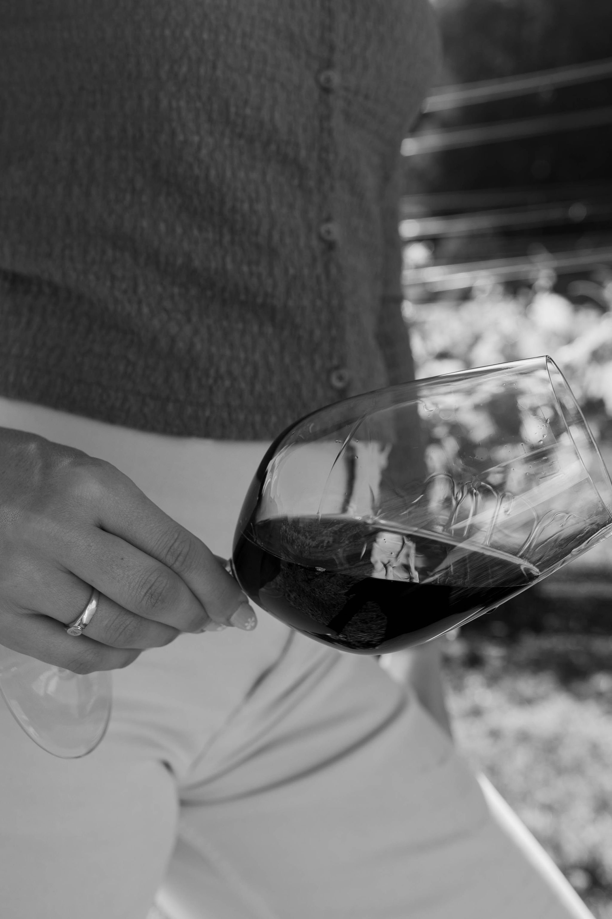
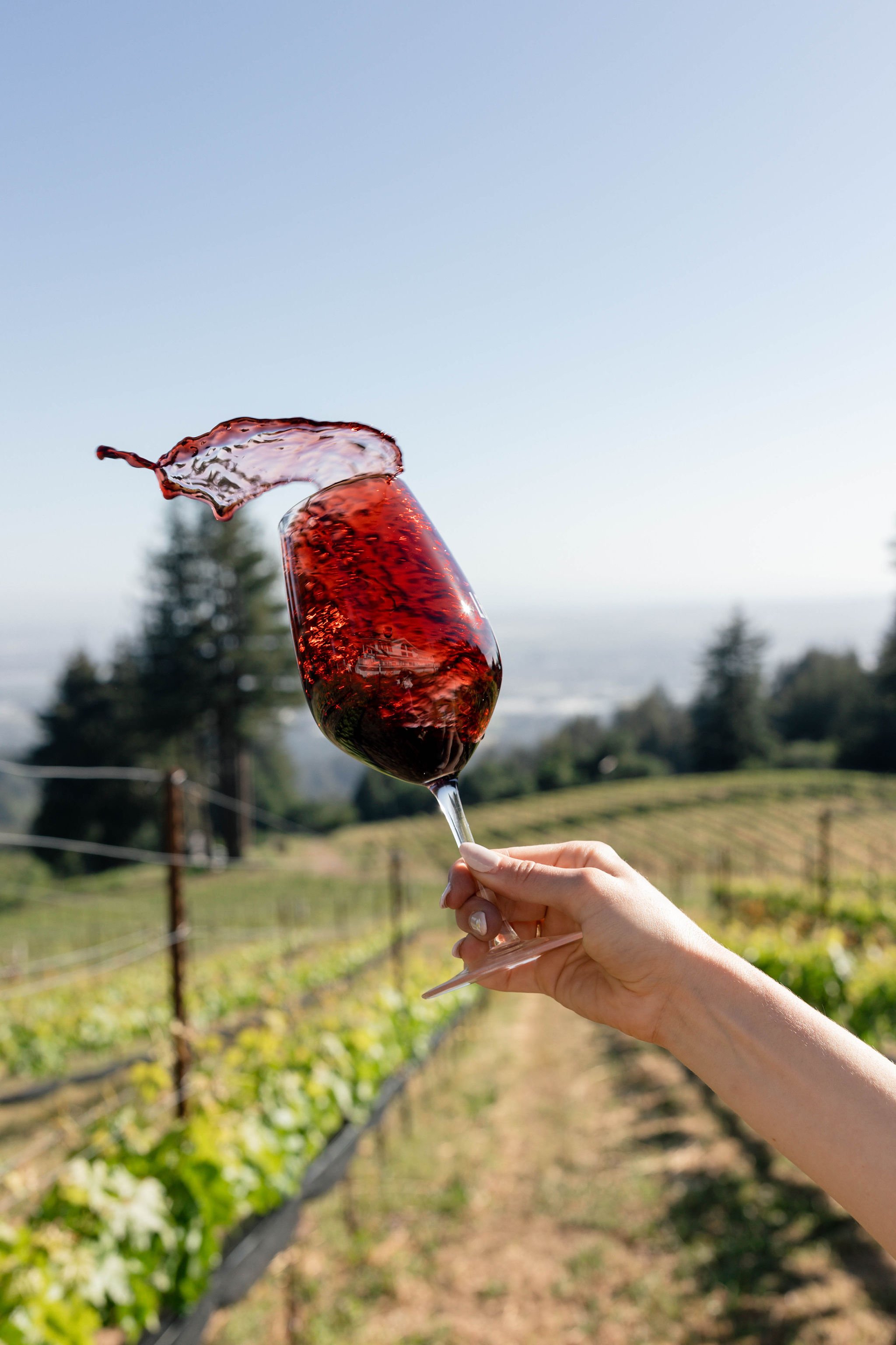
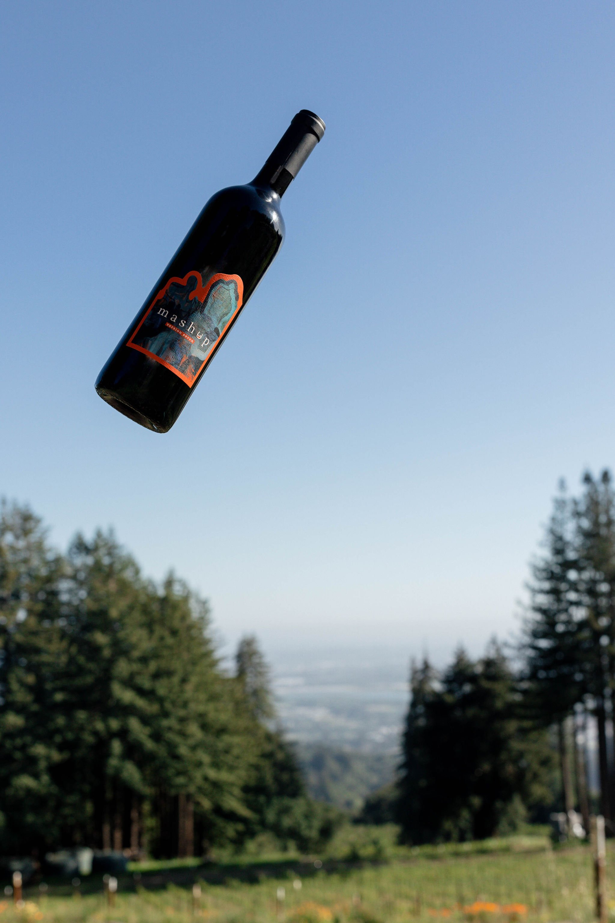
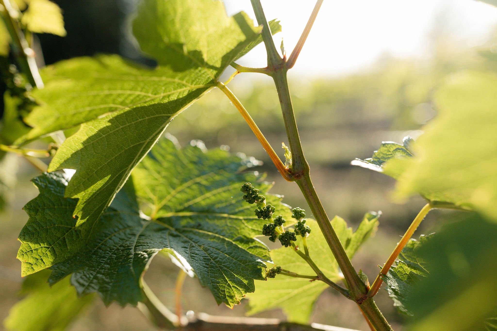
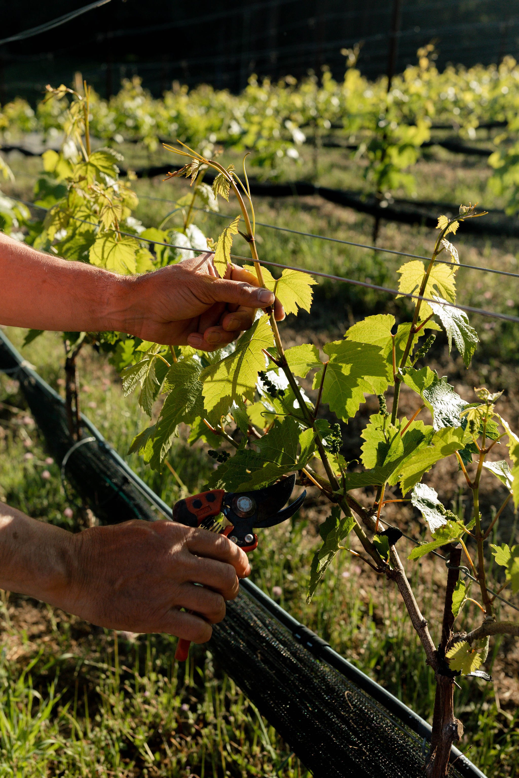
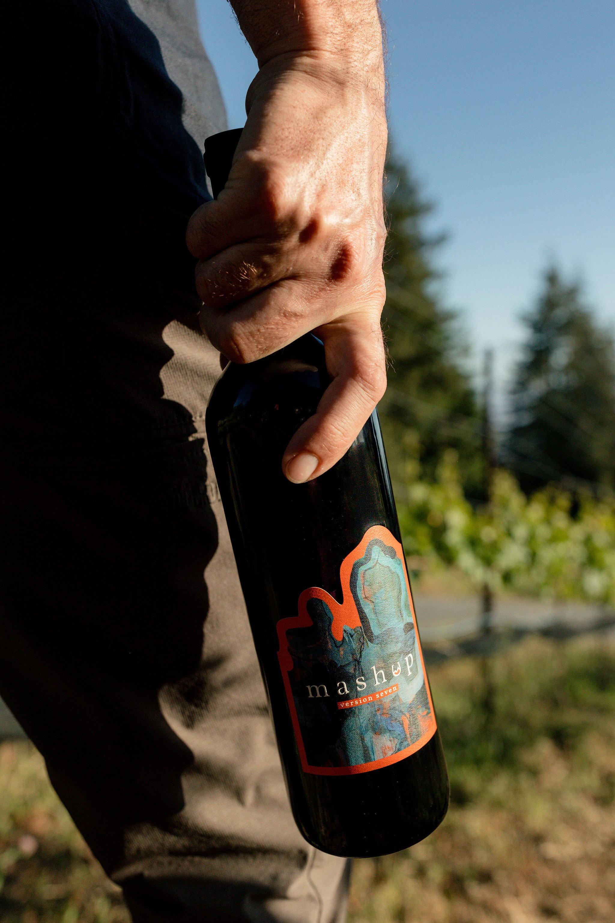
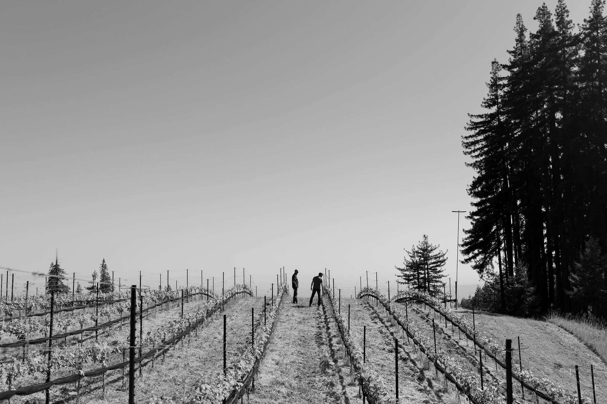
Mashup by Left Bend Winery is a multi-vintage wine created with fruit from the Santa Cruz Mountains.
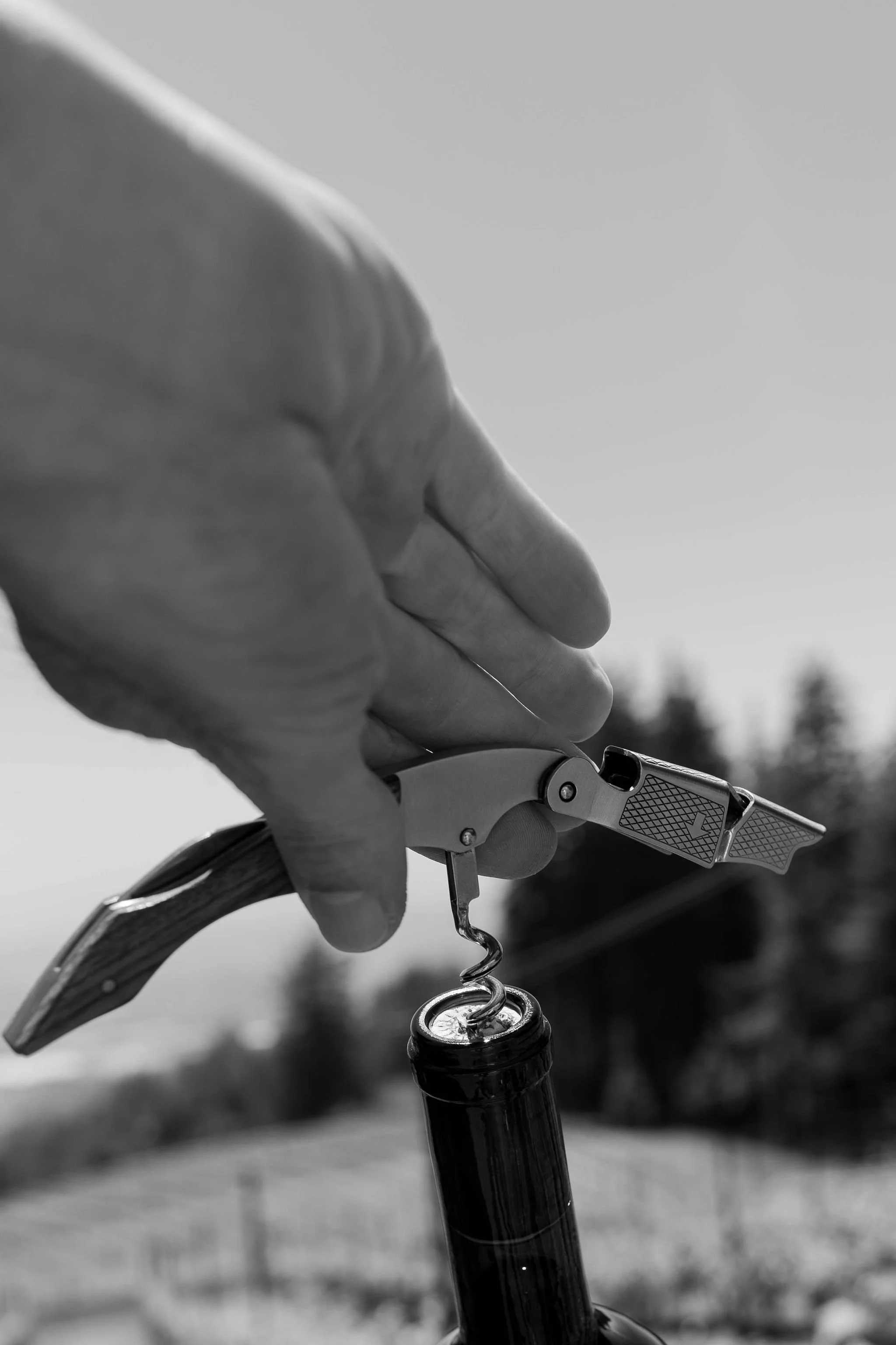
Their winemaking process is anything but ordinary. They use a technique called solera to deliver aged wine by blending different vintages in a set of barrels. Each batch produces a version of wine that can never be replicated.


In a wine industry that wants you to churn out wine quickly, they are doing it a different way.
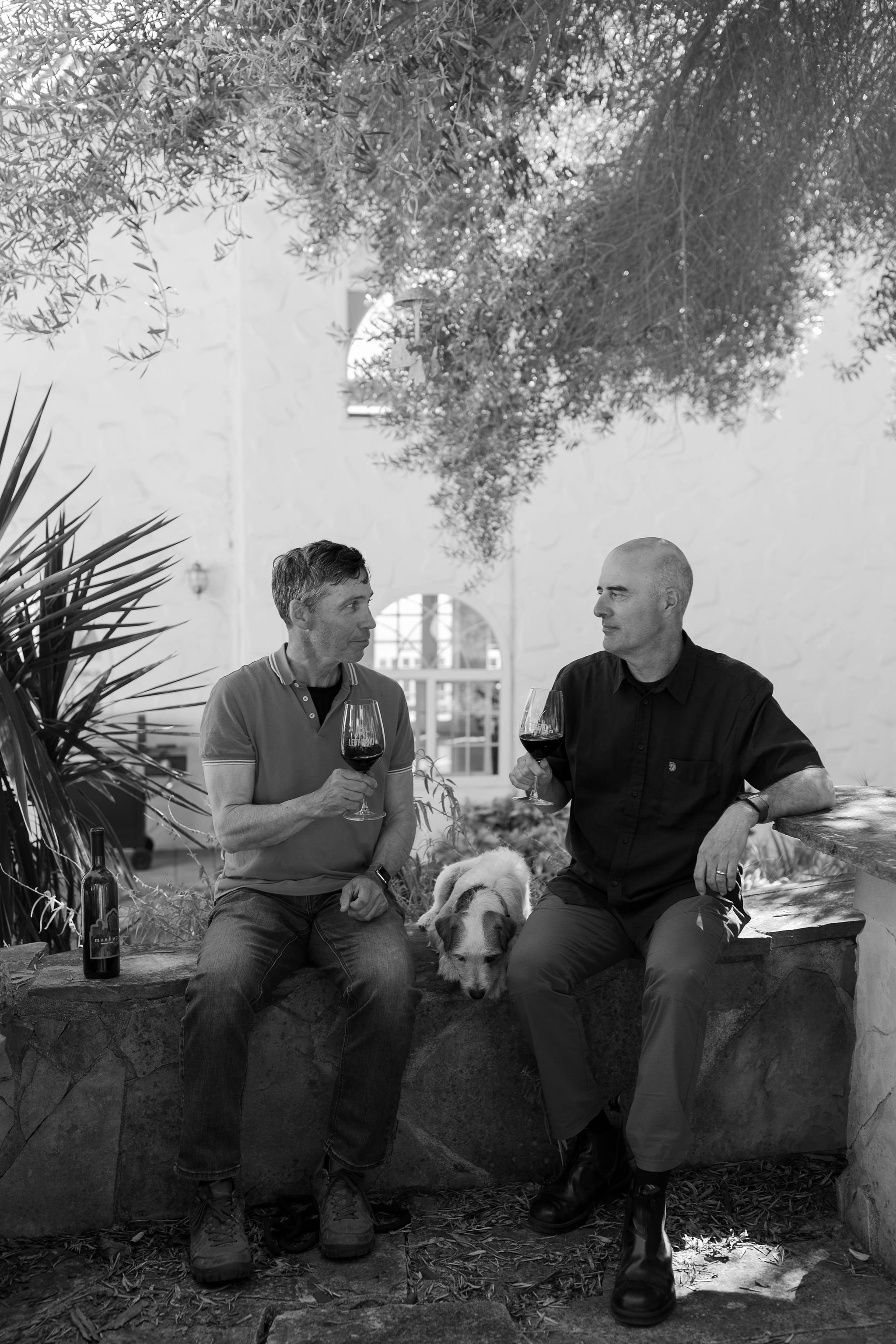
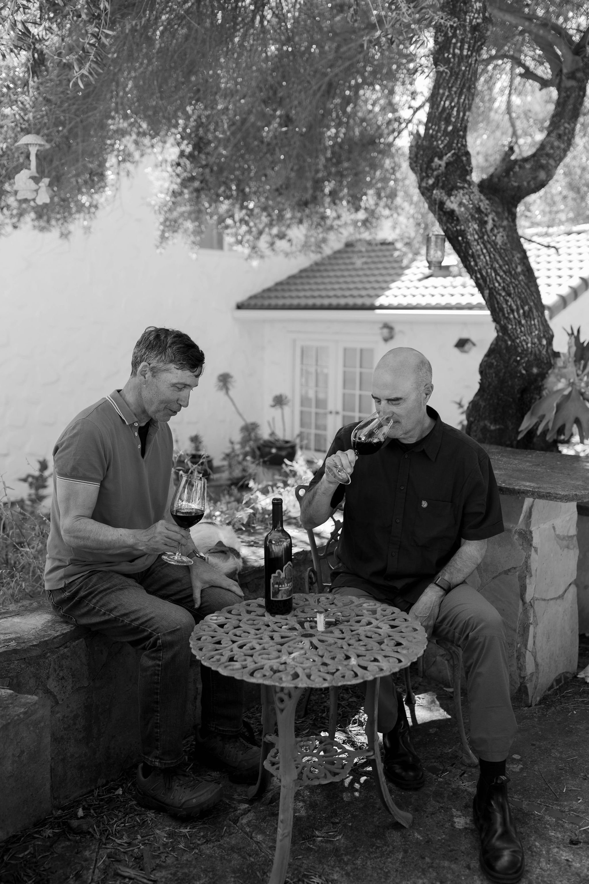
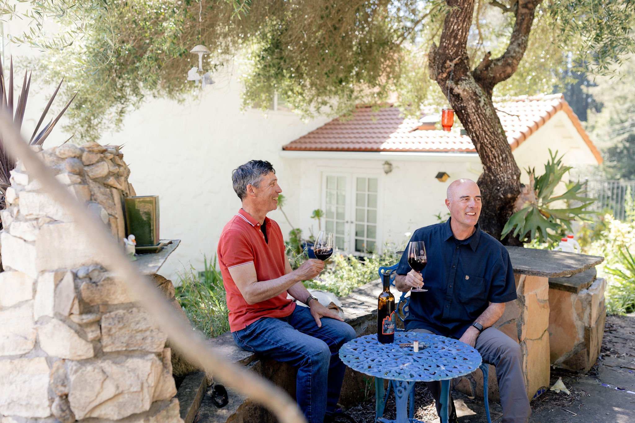
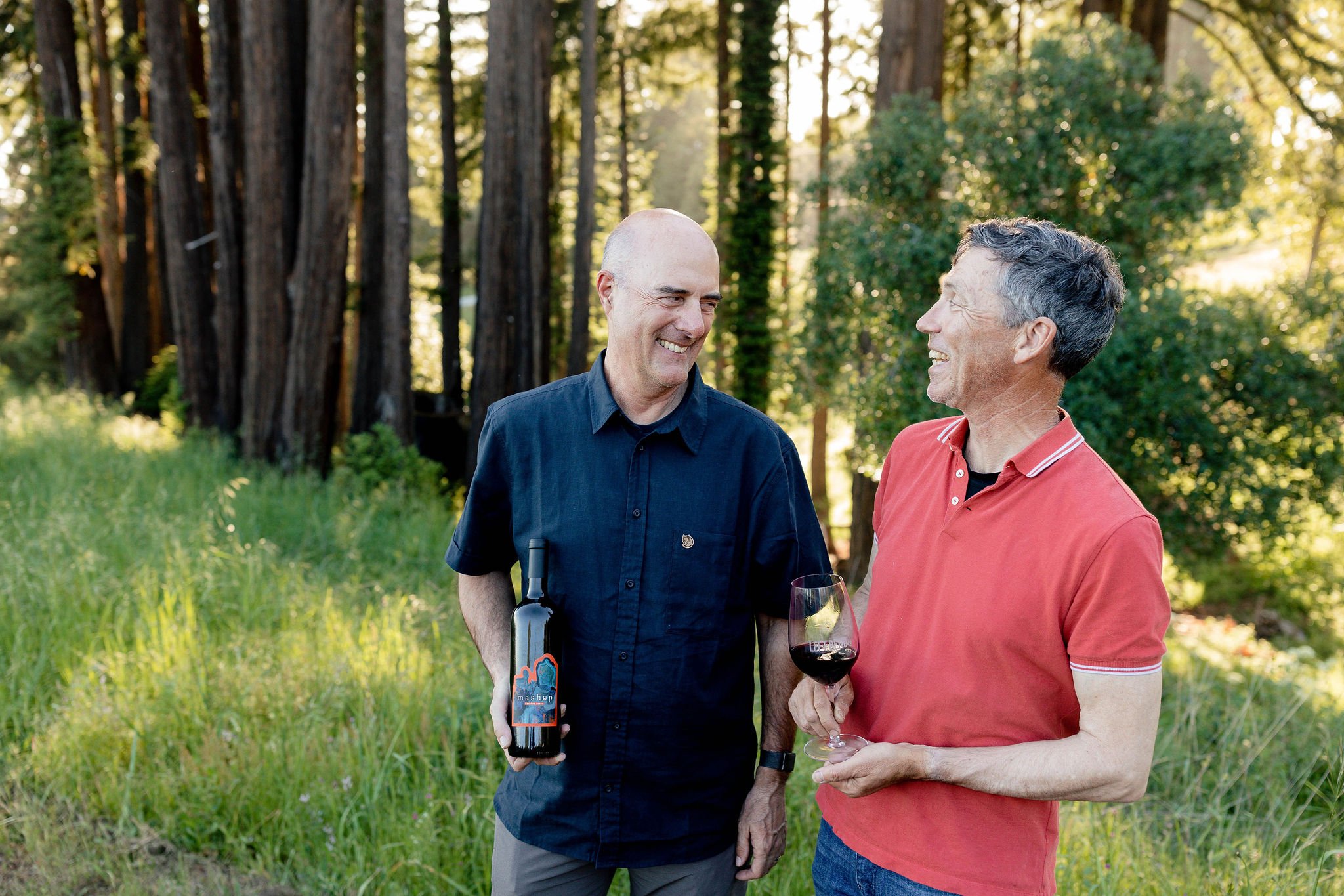
So, when winegrower Richard Hanke and winemaker Gary Robinson came to us for help launching Mashup as a new product for Left Bend, we knew their brand had to align with their wine: daring, fresh, and unique.


What do good branding and good wine have in common? They both get better with age.
In our branding process, especially for a new product, it’s our goal to create a brand that can stand the test of time.
It’s normal for your business to evolve with time, but even as you make changes, your brand should still feel true to who you are and why you’re in business.
We helped owners Richard and Gary figure out how they can emotionally connect with their consumers by communicating their value proposition through Mashup’s brand personality.


We defined Mashup’s:
Positioning | Voice | Visuals
To set the tone for communication that will inspire their audience to take action.
Once the key foundational pieces of their brand were in place, the execution was strategic and seamless.

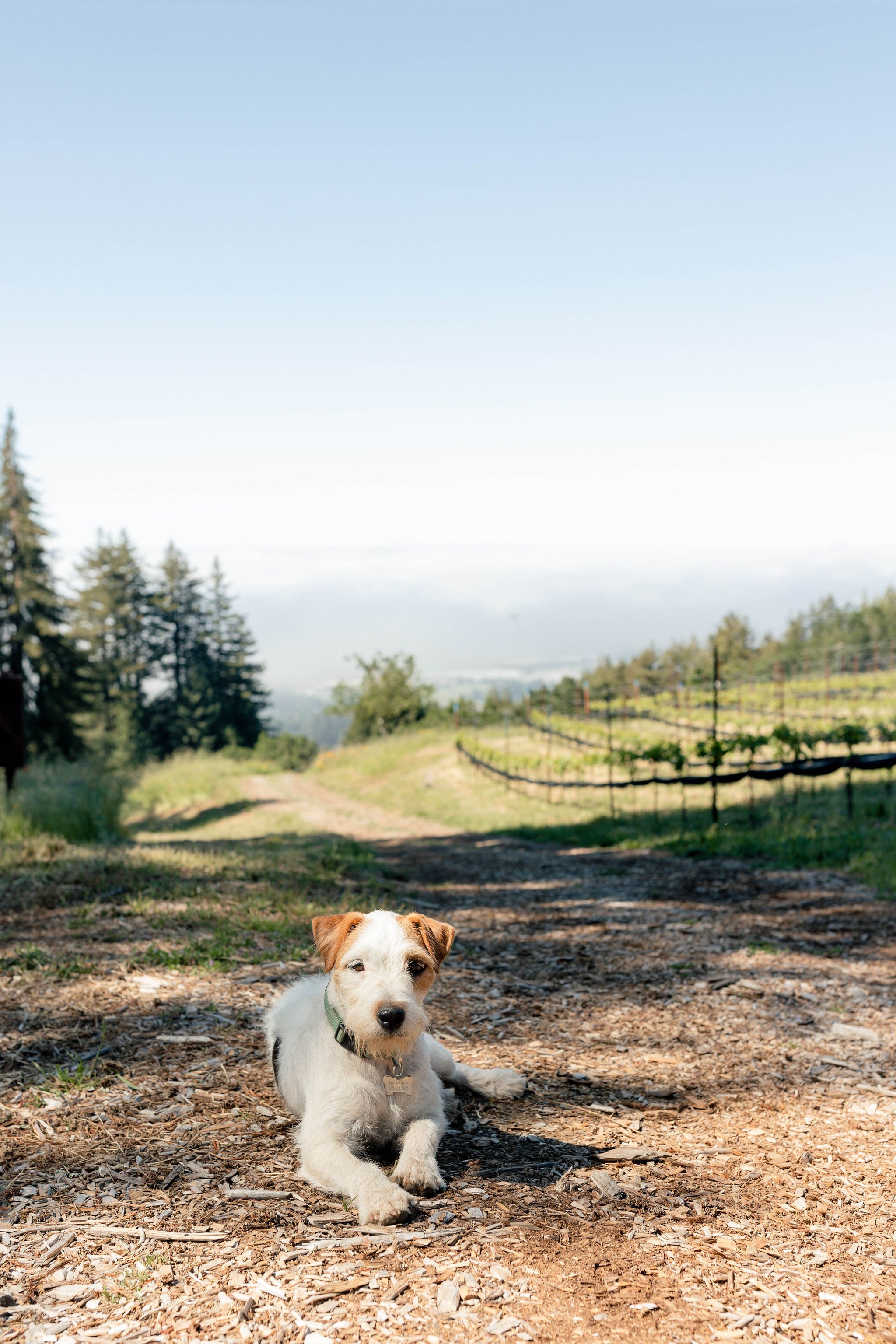
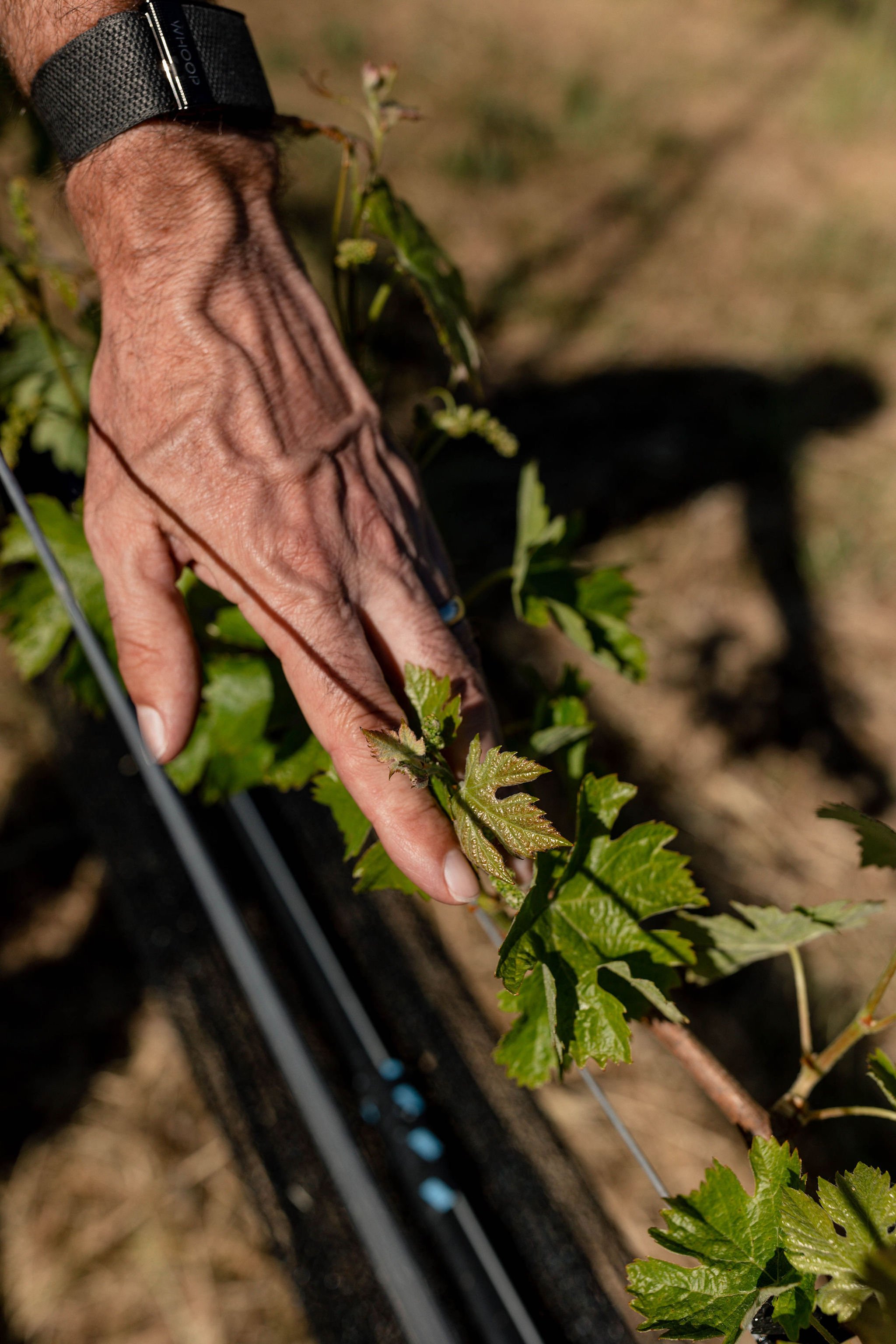
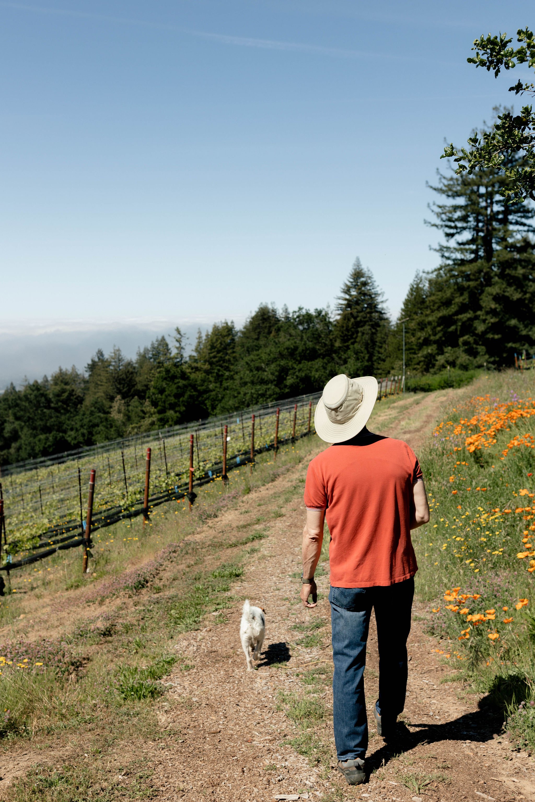
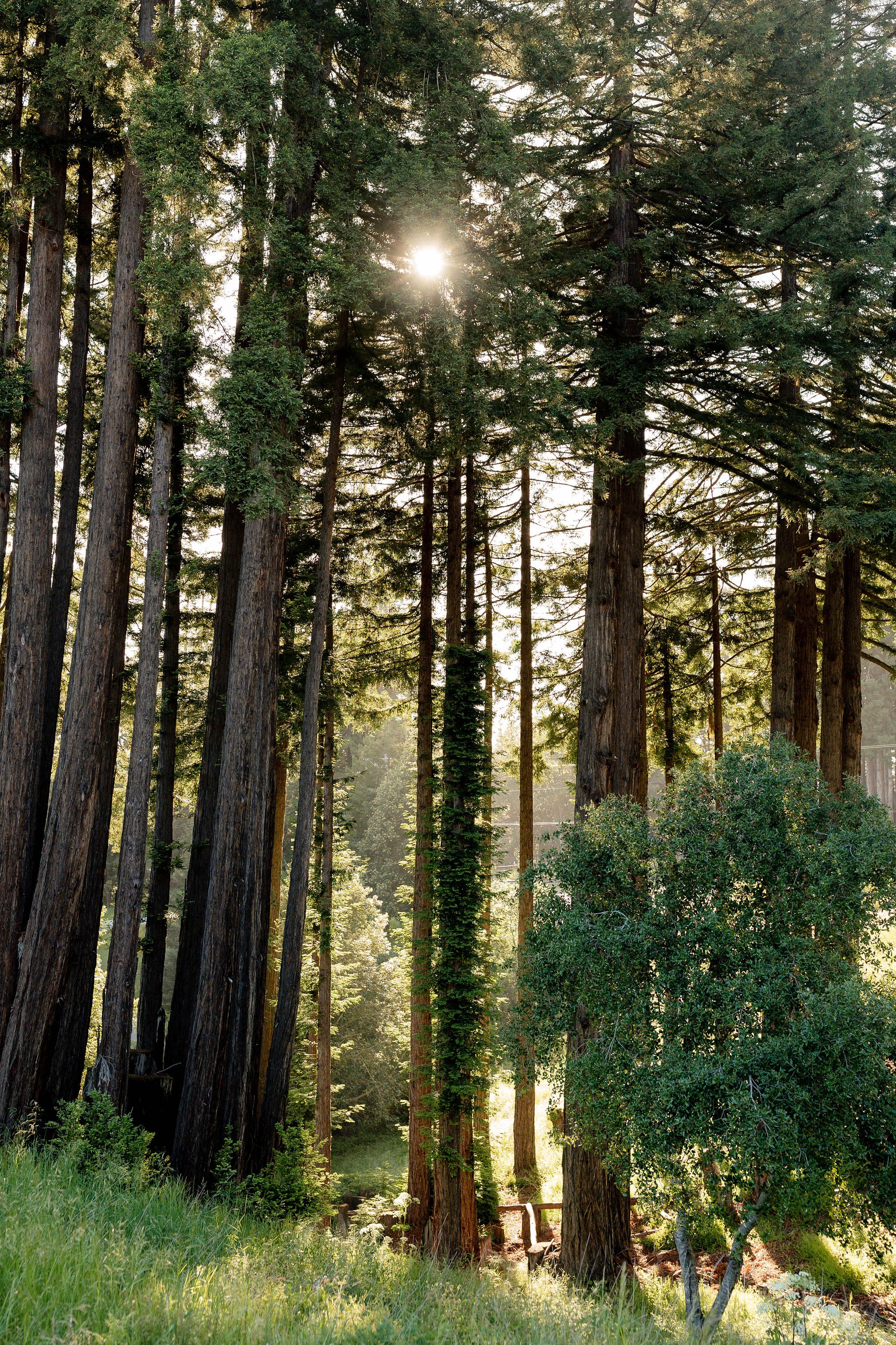
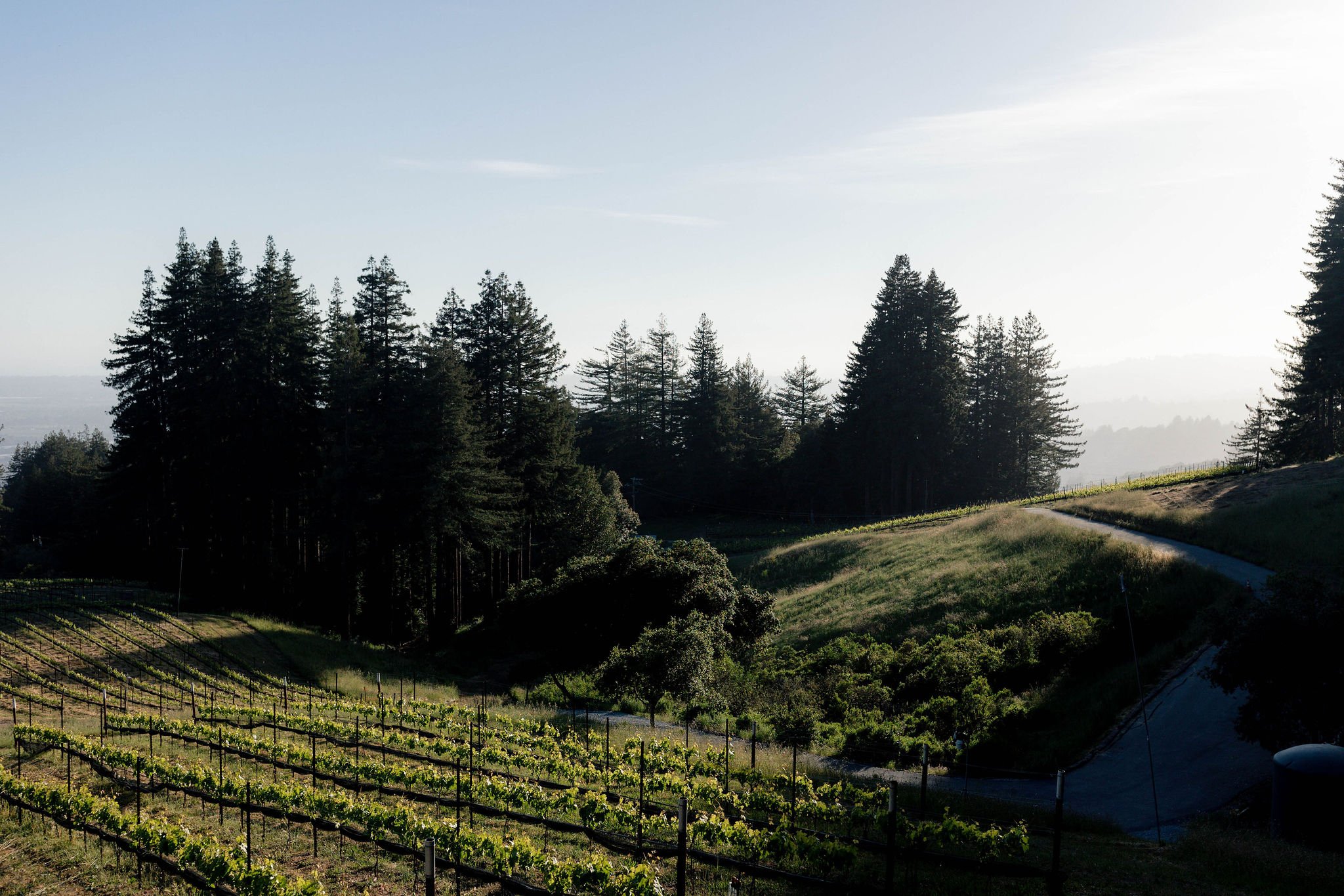
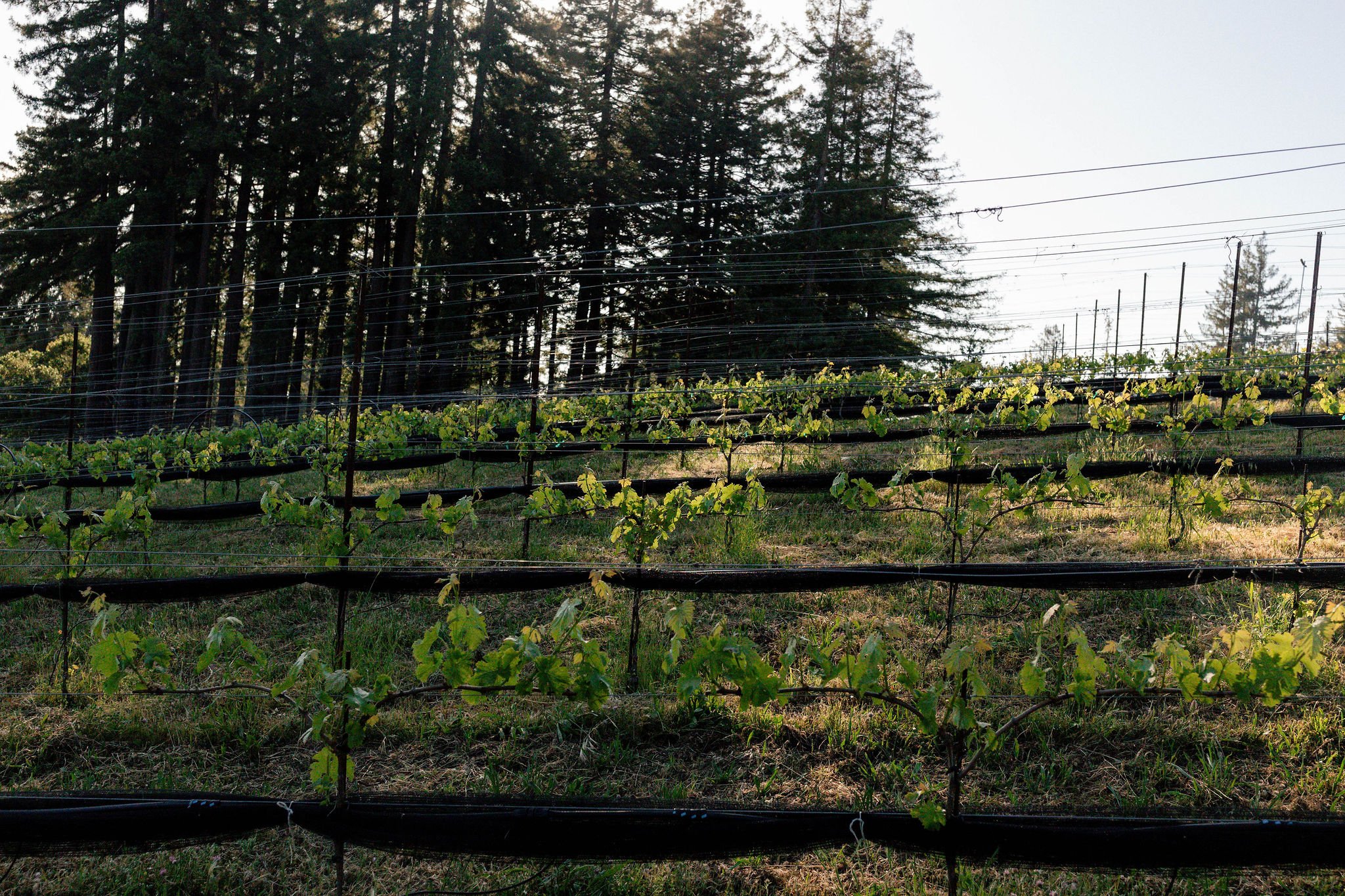
We managed, concepted, and executed all of Mashup’s brand assets and website, and even got to walk the vineyard with the Left Bend team to capture the beauty of their vineyard.
Our team is passionate about product and brand launches because we get to help business owners capture the vision they’ve been chasing after and bring it to life.