The Next Chapter: BookCon's Brand Evolution
We partnered with ReedPop to reimagine BookCon, creating an authentic brand that celebrates the literary community and speaks directly to passionate readers.
The Challenge
ReedPop, the world's largest producer of pop culture events, approached Hoot to help revitalize BookCon after a hiatus. They needed a brand that would resonate with their core audience of 30-35 year old professional women while capturing the magic and community that makes BookCon special. The brand needed to feel sophisticated yet playful, timeless yet on-trend, and most importantly, it needed to embody their "fans first" philosophy.
Our Approach
Through in-depth discovery sessions with the ReedPop team, we identified that BookCon isn't just an event—it's a homecoming for readers. Our target audience isn't just attending for books; they're seeking authentic connections, meaningful experiences, and a space where they can fully express their passion for reading.
We developed a comprehensive brand strategy focused on three core elements:
Community First:
Creating spaces where online friendships become real-life bonds
Experiential Innovation:
Designing moments that can't be replicated online
Digital Integration:
Extending the experience beyond the event itself
The Solution
Brand Positioning
Through our discovery and strategy work, we identified a unique market position for BookCon at the intersection of communal and interactive celebrations. Our perceptual mapping revealed a sweet spot where BookCon could stand out from academic book festivals and traditional trade shows.
We solidified BookCon's point of difference as creating "immersive, communal celebrations where passion becomes a party." This positioning:
Emphasizes the event's social nature rather than just transactional book-buying
Highlights the immersive, real-world experience in an increasingly digital reading landscape
Validates the emotion that readers bring to their favorite books and authors
Creates space for both serious literary discussion and joyful fandom celebration
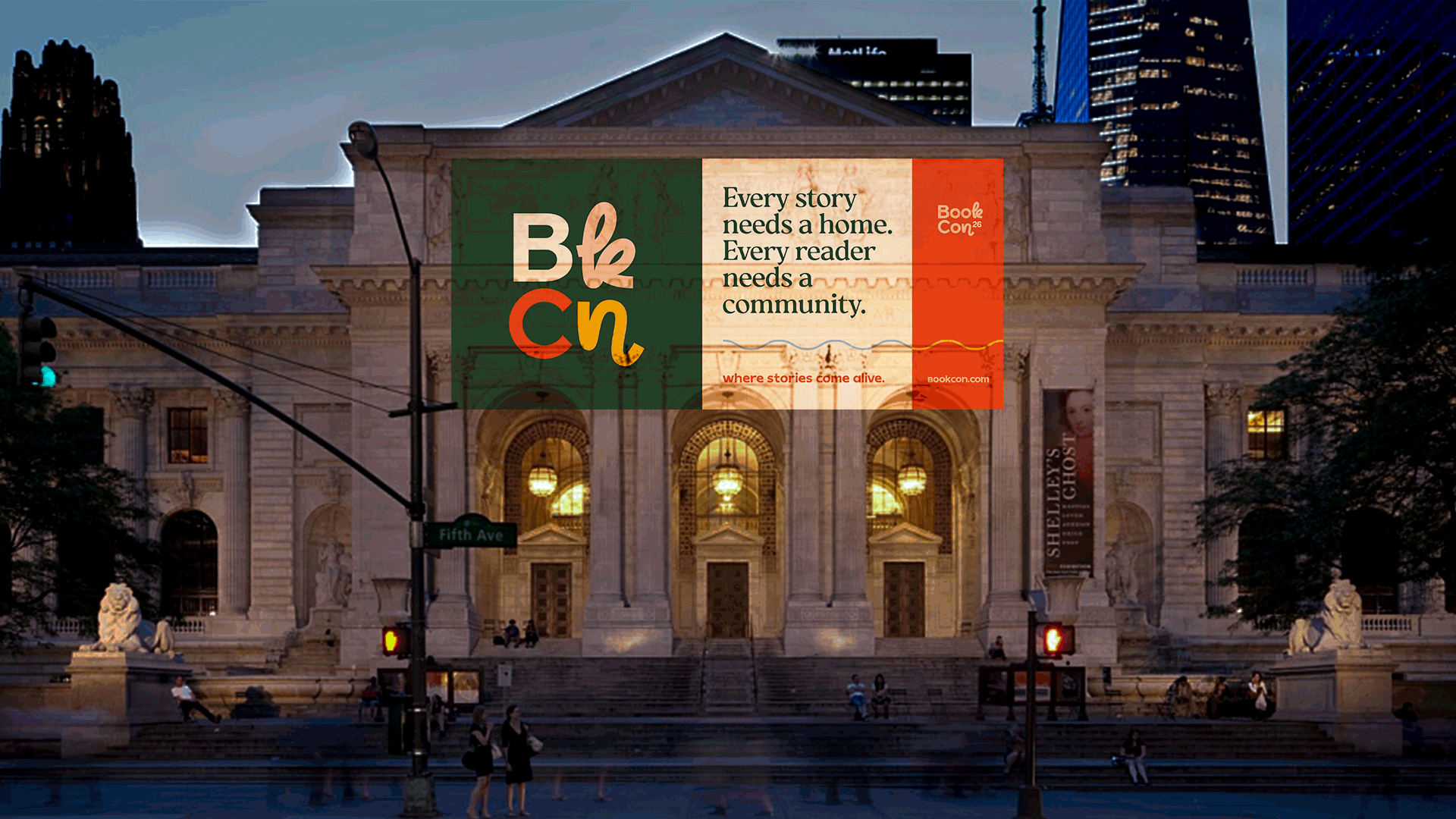
This positioning informed everything from marketing language to event design, ensuring that BookCon would be recognized as more than just another convention —
it's an invitation to come as you are. To geek out. To dress up. To show up. To have your best weekend ever.


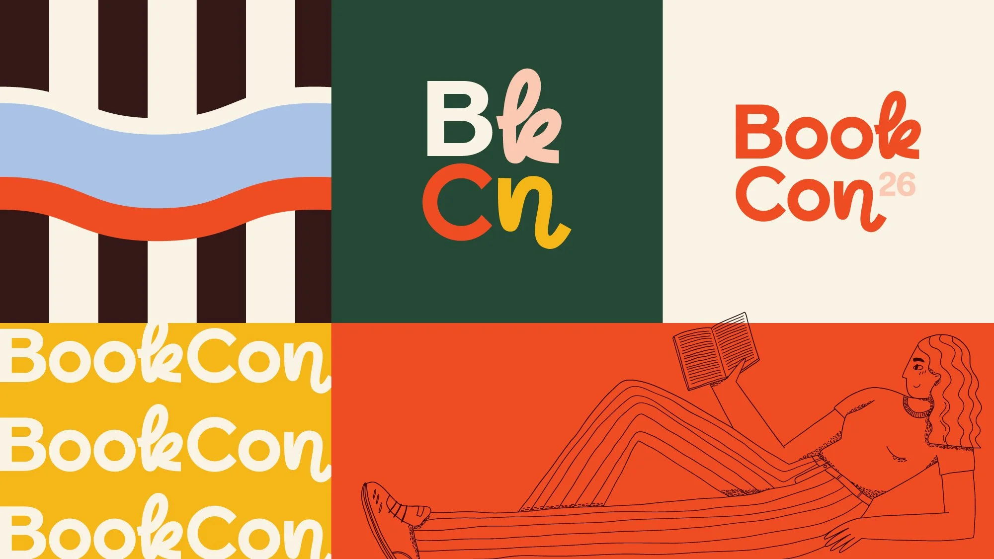

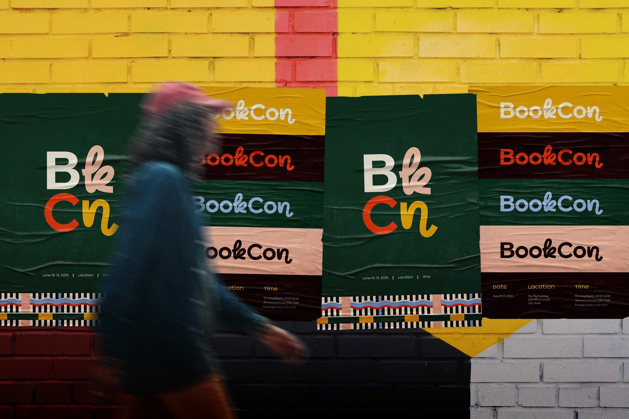
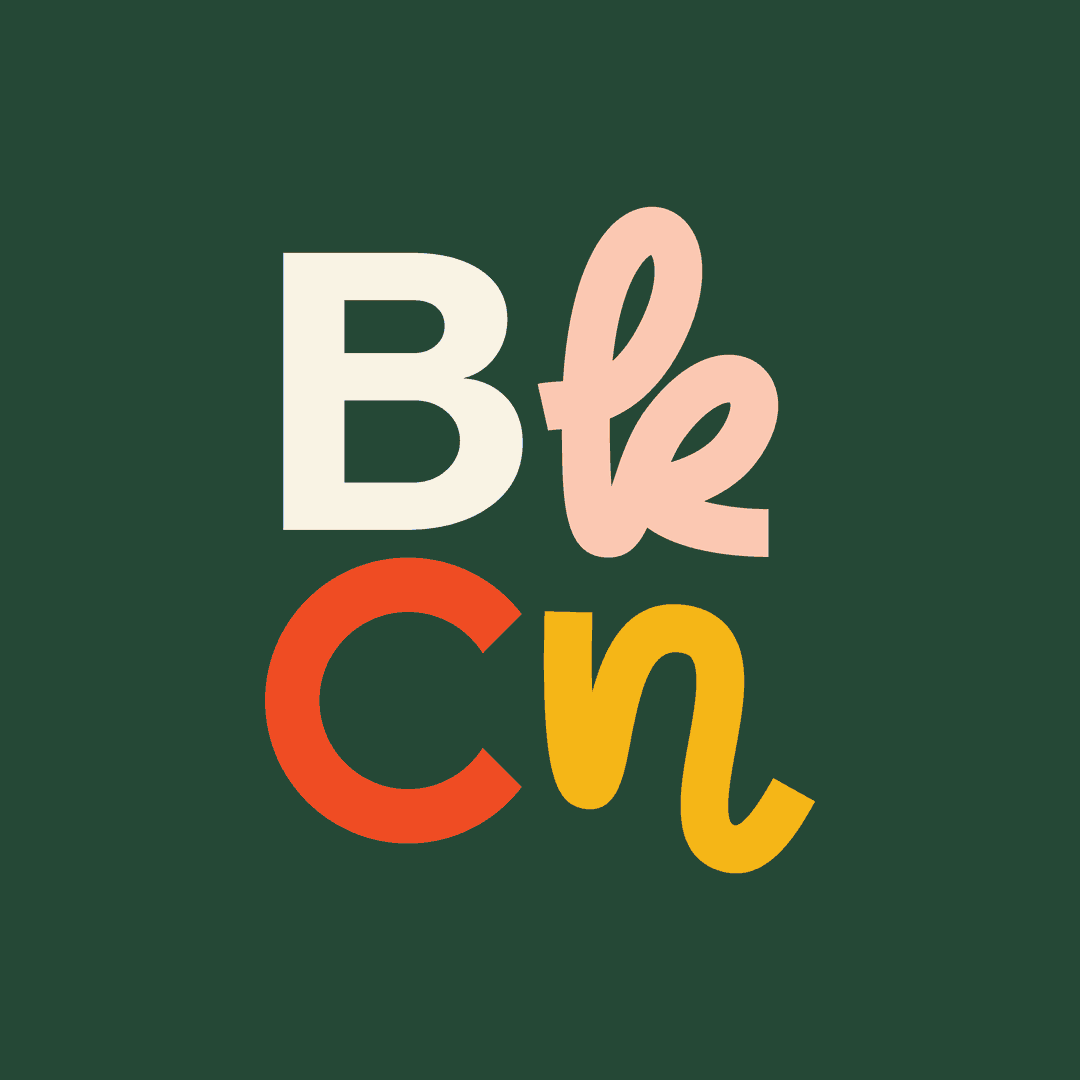
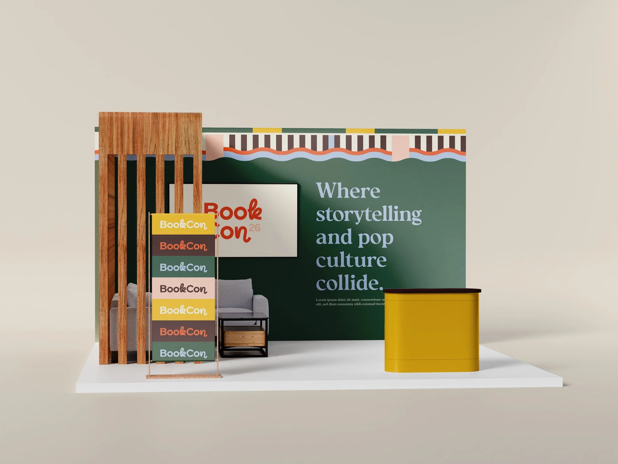
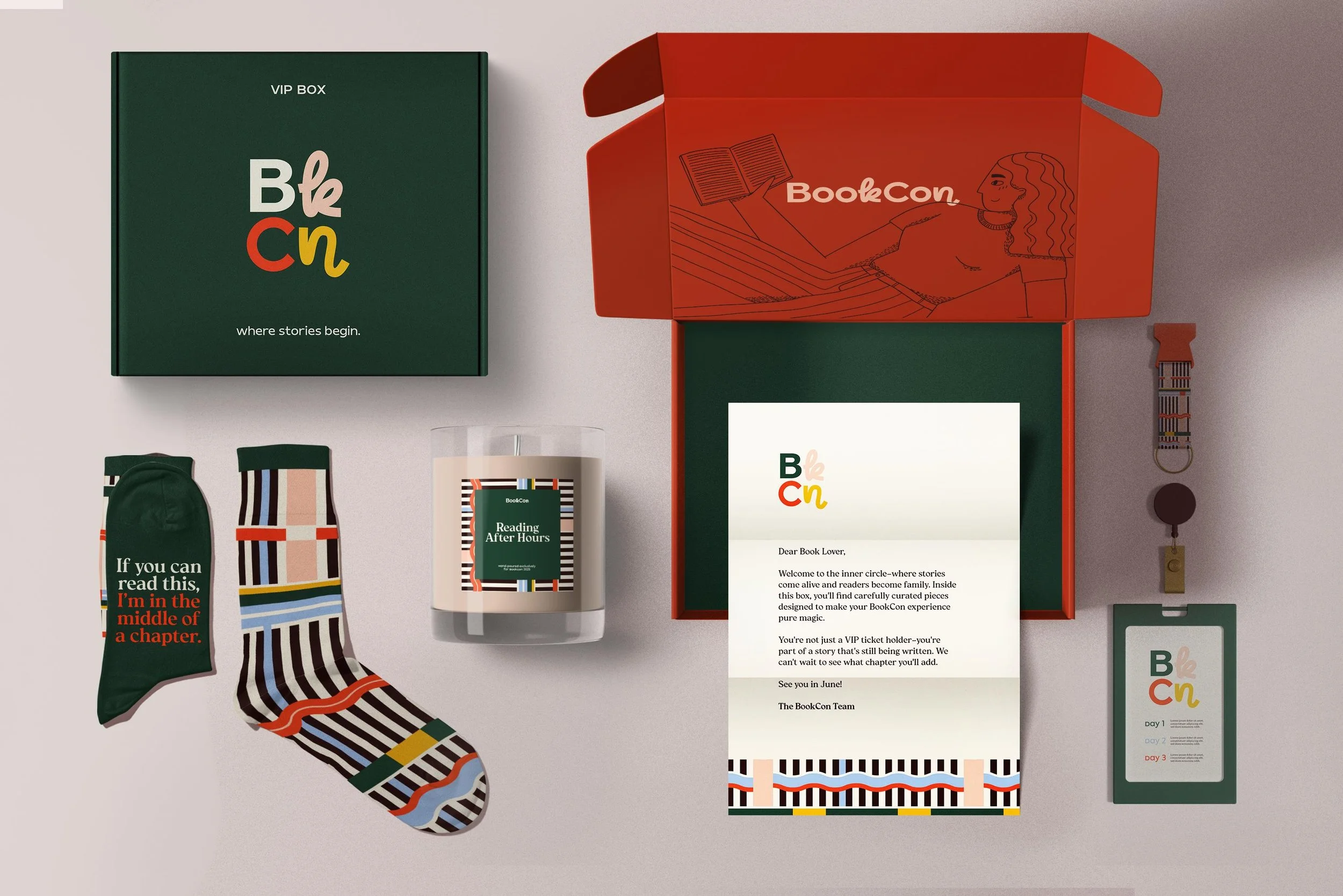
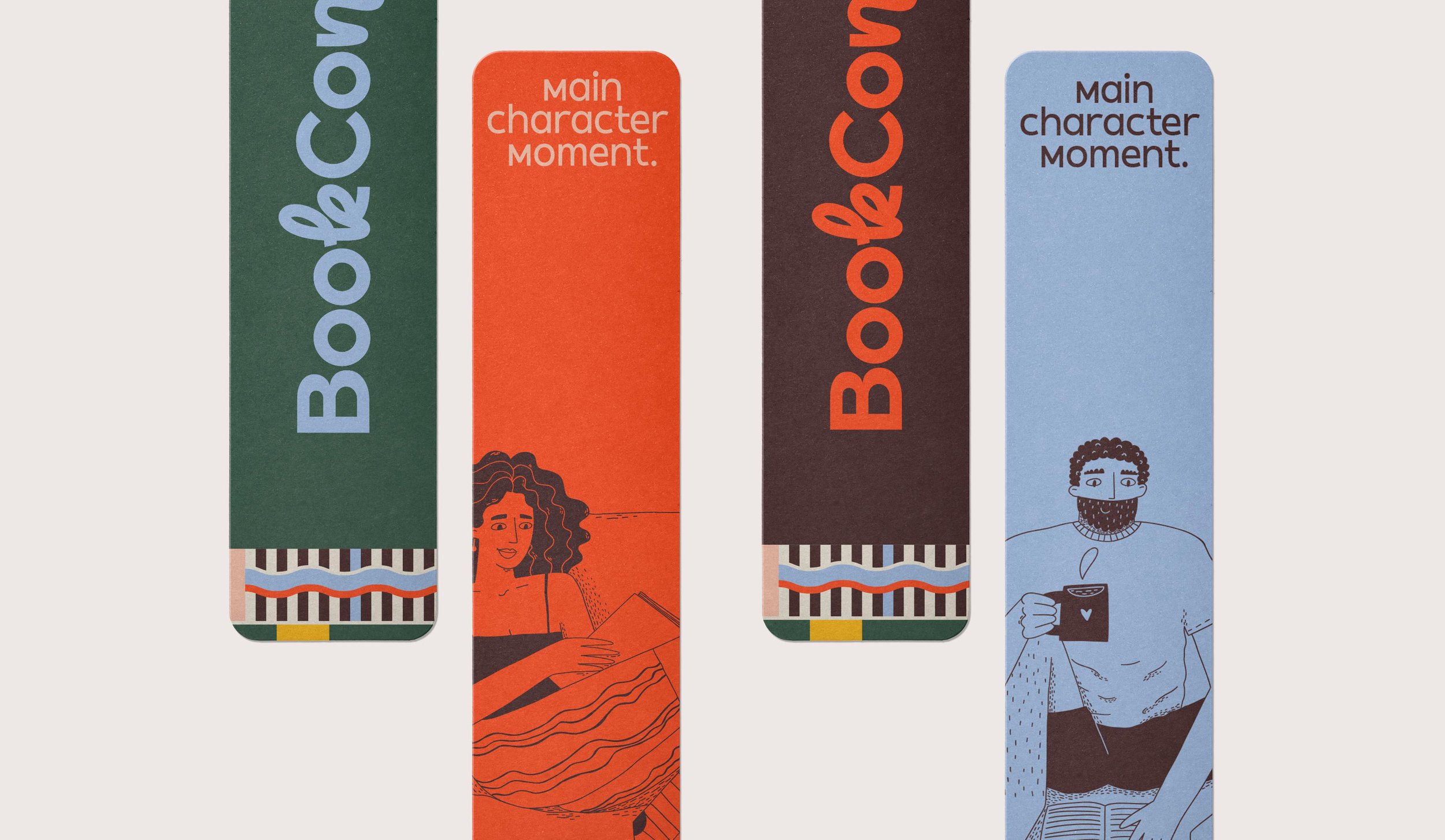
Visual Identity
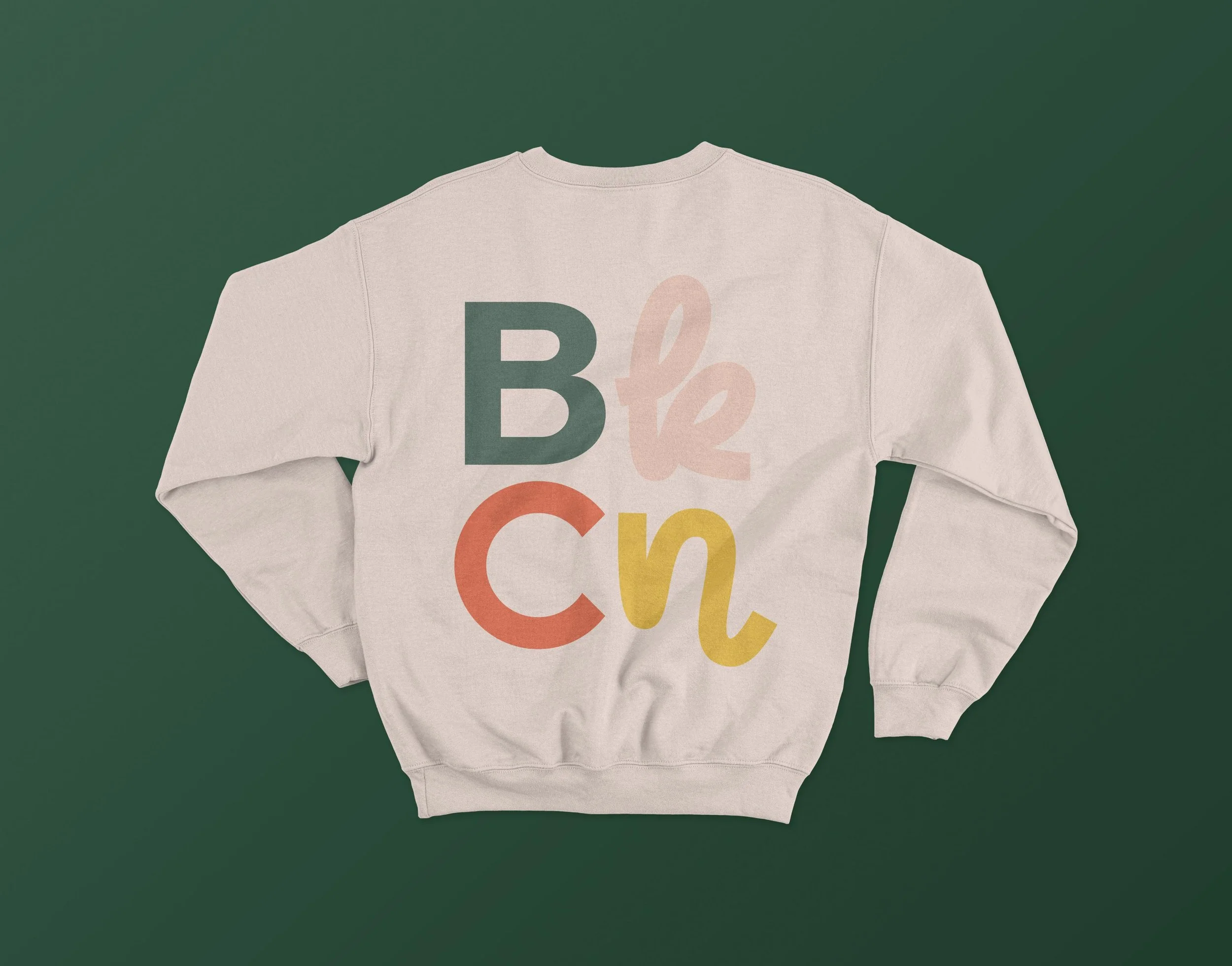
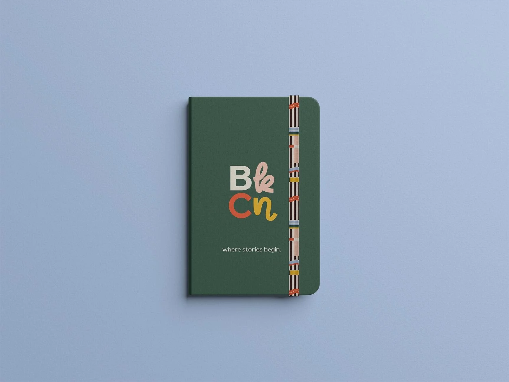
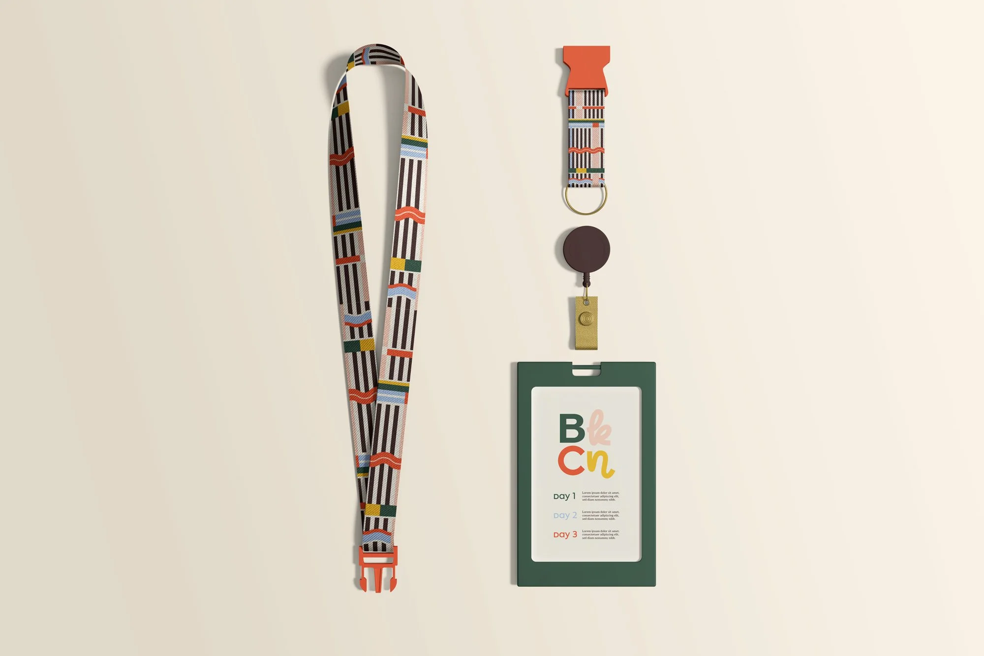
The visual identity balances sophistication with playfulness, drawing inspiration from romantasy, gothic elements, and contemporary design trends. We crafted a timeless logo complemented by flexible design elements that can evolve year to year while maintaining brand recognition.
We developed BookCon's visuals around a core brand tension: Aesthetically Curious - living in the sweet spot between polished and peculiar, where limited edition hardcovers meet vintage band tees.
The logo system features flowing letterforms that evoke the motion of turning pages, with subtle nods to the reading experience built into its design. Custom graphic elements include distinctive patterns reminiscent of book spines on shelves, while hand-drawn illustrations celebrate diverse reading moments.
The resulting visual system is sophisticated enough for the target audience while maintaining the playfulness and authenticity that defines the BookCon experience.


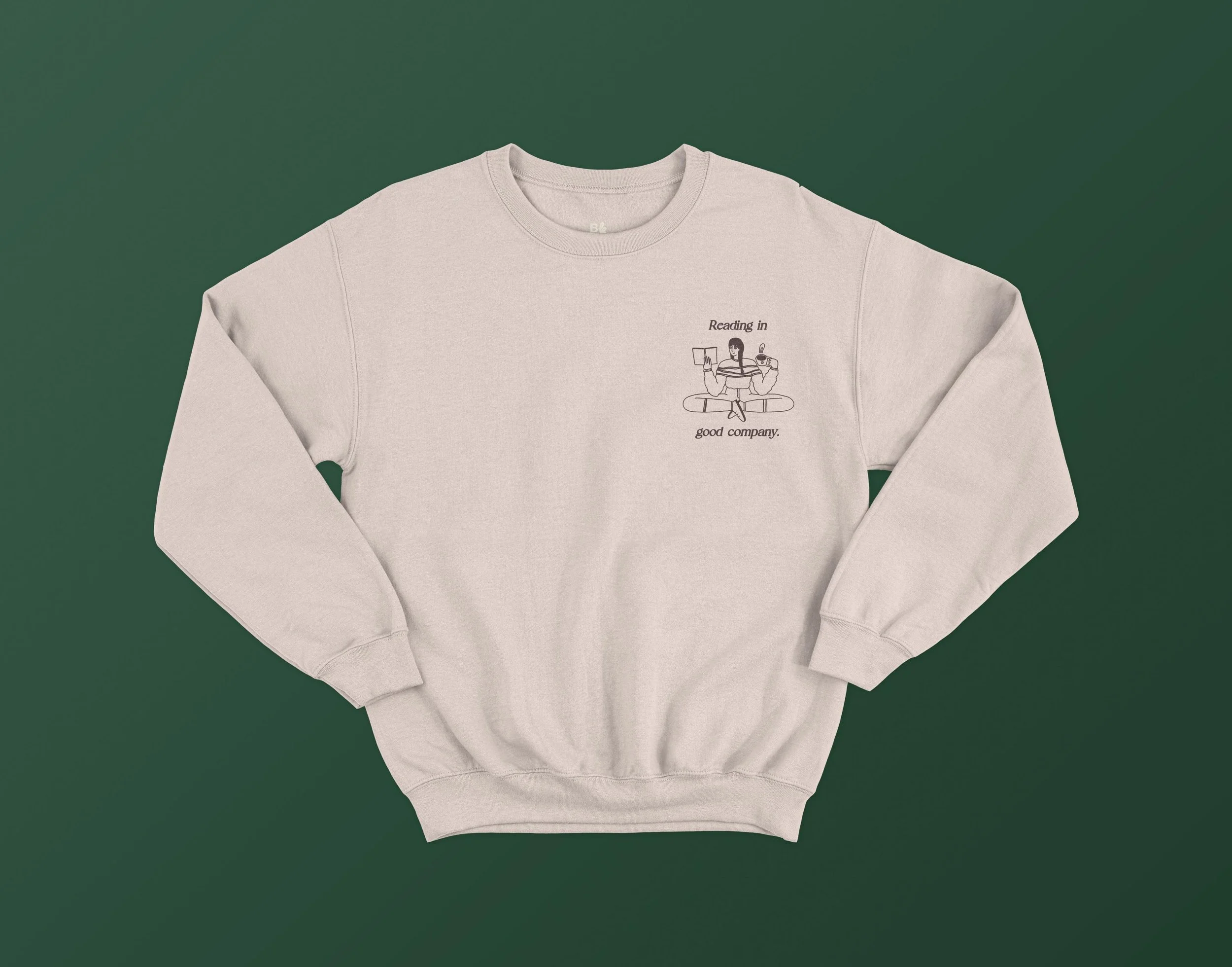
Voice & Tone
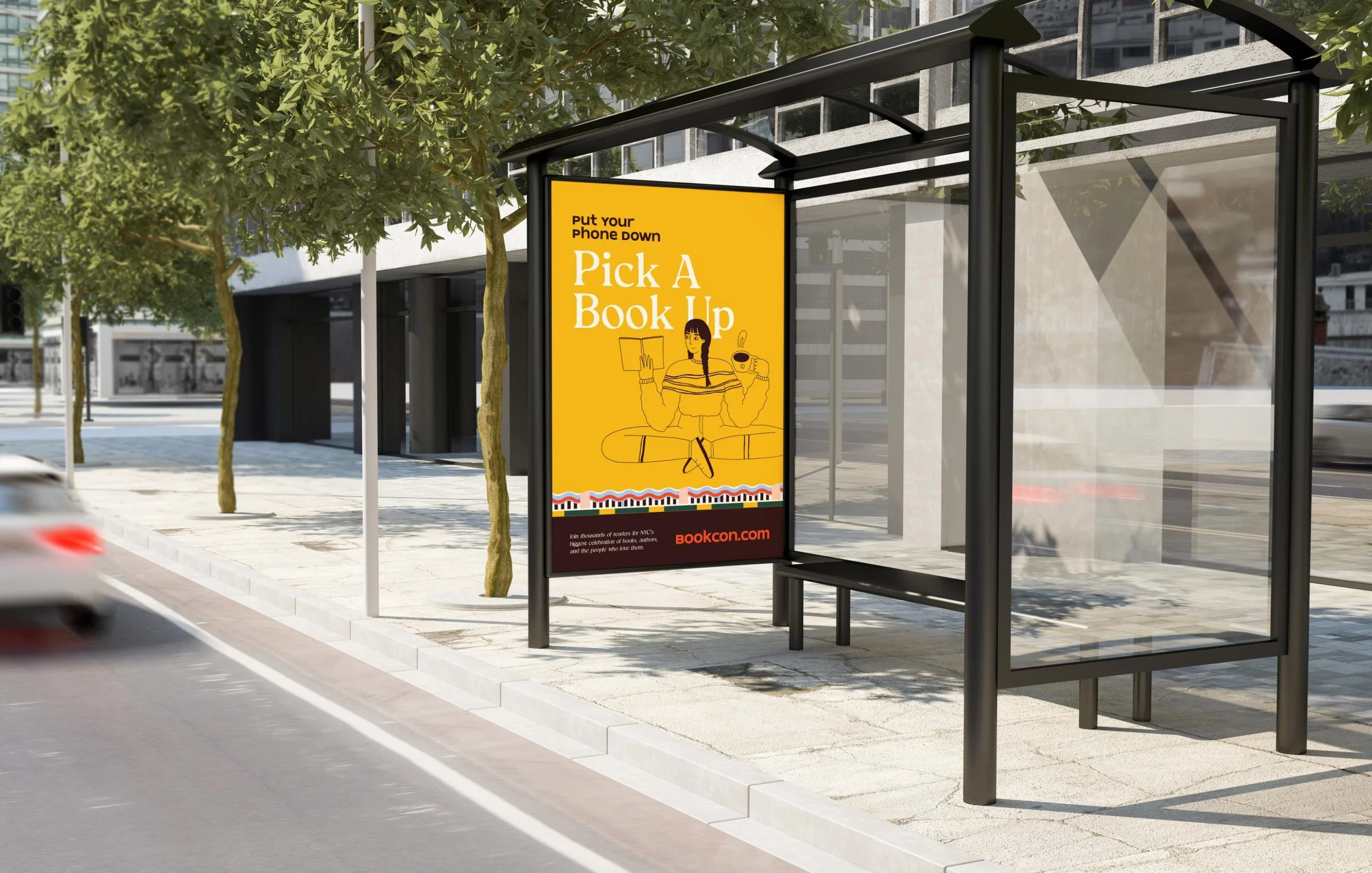
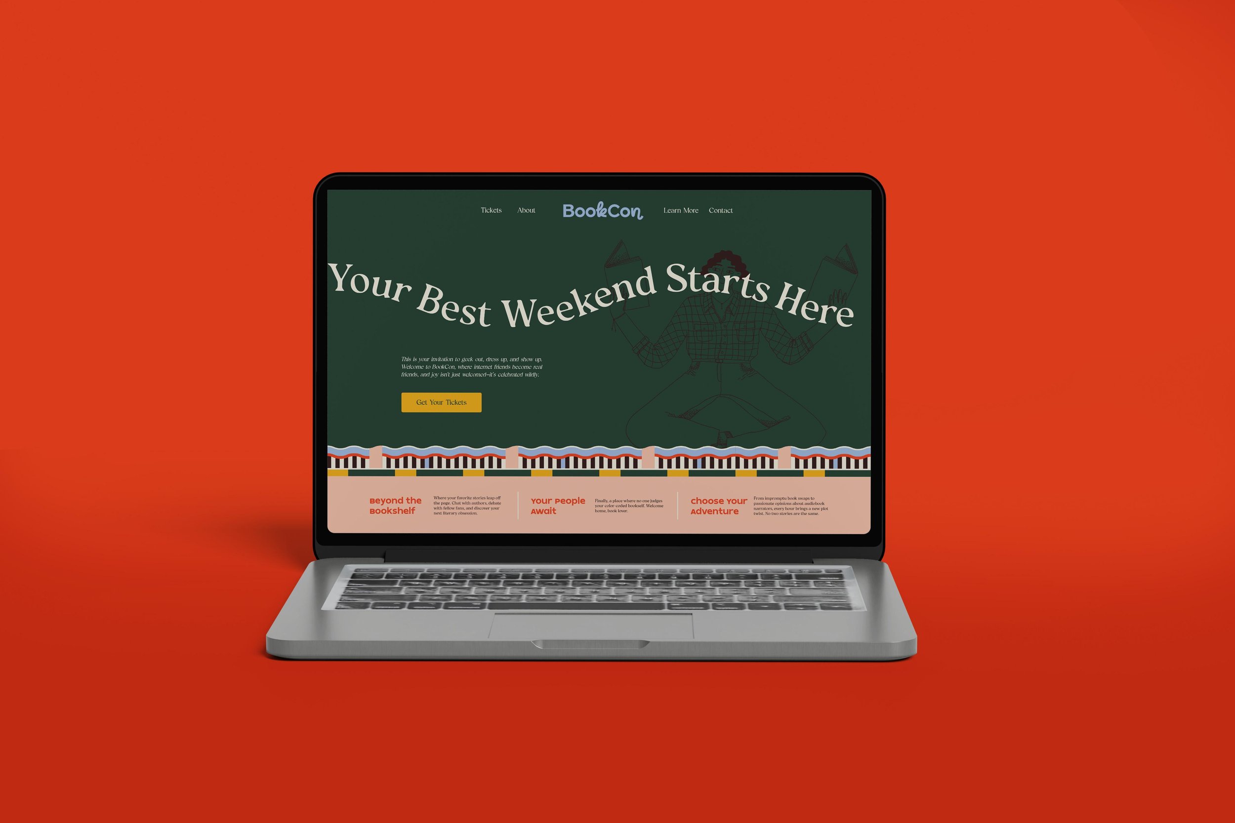
We developed a voice that feels like "the cool older sister" who's equally comfortable discussing Sarah J. Maas novels and recommending independent bookstores. The tone is confident, playful, and human—speaking to readers as equals.
In line with the "Aesthetically Curious" brand tension point, the voice celebrates authenticity over perfectionism, embracing the sometimes quirky, passionate nature of book lovers. Messages like "Come play IRL" and "Where storytelling and pop culture collide" invite readers to step away from their screens and into a community where being enthusiastic about books isn't just accepted—it's celebrated.

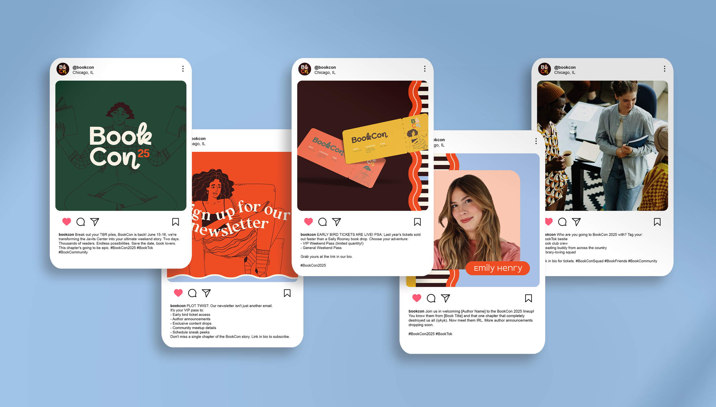
Marketing Strategy
We developed a strategic marketing approach built around three key pillars: creating anticipation, fostering community, and delivering authentic experiences.
The plan featured a phased rollout beginning with mysterious teasers and building to a coordinated launch across digital and physical spaces. We focused on Instagram and TikTok as primary platforms, creating content tailored to BookCon's audience of passionate readers.
Our NYC-focused experiential campaign included book drops, library takeovers, and street-level activations that transformed online connections into real-world interactions. Strategic partnerships with BookTok influencers and indie bookstores will amplify reach while maintaining authenticity.
The Results
The new BookCon brand successfully captured the essence of what makes the event special: a place where readers can be their authentic selves, connect with fellow book lovers, and celebrate their passion for reading. The brand and marketing strategy laid the foundation for BookCon's triumphant return to New York City.
ReedPop leadership praised the brand's ability to speak directly to their target audience while remaining flexible. The positioning as a premium experience rather than just another convention helped distinguish BookCon in a crowded event landscape.

"Hoot Design Company truly understood what makes BookCon special. They created a brand that speaks directly to our audience and captures the magic of bringing book lovers together. The work they delivered gives us a strong foundation for BookCon's return and future growth."
— ReedPop Team
Ready to Transform Your Brand?
We specialize in crafting authentic brand experiences that connect with your audience and drive your business forward.