Build This Town Campaign for the Agriculture Park
The Friends of the Farm partnership approached us with a pretty giant task: They were setting out to raise millions of dollars for a revolutionary Agriculture Park that Mid-Missouri has never seen the likes of before - and they needed our help.
We were immediately up for the challenge to bring the Build This Town Campaign for the Agriculture Park to life.
We knew we were looking at a HUGE host of needs:
• A vivid brand – to generate recognition and create legitimacy (including creating a name!)
• An inspiring communication style – to speak to our community and spark action
• A grasp of the challenges the campaign faces – to guide the campaign's overarching advertising strategy
• Targeted Dream Donors – to reach the key players we need and win them over
• A marketing strategy that emphasizes quality over quantity – to spur the audience to take action and keep the community engaged
• A plan to generate and maintain momentum – to keep fuel to the fire for the campaign's multi-year lifespan!
You know what we say: Bring on the challenge! 👊🏽
From the roots to the branches - let's break down how we're going to Build This Town. 🌳
Ready for the big reveal?
1. We focused on strategy
A capital campaign is NOT just about raising funds. It's about engaging an entire community, building trust and support, and creating a widespread movement that accomplishes an end goal.
There are two angles to consider in building this campaign:
1) Targeting specific dream donors: creating avatars, doing market research, and exploring the inner workings of these individuals' minds.
2) Growing passionate support from the community: building a brand that's infectious, energetic, welcoming, and down-to-earth
2. We developed a name that inspires action
To tackle the challenge of a multi-million dollar capital campaign, we'd need to push the boundaries of what's expected in a local campaign – and take risks in style, voice, and our outspoken belief in the power of brand strategy.
We knew the campaign needed more than a descriptive name: it needed a rallying cry.
That's what Build This Town communicates: what we need to do, and that we need to start doing it now.
The campaign's full name, Build This Town Campaign for the Agriculture Park, gives the long-form version to extend that to exactly how we're going to build this town: with a first-in-class Agriculture Park, unlike anything mid-Missouri's had before.
3. We created branding that captivates
Build this Town needed a recognizable, attention-grabbing look to communicate energy, inspiration, and passion to Mid-Missouri and beyond.
There was also a big challenge in our path: crafting a brand that could communicate the passion behind local produce – without getting confused with the branding of the Columbia Farmers Market or other partners bringing the campaign together.
We took inspiration from a wide variety of bright, colorful, energetic, texture-filled sources to pull together a highly unorthodox brand for a campaign centered around agriculture.
Brand Vision Board
We took inspiration from a wide variety of bright, colorful, energetic, texture-filled sources – check out the final Brand Vision Board at right.
Using the approved board for inspiration, we began crafting what can only be described as a highly unorthodox brand for any campaign centered around agriculture – the first of many risks that ended up paying off in the end!
Brand Vision Board for Build This Town
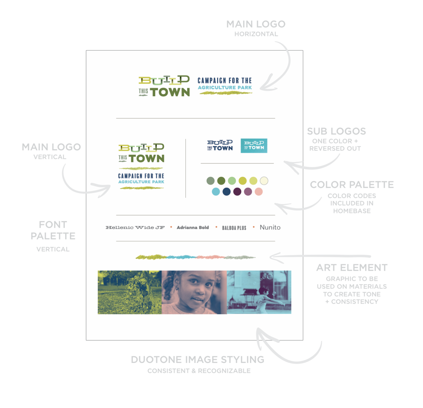
Final Brand Board
LOGO:
We used dynamic, interlocking letters with subtle dimensionality to create a memorable core logo that adapts easily into multiple layouts – including a striking version in one color, and arranged both horizontally and vertically with Campaign for the Agriculture Park.
COLOR PALETTE:
We ditched the familiar colors of agriculture-related projects altogether – goodbye, earthy browns with pops of green and orange (too close to our beloved Farmers Market!) – and hello bright purples, blues, and yellow-green spectrum!
TYPOGRAPHY:
Our typography palette needed to be fun and suitable for long-form copy. Done!
TEXTURE:
A custom-created speckle texture and scribbled shape works on two fronts: adding an organic element to break up Build this Town's strong type and bold colors, and creating continuity throughout Build This Town materials.
Final Brand board for Build This Town
4. We crafted language that spurs + connects
Through powerful language that evokes the senses, our ground-up strategy for the campaign inspires its audience to take action to make the Agriculture Park a reality.
5. We created bold advertising campaigns
Posters should not just blend into the supermarket's bulletin boards, and postcards should not get automatically tossed in the recycling. 🙅🏽
Our print materials pop out out of the crowd with exciting design and powerful language.
Advertising campaign for Build this Town: poster
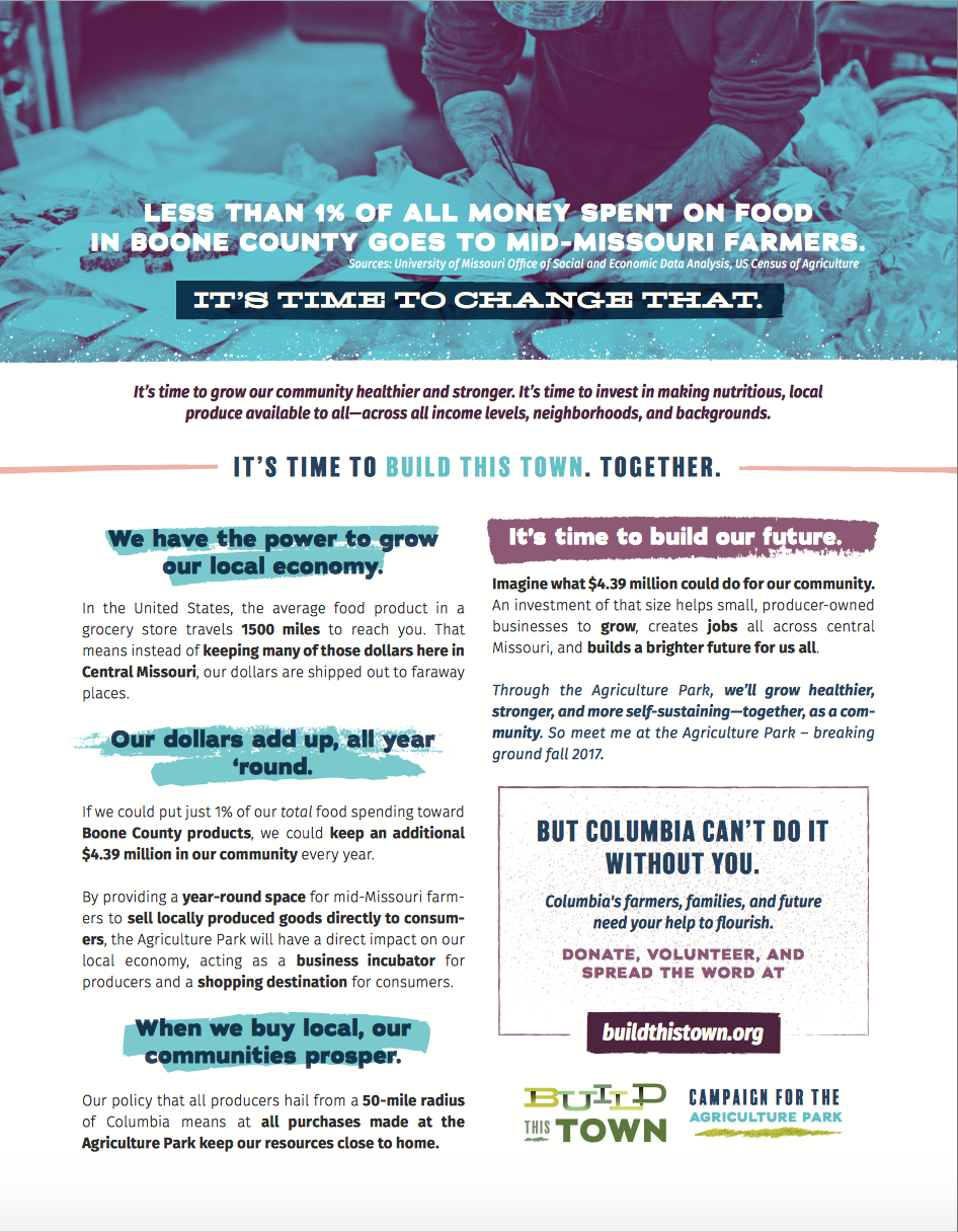
6. We forged educational copy to make the campaign's beliefs approachable
We also equipped Build This Town with economic & health educational fact sheets so they could directly and effectively communicate what the benefits of a successful campaign – and a fully completed Agriculture Park – will be.
Our seamless combination of Build This Town's visual brand, voice, communication style, brand values, and targeted marketing strategy is what makes these educational sheets successful.
Fact sheet: Health Benefits
Fact sheet: Economic Benefits
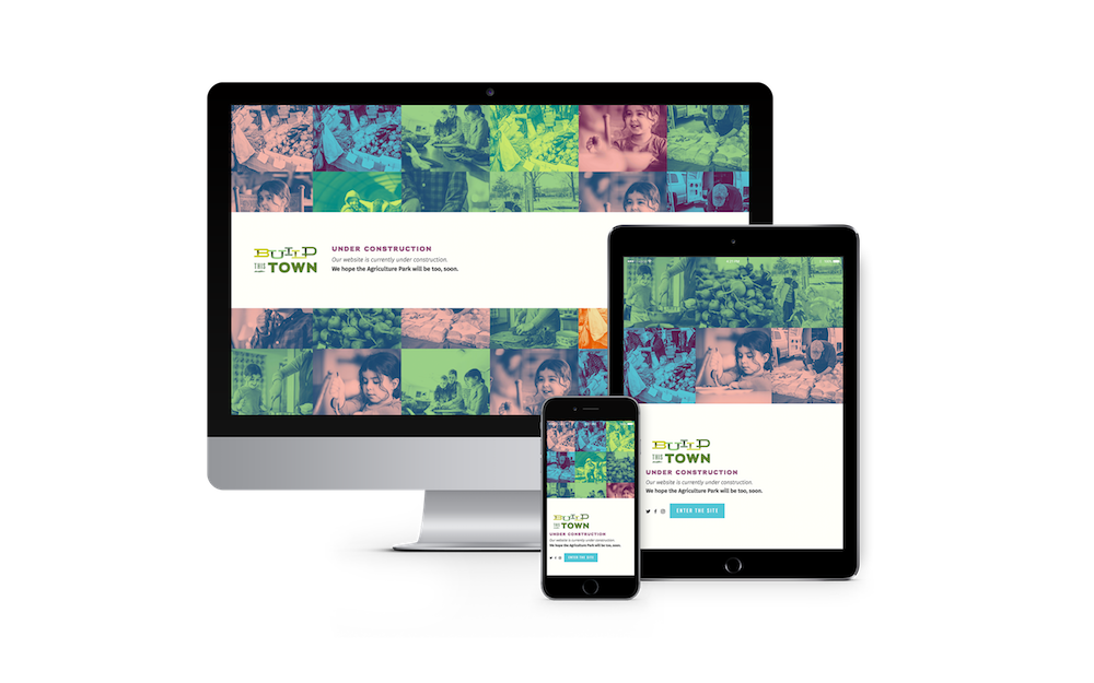
7. We built an effective website
To ensure potential supporters stay on the website for longer than 30 seconds, it needed to be interactive, easy to navigate, and informative. We did that.
Build This Town's site takes the reader on a journey using prose and powerful imagery. And every step of that journey leads the user toward taking an action – whether that's making a donation, becoming a volunteer, or sharing info about the campaign with a friend, the Build This Town website funnels users toward doing.







Read More →