Investigative Reporters & Editors (IRE)
Using Messaging Architecture to Tell a Brand Story

Investigative Reporters & Editors is a grassroots nonprofit organization that serves journalists across the globe. The nonprofit was founded in 1975, and it has since grown to become the number one resource for investigative journalists in the world.
IRE remains up-to-date on global events big and small, but when the nonprofit approached us, its image was portraying a different story. Its website was outdated, its visuals needed a refresh, and its messaging was floundering. The IRE story needed some editing and updates, and we tackled the job without hesitation.
Messaging Architecture
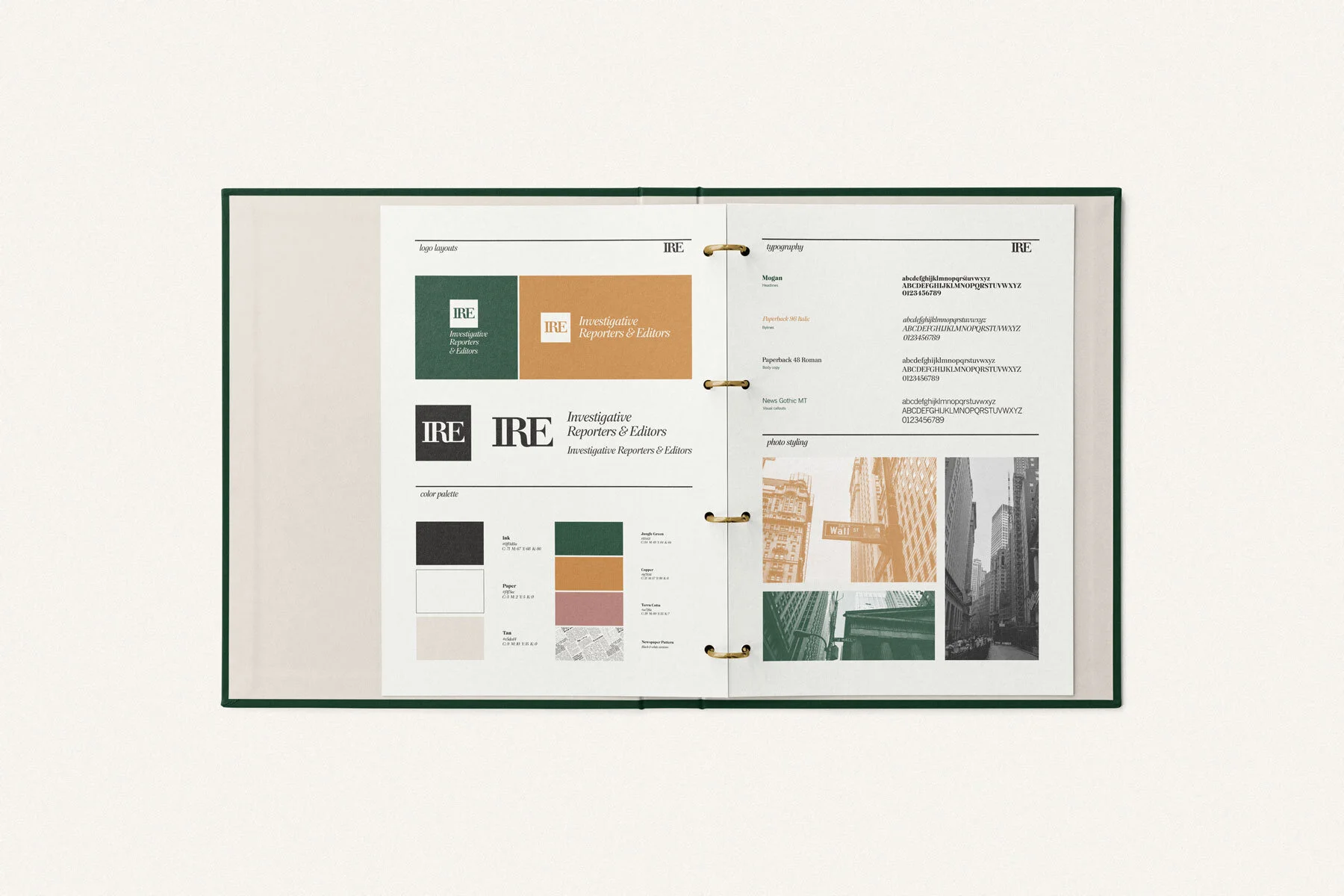
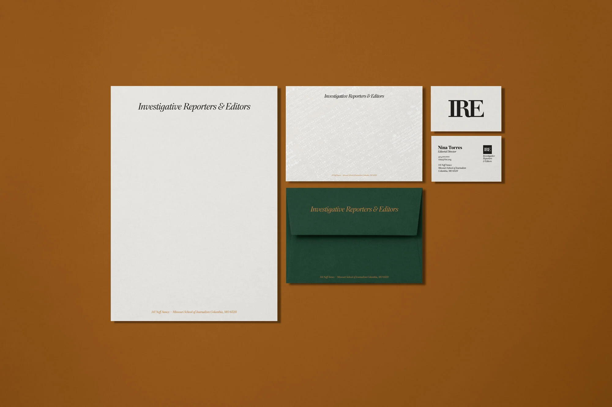
Full Visual Suite
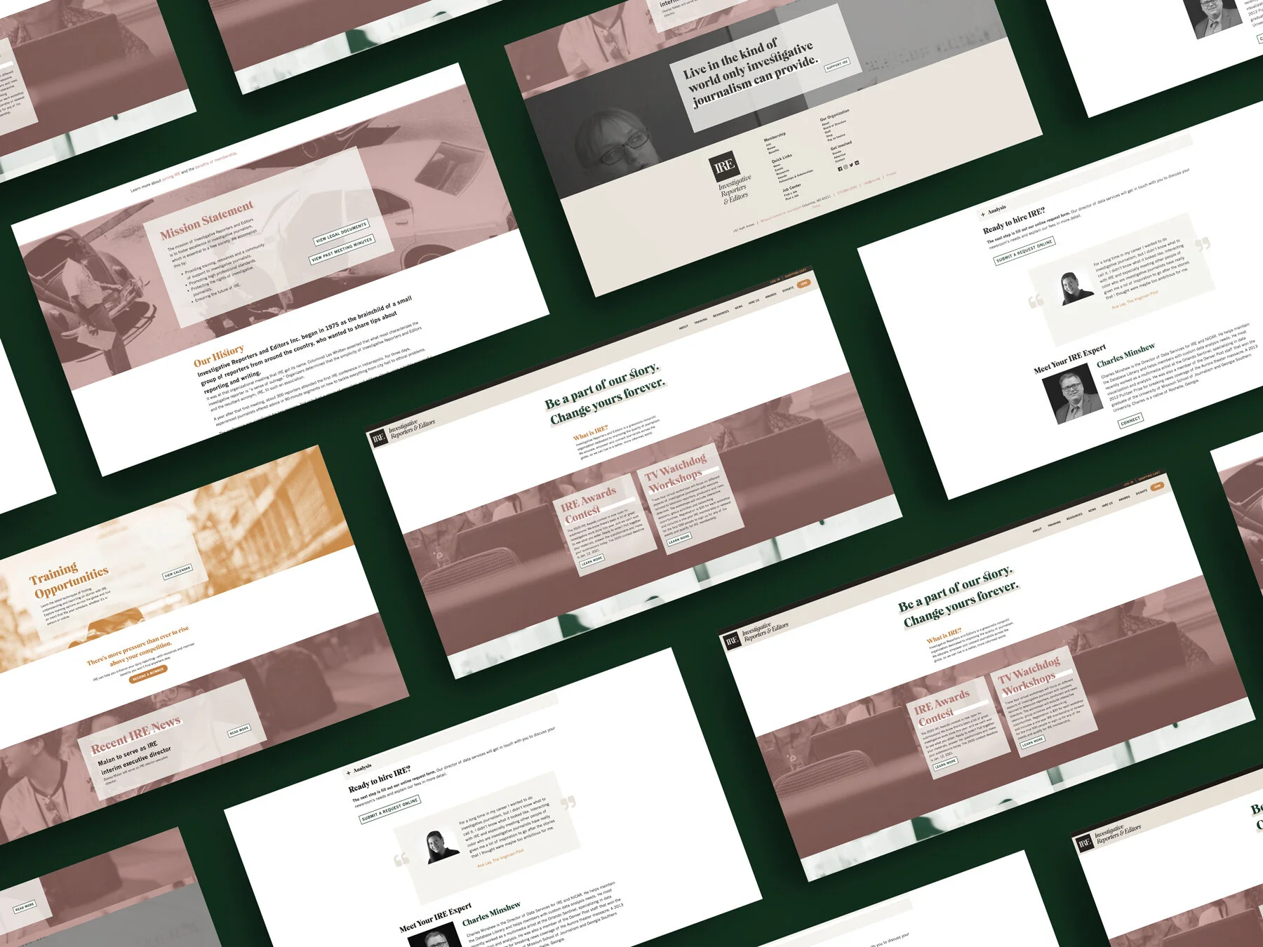
Website Design + Build
Tell the same story.
IRE has grown a great deal in 45 years, but its messaging hadn’t evolved with the organization. Without one clear voice, IRE team members were left infusing their own when speaking on behalf of the organization. This disjointed approach caused confusion internally and externally.
To finally define IRE’s voice, we created a messaging architecture for the brand. The in-depth document includes consistent, concise messaging and provides guidance for how to speak — and who to speak to. Now, IRE is telling the same story across all platforms. And the creative one liners ensure it’s a story you’ll want to dive into.

Staying up to date.
Unlike IRE’s original brand, the new, modern visuals were made for digital.
The digital age.
IRE hosts a robust library of resources on its website, which is the cornerstone of the support it provides to journalists. But the comprehensive digital collection was on an old server, clunky, and difficult to use. So instead of simply updating the original IRE website to match the new brand, we overhauled the entire thing.
The months-long project resulted in a website that is both beautiful and functional. Now, everyone who visits the site can experience the refreshed visual brand and messaging, and journalists can easily navigate the password-protected resource library. Investigative reporters will always have a difficult job, but the new IRE interface makes it easy for them to get the support they need.
“Our new friends at Hoot have been dream partners for Investigative Reporters and Editors. They helped us rebrand our 45-year-old nonprofit association with fresh design elements and visuals, along with smart marketing strategies to grow and sustain our organization. IRE was so pleased with the branding and marketing work that we hired Hoot. for a complete overhaul of our website. I highly recommend Hoot Design Company.”
We help brands tell their stories. Let us help you tell yours.
View more case studies:


