MOCO
Boundary-Pushing Branding in a Budding Industry
MOCO is at the forefront of the marijuana industry. The LLC is a collaboration of investors from Missouri and Colorado who are passionate about health, wellness, and, well, cannabis. MOCO wanted to establish itself as a leader in the medical marijuana market, and the new organization needed beautiful branding to make that happen.
MOCO sent out a request for proposal in search of a dynamic name and a fresh brand. We presented three fully baked concepts that could each grow from a medical marijuana brand to a line of recreational products and dispensaries. Our custom creative blew the team away - and left the other agencies green with envy.
High standards
While MOCO is a great name for an LLC, the group needed something a little more refined for its consumer-facing brand. Our creative team namestormed three distinct brand names, which then inspired the respective visual brands. The final result? Three complete brands would translate well on everything from CBD gummies to dispensary locations.
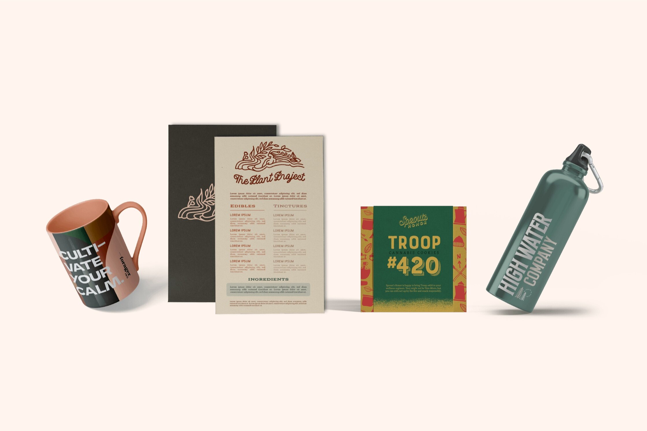
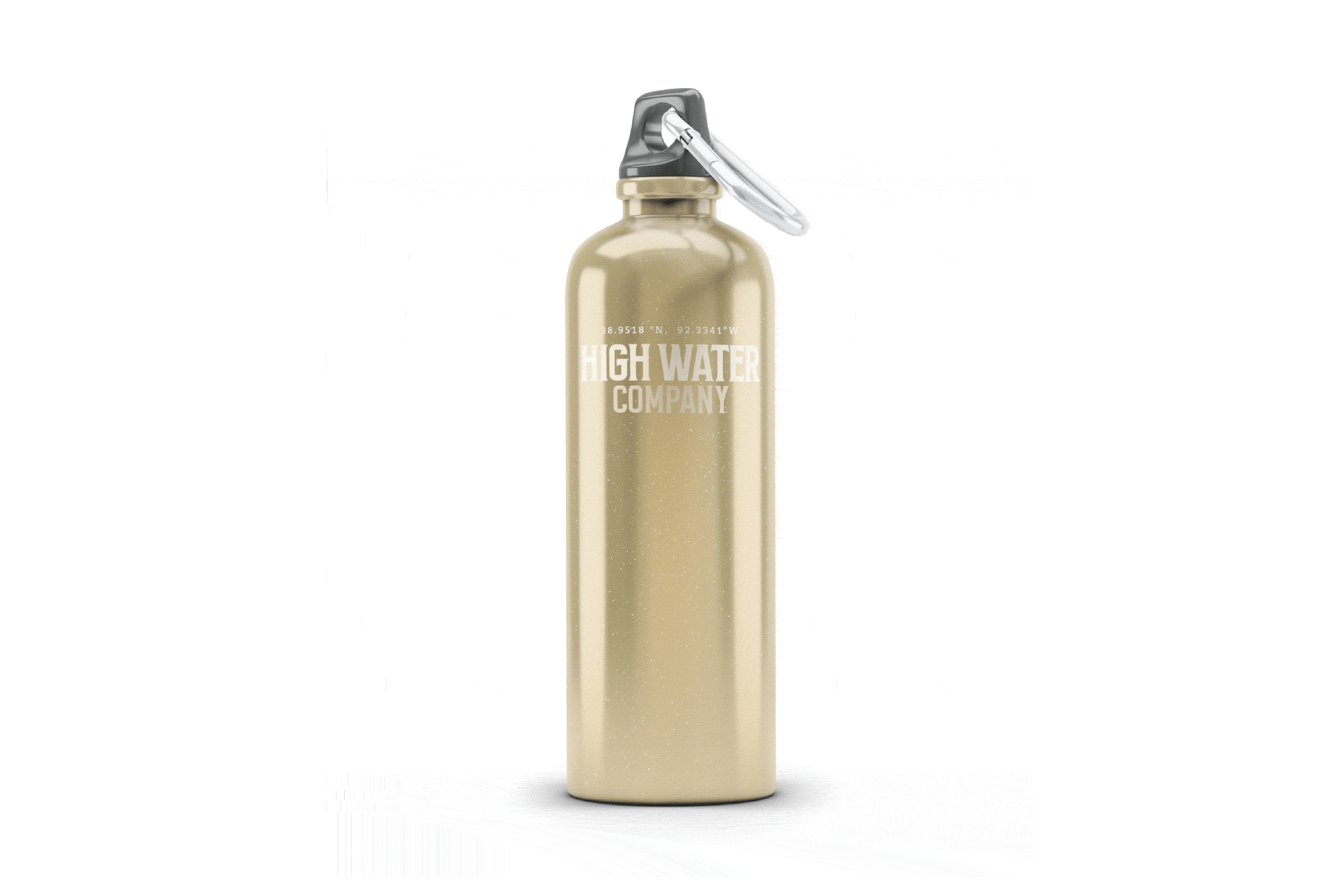
High Water Co.
High Water Co. was inspired by MOCO’s ties to Missouri. The name is pulled from Missouri’s long-standing relationship with floods, or high waters.
This brand is grounded in honesty and evokes feelings of calm and relaxation. That’s what led us to the tagline: a better headspace in the heart of Missouri.
Visual Brand Identity
Brand Messaging + Voice
Print & Packaging Design

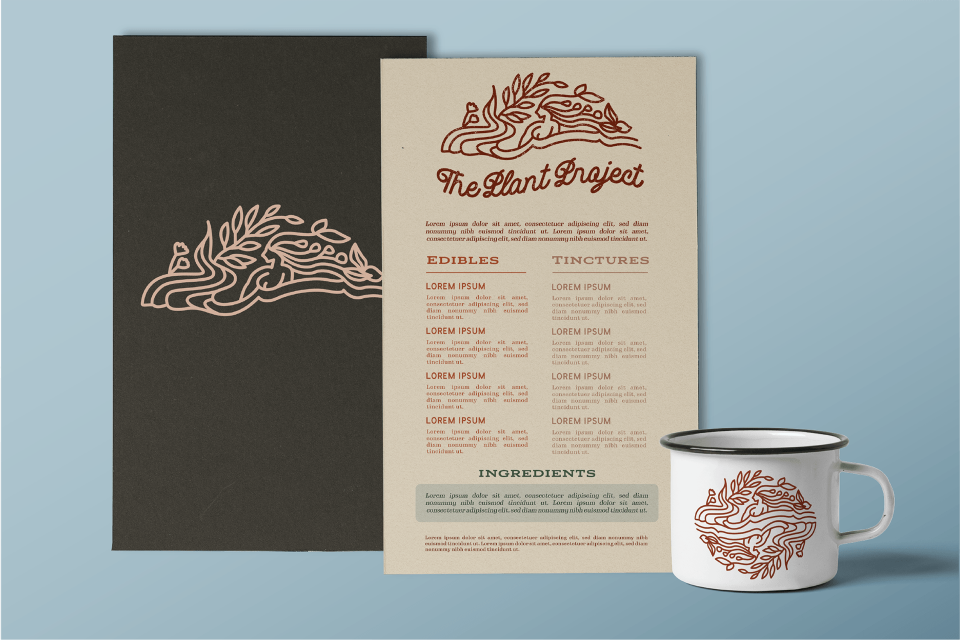
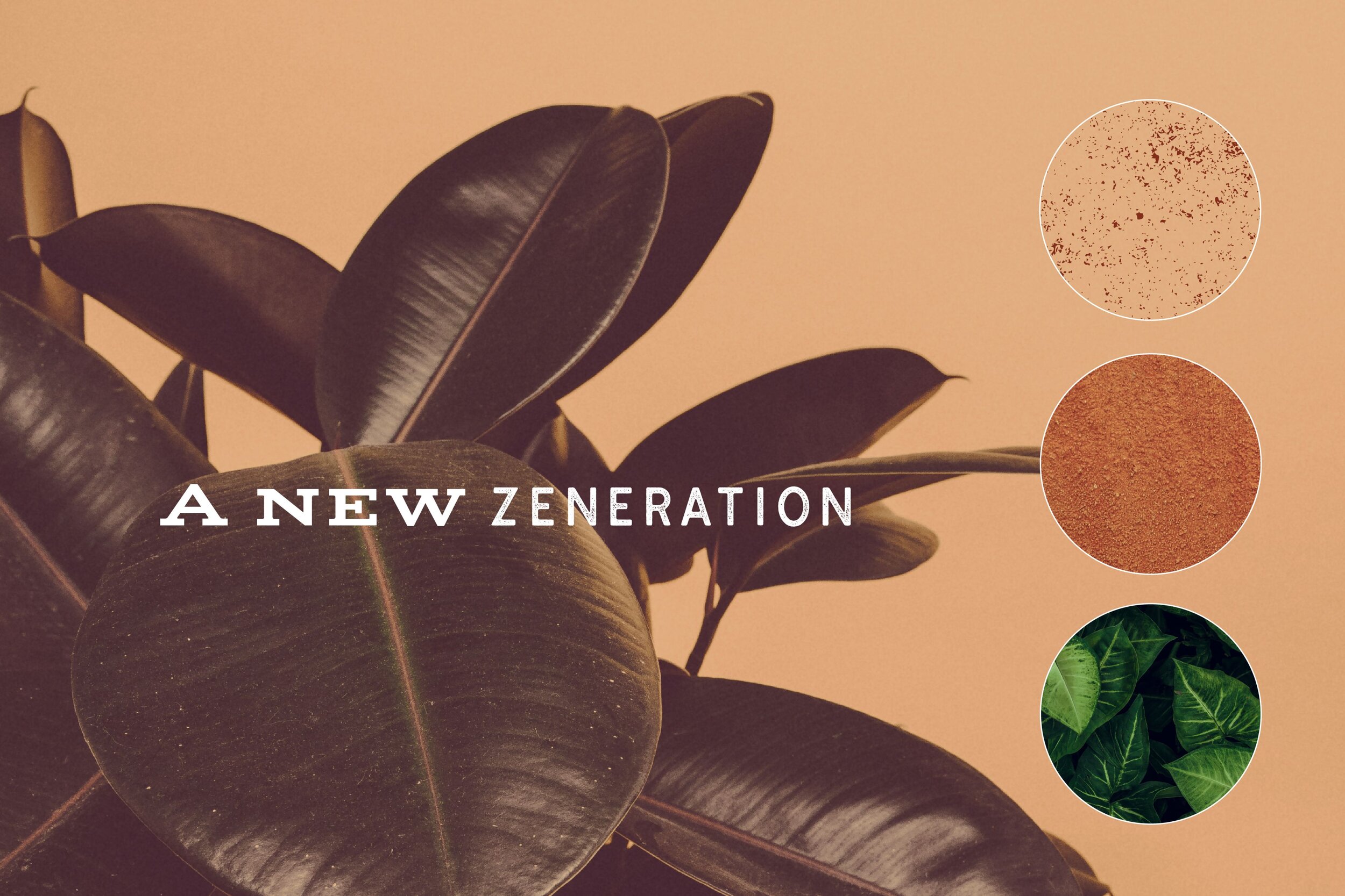
The Plant Project
The Plant Project brand is all about being bold and current. It was made to target people who love trends almost as much as they love cannabis. The brand has a coastal vibe that would perform well on Instagram, and the tagline, a new zeneration, was made to be a hashtag.

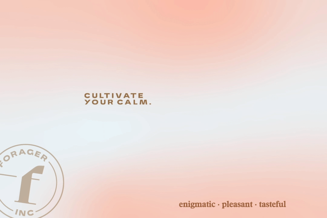
Forager Inc.
With Forager Inc., you no longer have to search far and wide for the best medical marijuana. This brand was made to feel pleasant and tasteful, ideals that its tagline, cultivate your calm, perfectly embodies.

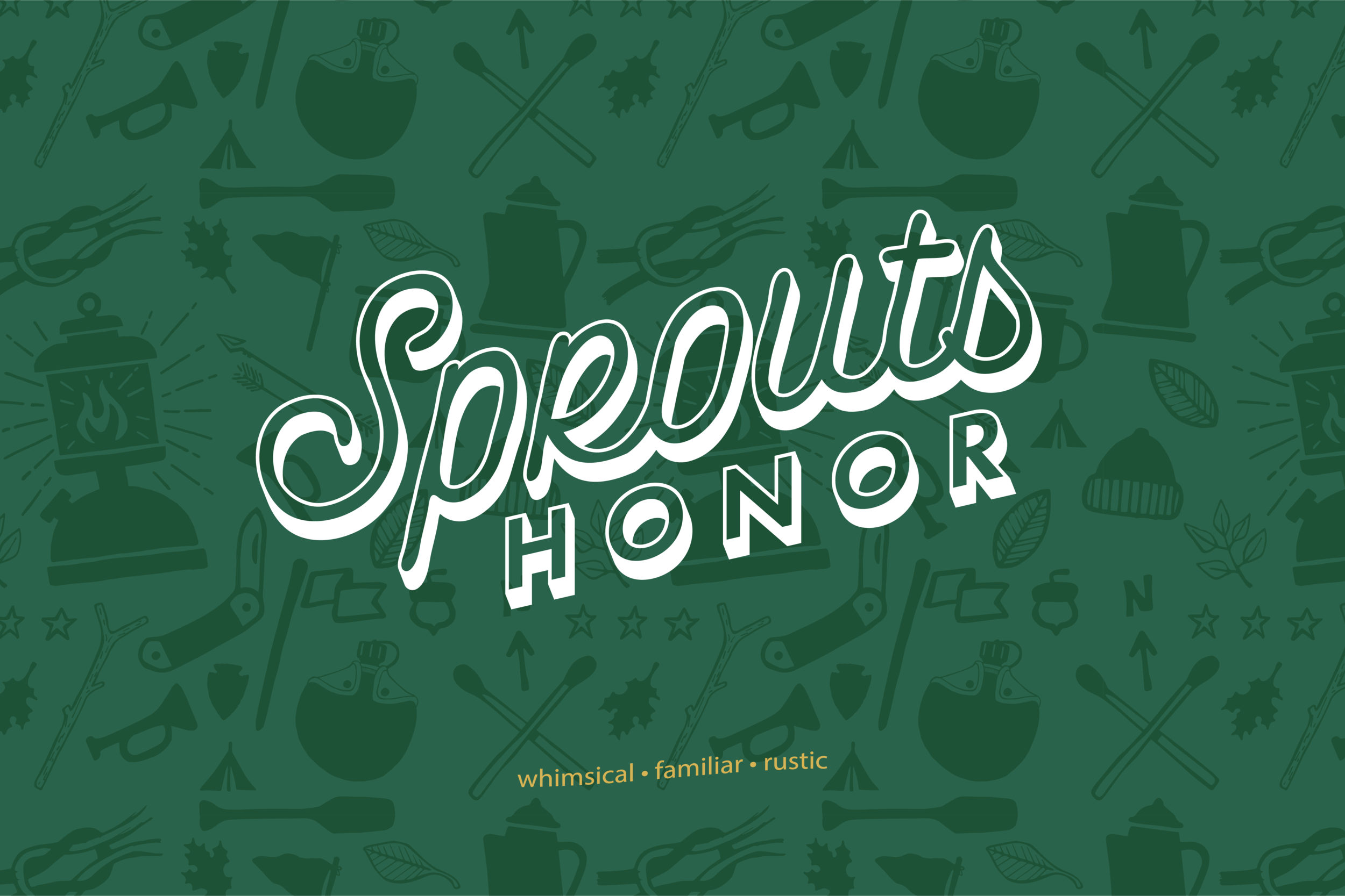
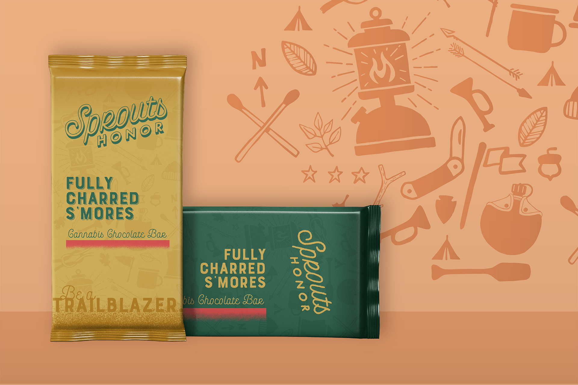
Bonus: Sprouts Honor
As a cheeky addition to our presentation, we also named and branded an original product line. The Sprouts Honor brand was made for CBD-infused brownies and chocolate bars. The name and tagline, be a trailblazer, have serious camp vibes, which inspired the packaging design.

We help bring business concepts to life through boundary-pushing branding. Get in touch to learn more
View more case studies: