Brightside
From Messaging Crisis to Market Clarity: How we transformed a fintech benefits provider into a culture-changing force for financial justice.

The Challenge
Brightside came to Hoot Design Company at a critical inflection point. Despite serving major enterprise clients like Amazon, they were struggling to communicate their value to the people who needed them most.
The Problems
Internal messaging chaos. Different stakeholders had different opinions on messaging. There was no unified "Brightside voice," and their content was loaded with unclear, adjective-heavy language that failed to connect emotionally.
Sales team frustration. The sales team was caught between two B2B audiences: they needed to move CHROs emotionally while satisfying C-suite demands for data and ROI. They lacked materials that could do both—and they needed them for a time-sensitive selling season.
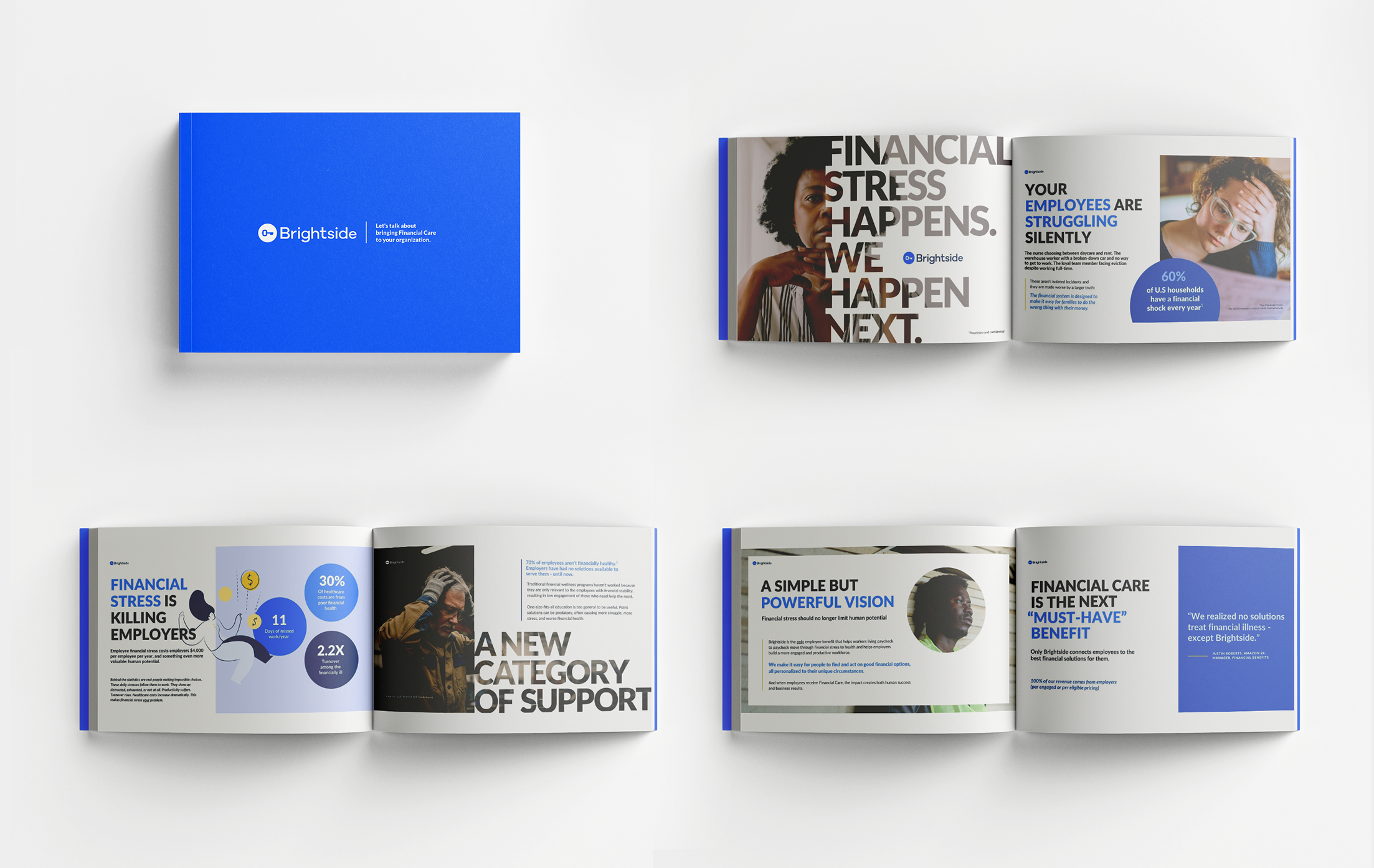
B2C communication breakdown. A late 2023 survey revealed their biggest challenge: eligible employees "had no idea what Brightside does." Even after signing up, many never engaged with a Financial Assistant. This was the core of Brightside’s compensation model, creating a direct revenue problem.

The Deeper Truth
Brightside was sitting on something revolutionary: the only financial care solution that meets people in crisis and walks them to long-term stability. But they'd lost their voice.
They had scaled back powerful messaging, and in an effort to please everyone, they'd weakened their entire value proposition.
Behind the messaging problems was an identity crisis: Were they a financial wellness app or something fundamentally different?
Through Hoot's Brand Being Method™, we backed our way into discovering Brightside's deeper why: They were doing more than solving financial problems, they were shifting the landscape of financial health and support.

Our Approach
What We Discovered
The emotional connection was missing. While competitors offered generic education or predatory single-point solutions, Brightside was providing genuine human support paired with actionable financial solutions that made a life-changing difference in their clients' lives.
The breakthrough insight. Financial inequality isn't about personal failure, it's about unequal access. This reframing became central to everything: from charity to justice, from individual weakness to systemic barriers.
The Strategic Framework
Vision: We envision a future where financial distress no longer limits human potential.
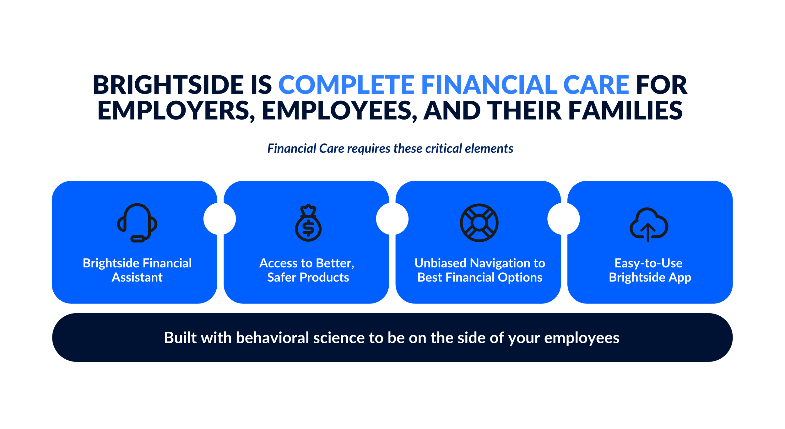
Purpose: We transform lives. Brightside provides the only transformative financial solution that addresses both distress and long-term health.
Point of Difference: Brightside stands in the gap for those left behind. We go beyond crises and education to offer real solutions and high-touch support that move people from surviving to thriving.
Brand Tension Point:

Raw speaks to unfiltered, authentic reality: honest acknowledgment of financial hardship without sugar-coating, willingness to deal with messy realities, direct confrontation of difficult situations.
Optimism represents forward-looking possibility: belief that financial hardship is temporary, confidence that every situation can improve with right support, focus on building long-term resilience.
Together, these create compelling tension because optimism is typically portrayed as polished or idealistic. By pairing it with rawness, Brightside presents a different kind of optimism—one grounded in reality, that has seen the worst but still believes in better futures.
The Work
Brand Foundation & Positioning
We created the strategic backbone that would guide all future communications:
Brand Advocates - Detailed personas for both B2B (Lisa Martinez, the empathetic CHRO fighting for frontline workers) and B2C (the financially vulnerable working class, living paycheck to paycheck) to guide every messaging decision.
Verbal Identity - A complete voice and tone framework anchored in "Raw Optimism" that balanced honest acknowledgment of struggle with genuine hope for transformation.
Messaging Architecture - Clear hierarchy of messages from vision to tactical value propositions, ensuring consistency across all stakeholder communications.
B2B Sales Enablement
We developed a complete sales ecosystem that balanced emotional storytelling with business results:
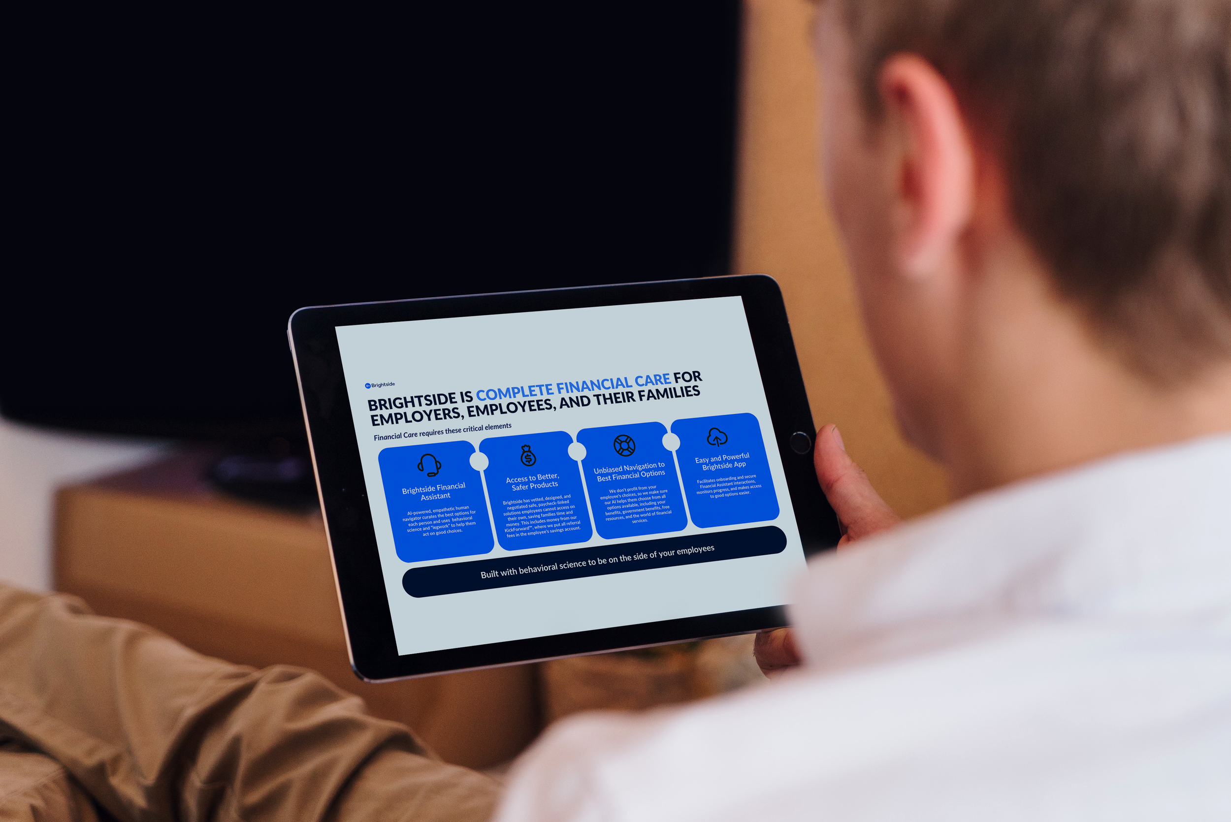
Leave-Behind Deck - A detailed resource that CHROs could read independently and share internally. This became the flagship piece and what the sales team calls "the opposite of a pitch deck." Bold headlines with substantial messaging overlaid on authentic photography of real people, powerful employee testimonials showing real human impact, and clear business outcomes and ROI data.
Pitch Deck - A visually-driven companion designed for live presentations with minimal text and maximum impact.
Executive Summary - A two-page synthesis for busy C-level executives and investors.
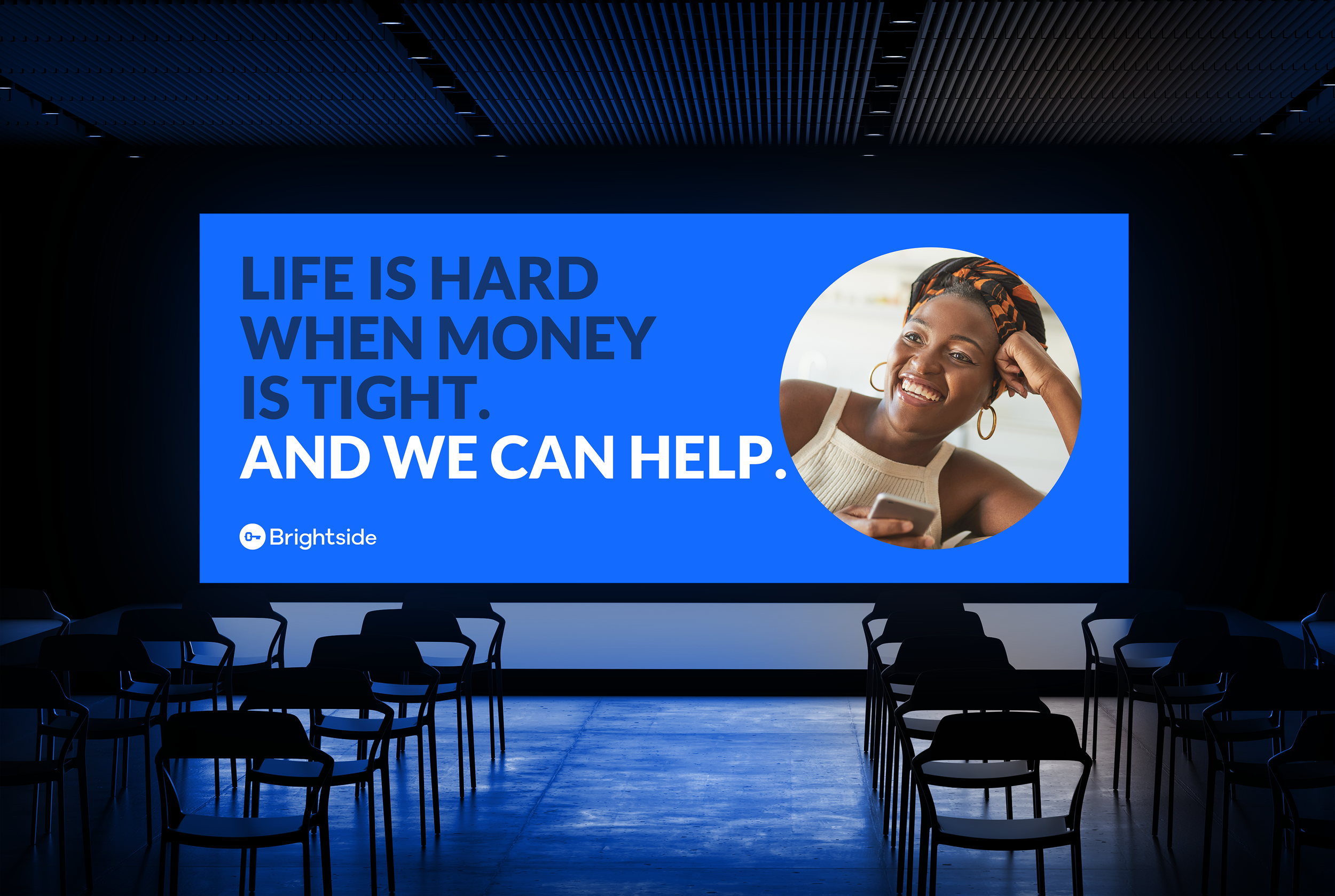
Visual Identity Direction - Bold typography using Lato family, emotionally grounded photography of real people in genuine moments, signature visual approach of large text overlaid on photography, strategic use of blue as accent with white and neutrals as foundation.
B2C Consumer Marketing
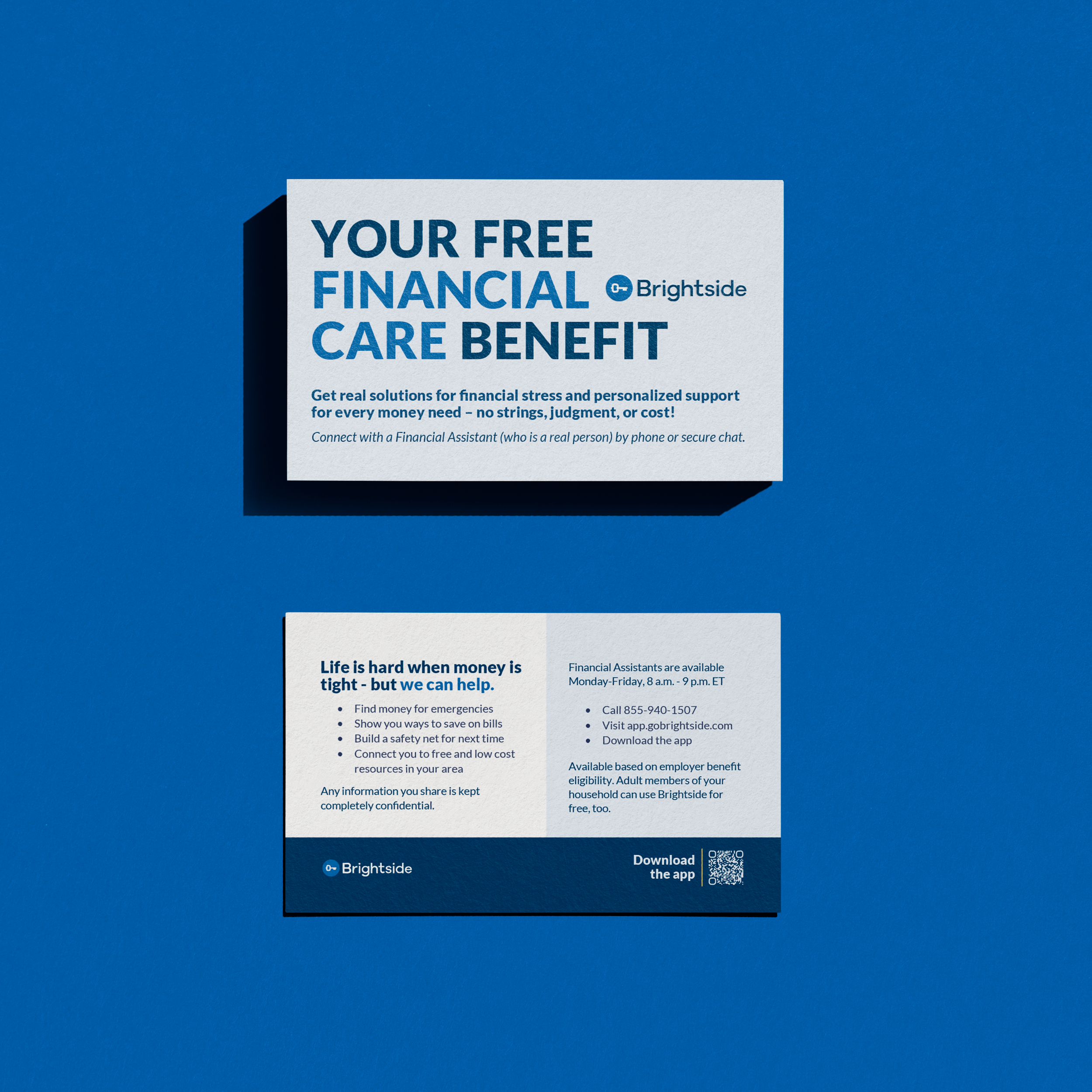
Messaging Approach: Social justice framing that shifts narrative from individual failure to systemic barriers. Comeback story language like "Life is hard when money is tight - but we can help." Reclaiming language that implies something was taken, not lost through personal failure.
We translated the brand strategy into employee-facing materials that acknowledge financial struggles while pointing toward solutions:
Consumer Audit - Comprehensive evaluation of existing materials to assess alignment with updated brand messaging and effectiveness for frontline workers earning less than $50,000 annually.
Updated Creative Suite:
Flyers with bold messaging and accessible design
Posters for workplace environments
Direct mail announcing benefit availability
Business cards for Financial Assistants
Digital screens for break rooms and common areas
Website Strategy & Vision: We delivered a comprehensive website audit showing how to elevate Brightside's digital presence to reflect their evolved brand identity:
Site-Specific Guidance:
Homepage modernization with stronger visual hierarchy
B2B page restructuring with card-based layouts
B2C page redesign centering employee stories and accessible language

Sales Transformation
Emotionally resonant differentiation. Transformed Brightside's messaging into emotionally resonant storytelling—pushing past safe, corporate language to create bold yet compassionate content that dissolves stigma, validates struggle, and inspires employers and employees alike to take action.
Unified messaging. Created alignment across all stakeholders from leadership to frontline sales, bridging internal disagreements about brand voice and positioning.
Compelling materials. Equipped sales team with materials that tell both emotional stories and deliver ROI evidence—directly addressing their frustration with weak, adjective-heavy content that failed to connect.
Strategic positioning. Elevated Brightside from commodity benefit provider to social justice champion with measurable business impact, giving CHROs a compelling narrative to take to leadership.
The Impact
Brand Clarity & Foundation
Messaging framework. Established "Raw Optimism" as the brand tension point that guides all communications—from sales presentations to employee outreach to website copy.
Visual identity system. Created cohesive design language across all touchpoints—from B2B sales materials to consumer-facing print and digital to website vision.
Brand advocates. Developed detailed personas for both B2B and B2C audiences to guide messaging decisions and ensure relevance.
Content foundation. Solved the "no unified Brightside voice" problem with clear voice guidelines, messaging hierarchy, and strategic frameworks.
Consumer Engagement Foundation
Messaging alignment. Ensured all consumer-facing materials reflected the shift from "you're bad with money" to "the system held you back"—reducing shame and increasing engagement potential.
Complete creative suite. Delivered print and digital assets ready for immediate deployment, ensuring consistent brand experience across every employee touchpoint.
Digital Roadmap
Modern standards. Provided comprehensive website recommendations grounded in current design best practices and user experience principles.
Scalable vision. Created design system thinking that allows for future growth while maintaining brand consistency and quality.
Ready to Transform Your Brand Identity
At Hoot Design Company, we're igniting cultural change—inside workplace cultures and in our society at large. We believe authentic positioning drives authentic results.
When you help an organization see themselves clearly first, they can express that truth in ways that transform markets.