
Missouri River Relief: MR 340 The World’s Longest Non-Stop River Race
Client Challenge
The MR 340—the world's longest nonstop river race—faced a unique branding challenge when it transitioned from being an independent race organization to becoming part of the Missouri River Relief family. This wasn't just any acquisition; it was the integration of a beloved 20-year-old racing tradition with a passionate, tattooed-loyal community into the broader mission of Missouri River Relief.
The race had developed its own distinct identity and fierce community loyalty since its founding in 2006. With participants who literally have tattoos commemorating their participation, the MR 340 represented more than just a race—it was a badge of honor, a rite of passage, and a defining experience for hundreds of dedicated paddlers worldwide.
The challenge was clear: how do you honor and preserve the sacred history and community of the MR 340 while seamlessly integrating it under the Missouri River Relief brand umbrella? How do you respect the race's independent legacy while aligning it with a broader organizational mission?

Our Approach
Hoot approached this sensitive brand integration through:
Deep cultural immersion to understand the race's passionate community
Respectful preservation of the race's iconic elements and heritage
Strategic brand architecture that honored both identities
Community-centered design that spoke to the dedicated racing culture
Careful balance between reverence for tradition and organizational alignment

The Solution
Brand Heart Strategy
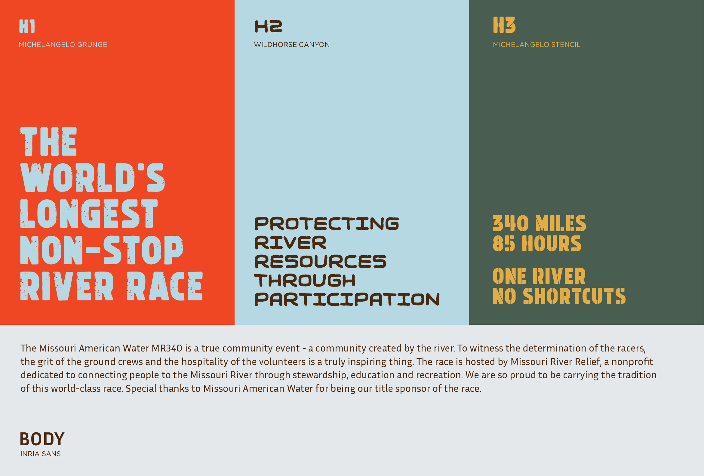
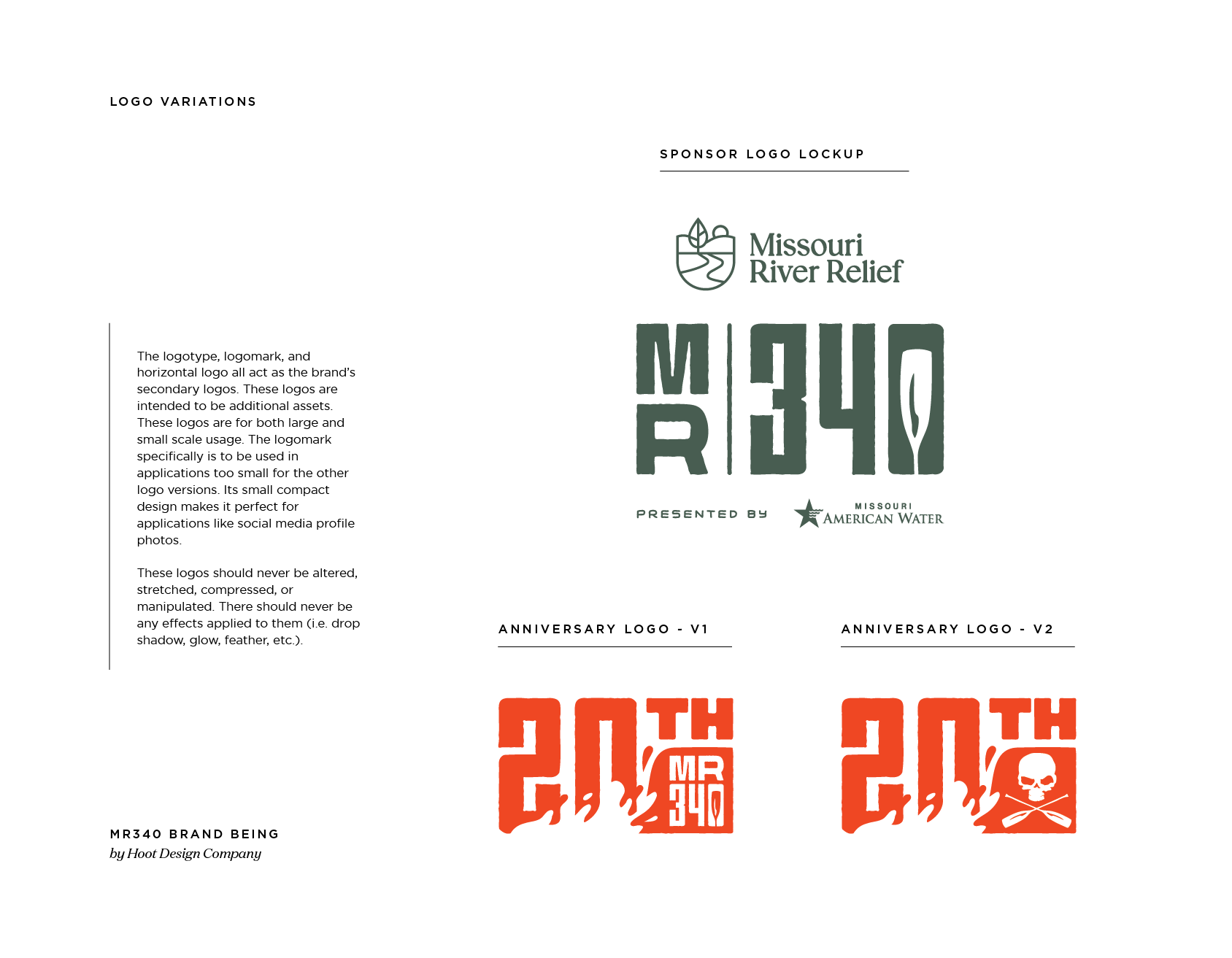
Rather than absorbing the MR 340 into Missouri River Relief's existing identity, we developed a brand architecture that honored the race's independence while clearly communicating its new organizational home. The race maintains its distinctive MR 340 identity while being proudly "hosted by Missouri River Relief."
This approach recognized that the MR 340 is "a true community event - a community created by the river" and that this community needed to see their beloved race preserved, not diminished.
Strategic Positioning
We positioned the MR 340 as Missouri River Relief's flagship event—a crown jewel that demonstrates the organization's commitment to connecting people with the river through recreation. The race becomes a powerful example of how Missouri River Relief facilitates meaningful river experiences, from their community cleanup programs to this world-class endurance event.
The messaging emphasizes that Missouri River Relief is "so proud to be carrying the tradition of this world-class race", positioning the organization as stewards of the race's legacy rather than its owners.
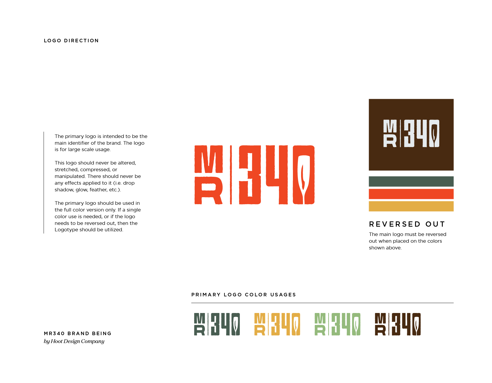
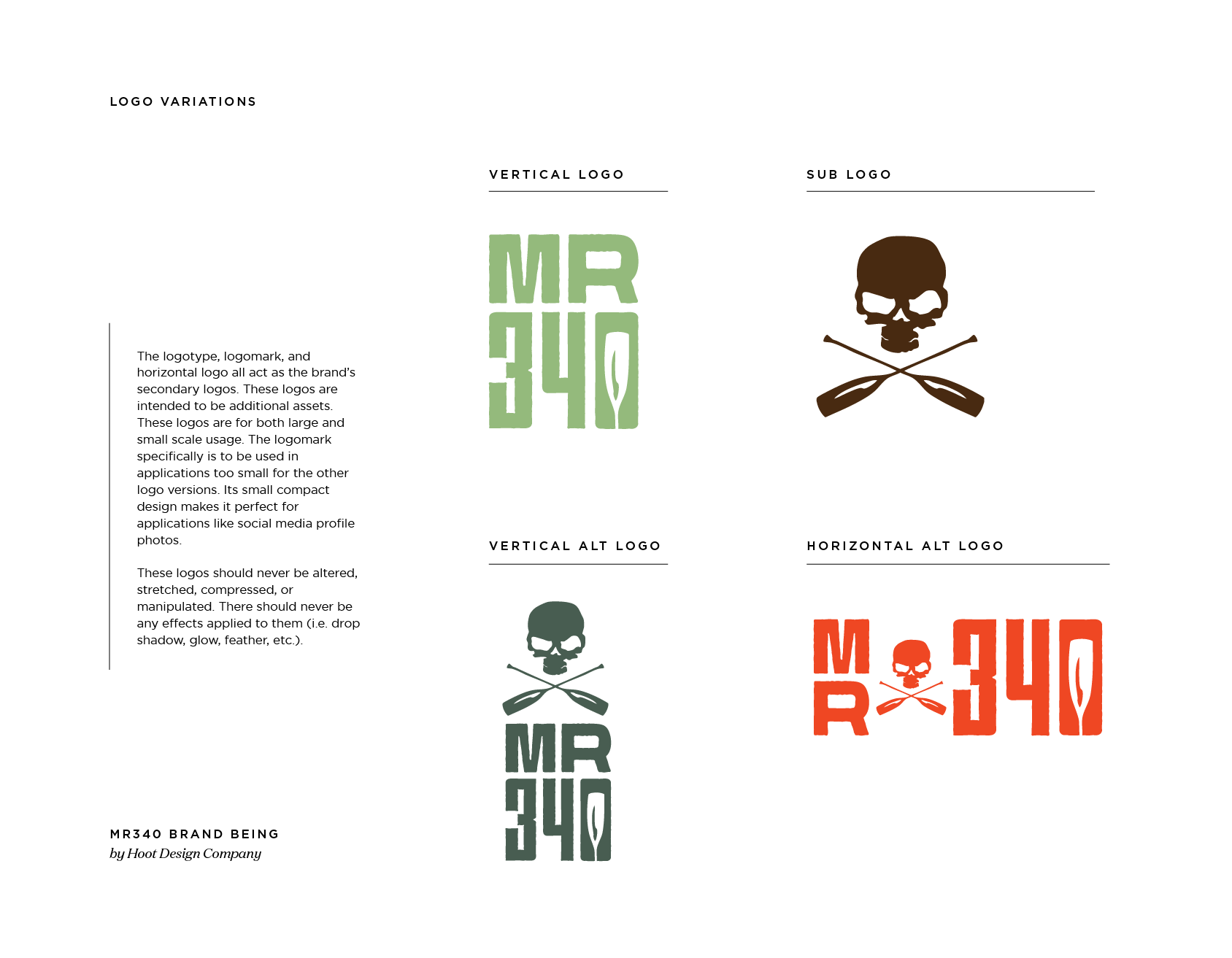
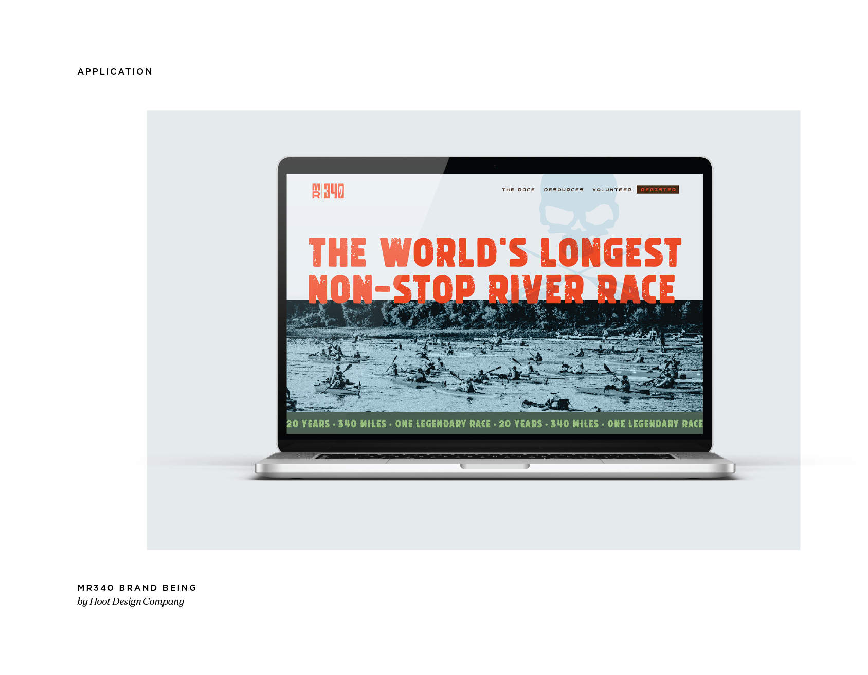
Visual Identity Integration
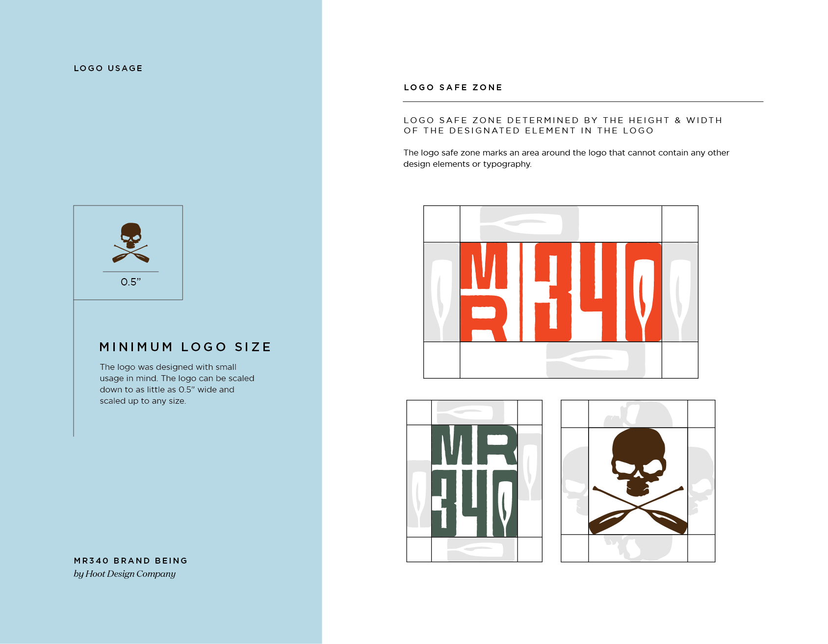
The refreshed MR 340 identity includes:
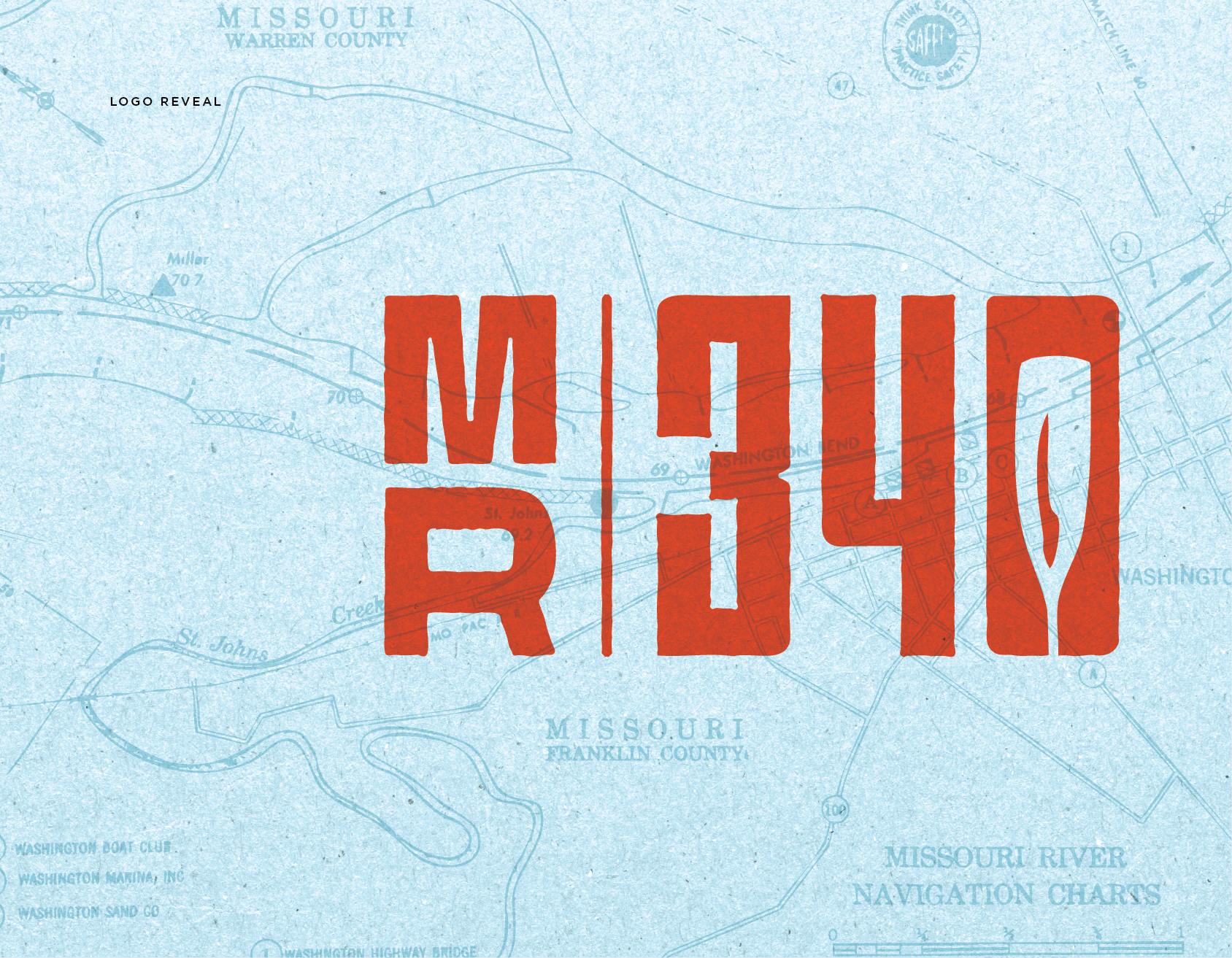
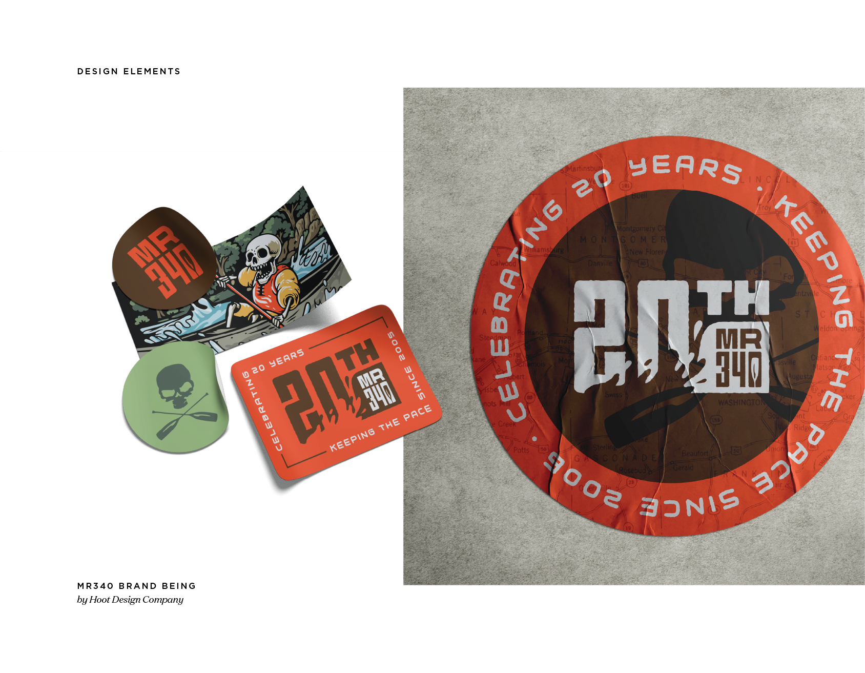
Preserved race heritage: Maintained the iconic MR 340 name and racing legacy
Respectful organizational connection: Clear but secondary Missouri River Relief attribution
Community-centered messaging: Language that honors the race's unique culture
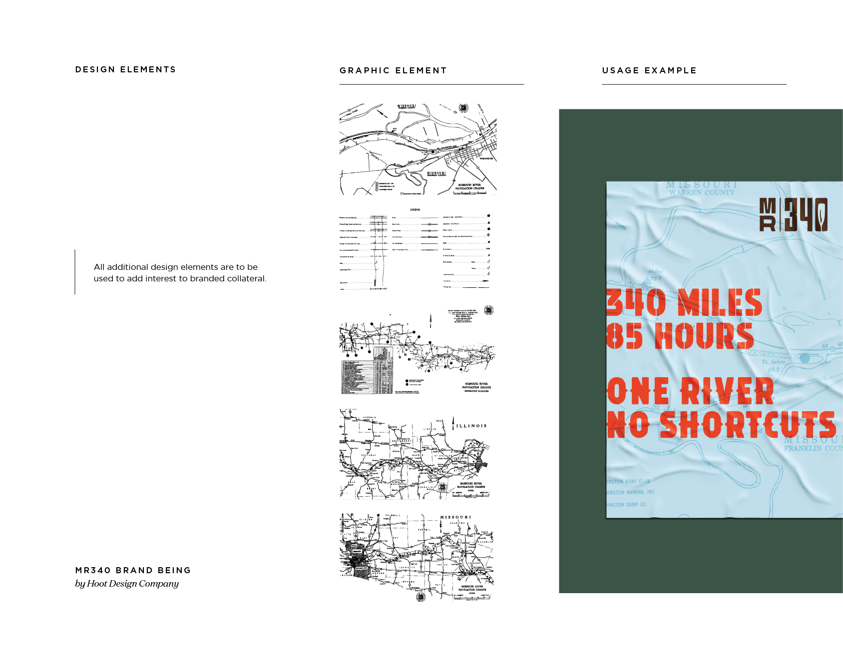
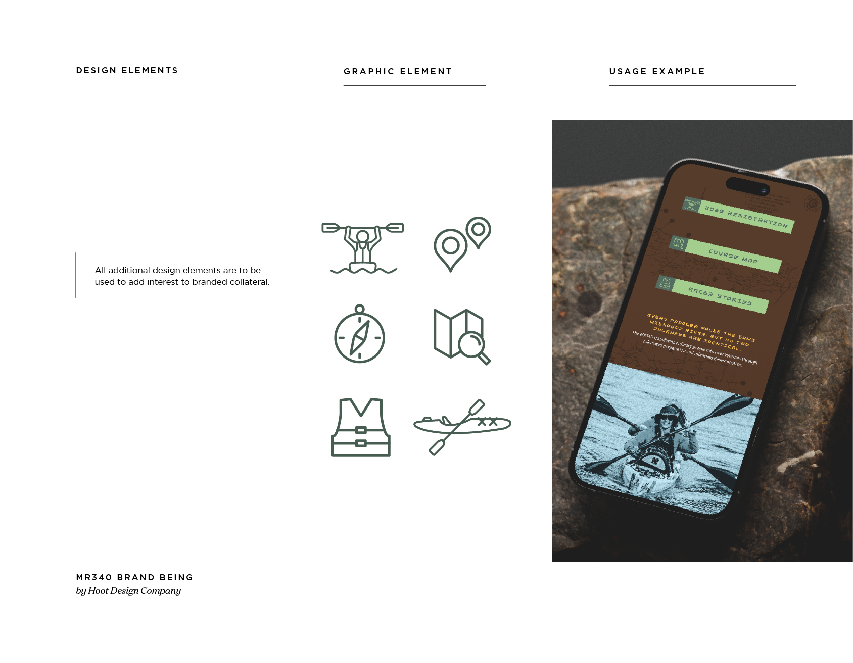
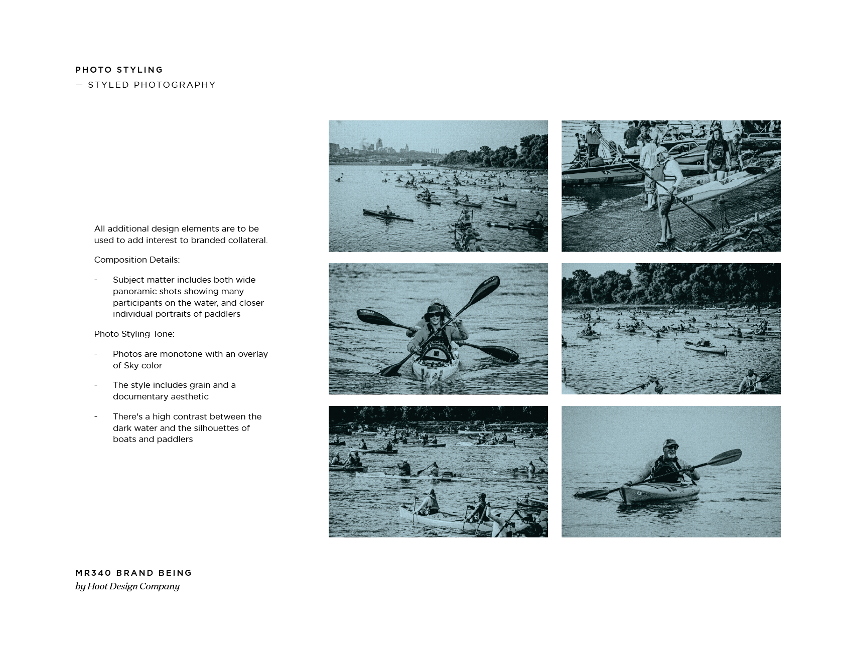
Authentic racing aesthetic: Visuals that speak to the endurance and grit of the competition
Flexible brand system: Materials that work for both race-specific and organizational needs


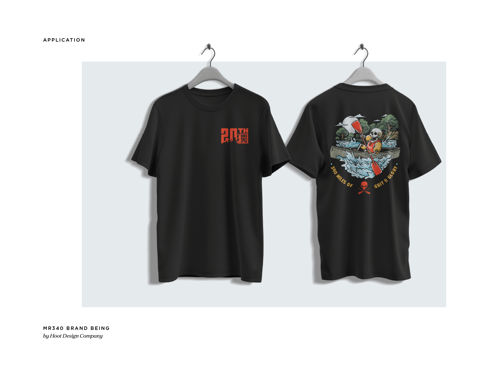

Merchandise Success
300% increase in merchandise sales: The refreshed brand identity drove merch sales to 3X their typical numbers
Enhanced brand equity: The integrated identity created stronger emotional connection with both race participants and Missouri River Relief supporters
Expanded product line: New merchandise opportunities emerged from the brand integration
Organizational Impact
Aligned mission: The race now clearly supports Missouri River Relief's broader mission of connecting people to the Missouri River
Fundraising opportunity: The race became a significant fundraising vehicle for the organization
Community growth: The integration brought Missouri River Relief into contact with a passionate new community of river enthusiasts
Results
The brand integration has been remarkably successful:
Community Acceptance
Preserved loyalty: The racing community embraced the transition, understanding that Missouri River Relief would protect and nurture their beloved race
Enhanced credibility: The race gained the stability and organizational support of an established nonprofit
Expanded reach: Missouri River Relief's broader network brought new awareness to the race


The Hoot Difference
This project exemplifies exactly the type of challenge where Hoot excels: navigating the delicate balance between honoring established tradition and embracing necessary change. We understood that the MR 340 wasn't just a race—it was a cultural institution with deep emotional significance for its community.
Rather than forcing a complete rebrand, we crafted a solution that respected the race's heritage while positioning it for a stronger future. We recognized that some participants have literally tattooed the race logo on their bodies, and we honored that level of commitment by preserving what made the race special while enhancing its long-term sustainability.
The 300% increase in merchandise sales proves that when you honor a community's values while strategically evolving their brand, you create not just acceptance but enthusiasm.
Ready to Transform Your Brand?
Your brand should be as powerful and authentic as the work you do. At Hoot Design Company, we craft strategic brand identities that connect with audiences and inspire action.