
Hemlock Goods
An Adventurous Brand Product Launch

Problem
Hemlock’s bandanas were a hit, but business growth without direction is hard to sustain.
Solution
A clear brand strategy that led the company to the top of its industry.

Hemlock Goods was at a turning point. After a year in business, its bandanas were selling and its audience was growing. Good problems, right? But the brand lacked personality and direction, and its growth felt aimless and unsustainable. Hemlock had to make a choice: continue on its path (and hope for the best) or solidify its brand identity (and see how far the business could go). Luckily, the budding bandana brand chose the latter.
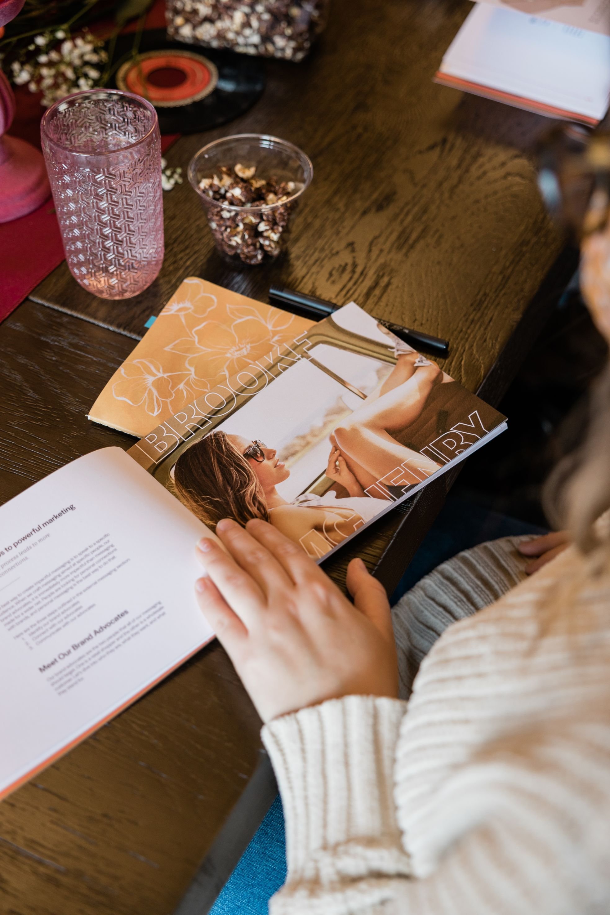
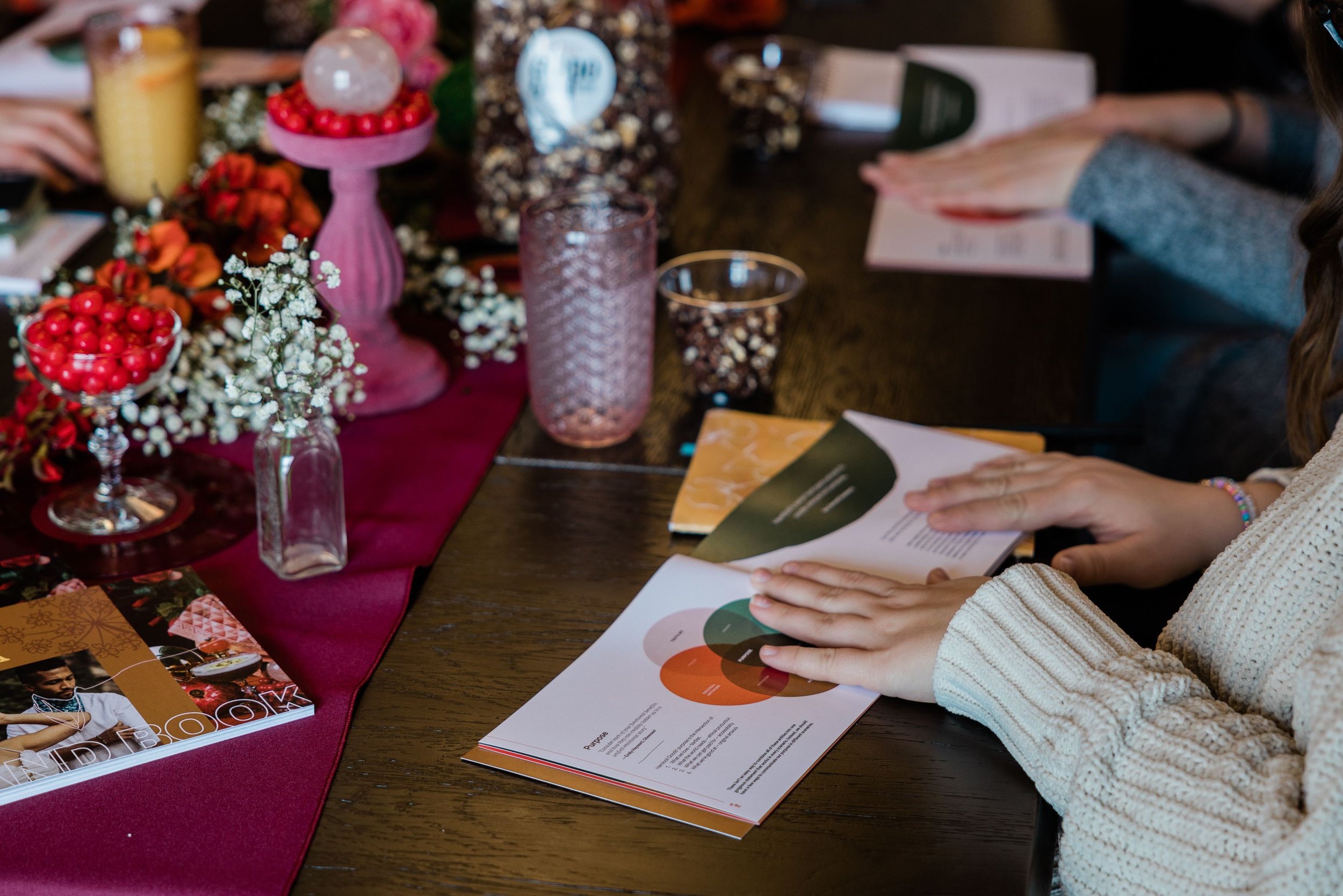
To find its footing before its sixth bandana launch, Hemlock partnered with us and engaged in our brand development process.
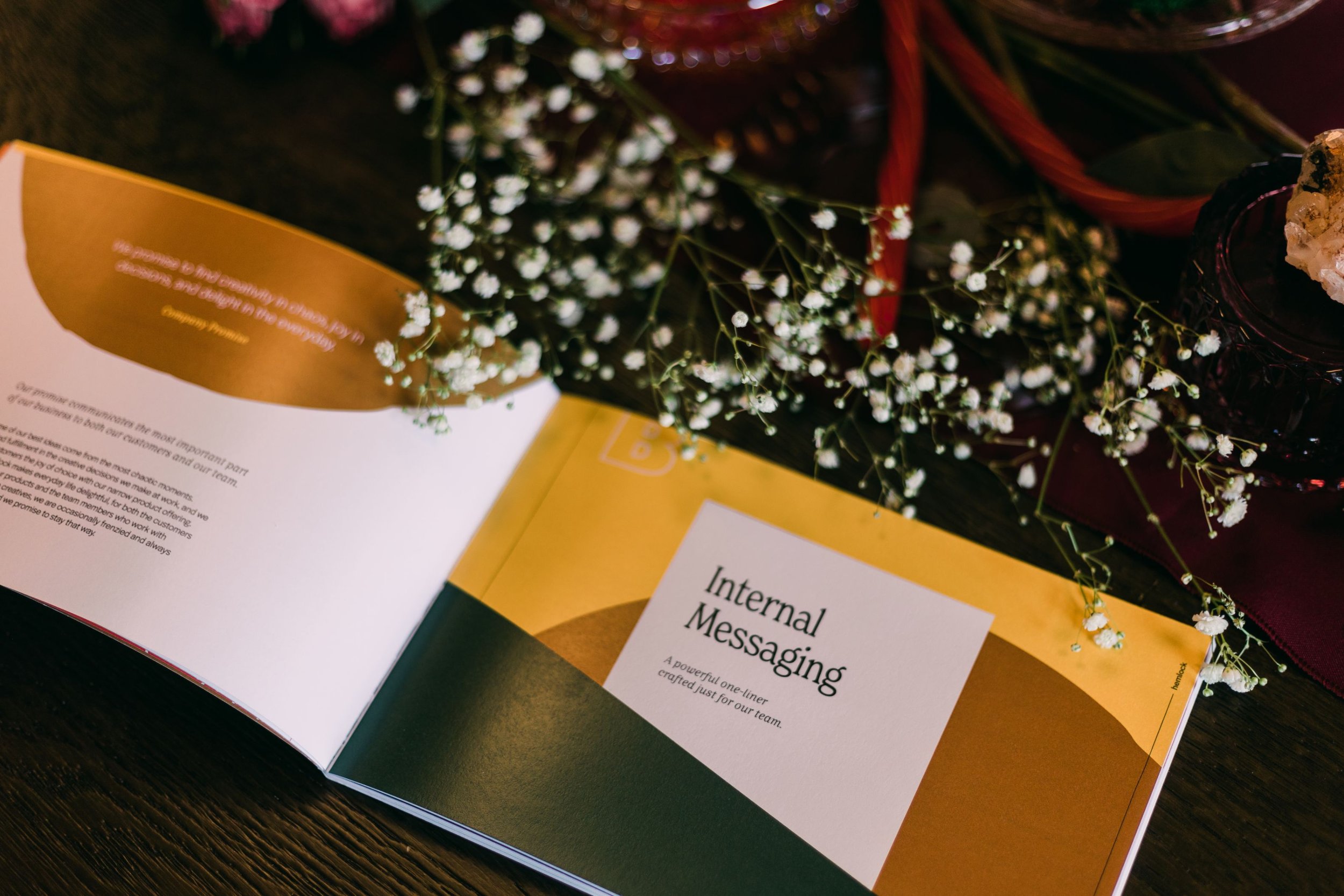
The comprehensive process gave Hemlock a distinct brand personality, but more importantly, it gave the in-house team the tools necessary to carry it out. And thanks to establishing cohesive external communication, visual direction, and internal messaging, the Hemlock team managed a successful launch on their own.
This new direction framed daily routines as memorable experiences and introduced Hemlock as the perfect partner for local hikes and low-key date nights.
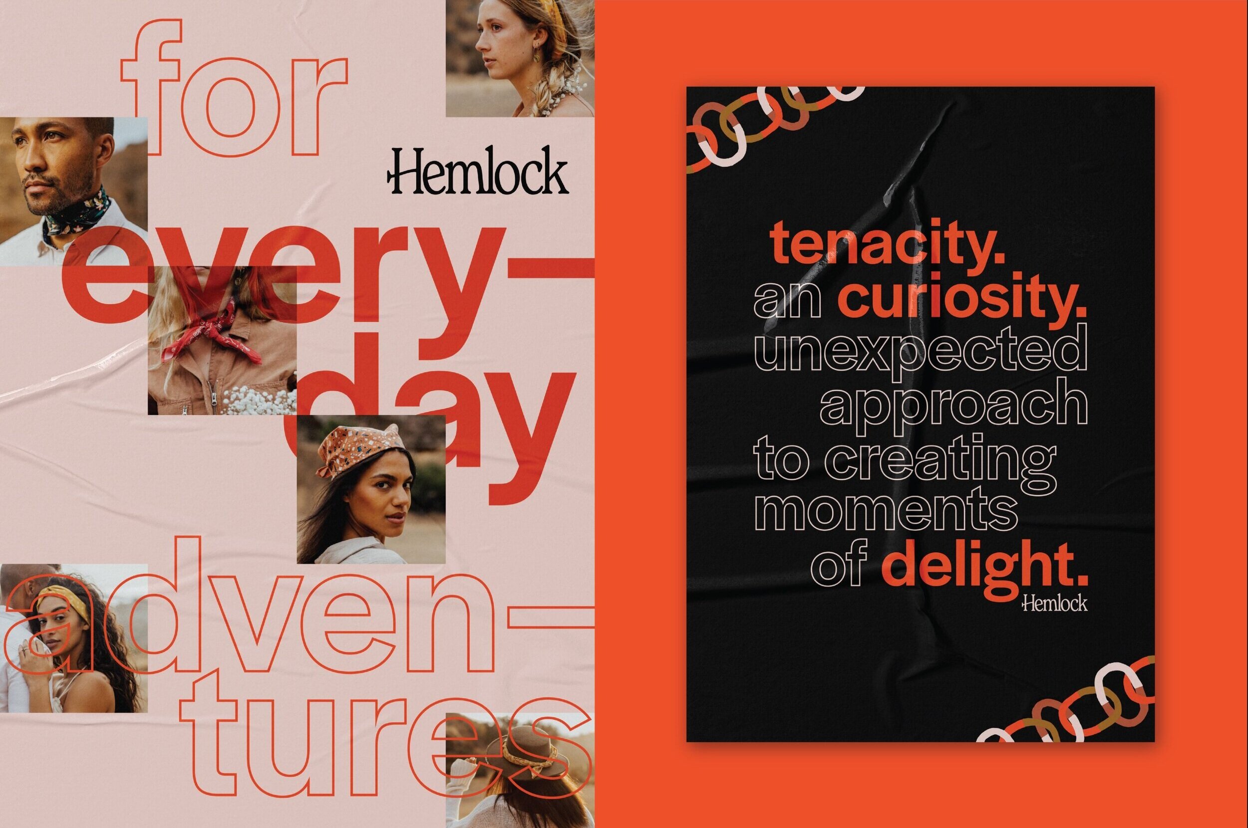
‘For everyday adventures’ influenced every facet of the Hemlock brand — and its series six launch.


Adventure Awaits
Hemlock is tender yet tenacious, its bandanas are both thoughtfully designed and utilitarian, and its artwork is original yet affordable. The juxtaposing ideals that run through Hemlock’s veins inspired its brand identity: for everyday adventures.
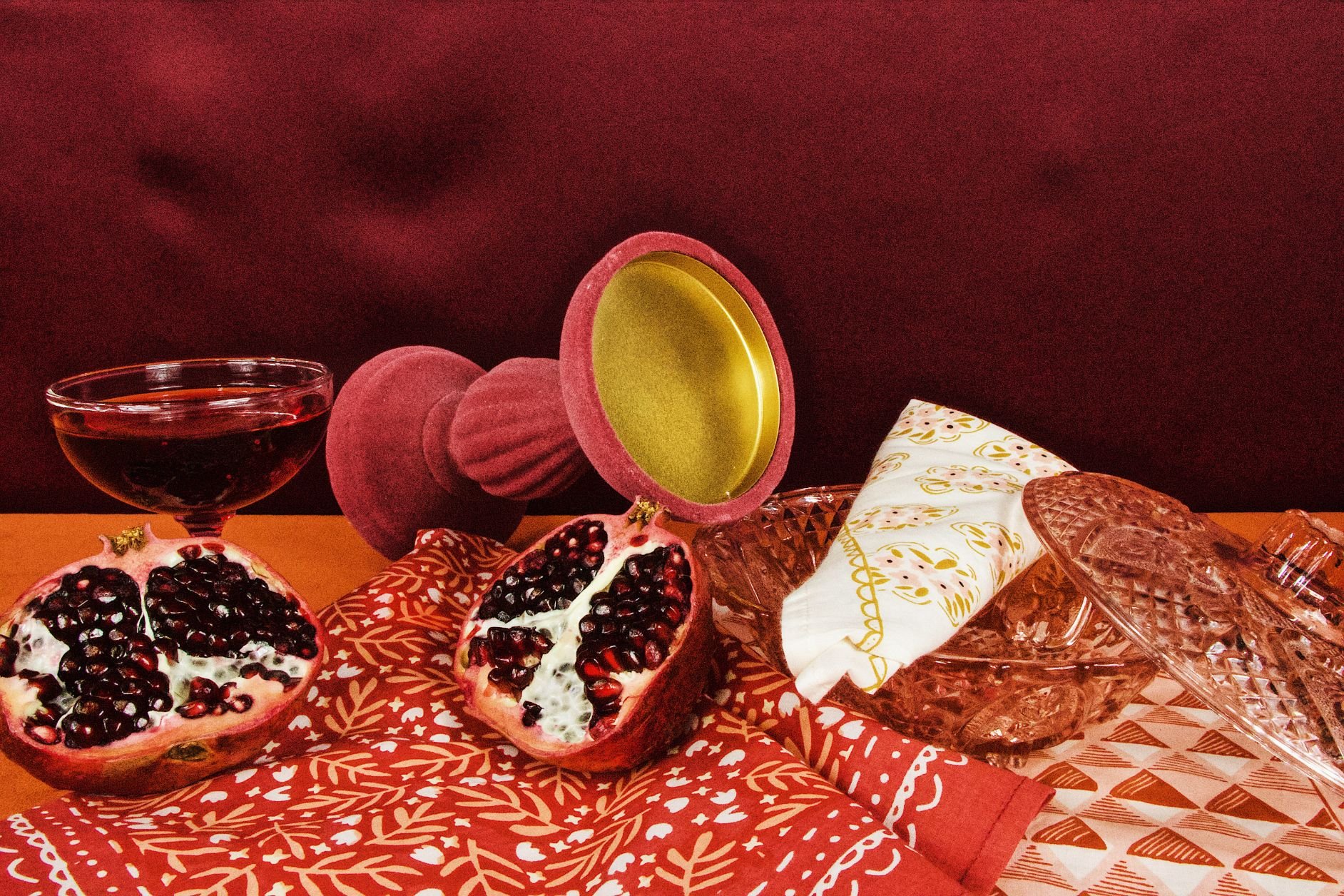
From Pretty to Poisonous
Before Hemlock met Hoot, its brand voice was delicate and sweet. But Hemlock needed to sound spunky and fearless to feel adventurous — connecting with its free-spirited target audience.
The copywriting standards took Hemlock’s tone from darling to disruptive, and it provided clear resources and guidelines to enable the team to write with the right vibe. The new brand voice inspired Hemlock’s spring line, Pretty Poison, and all the messaging that surrounded it.
Moments of delight
Looking and sounding disruptive isn’t enough — Hemlock had to dive deeper to really make waves. To help Hemlock with its long-term plans, we outlined marketing strategies big and small, from branded catalogs to a traveling bandana pop-up. Our recommendations ranged in cost and scale, but they were all designed to delight an audience that craves memorable moments.
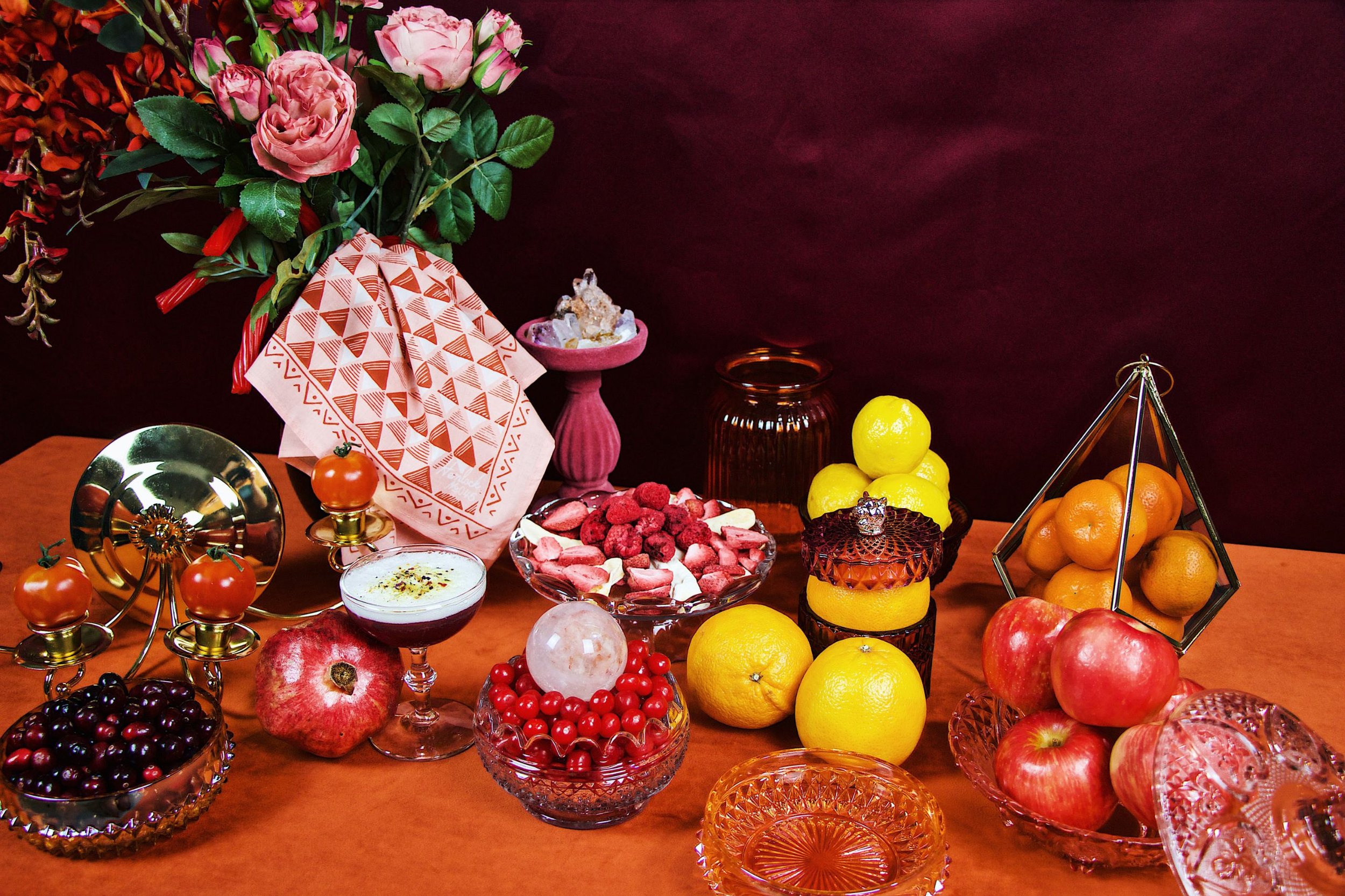
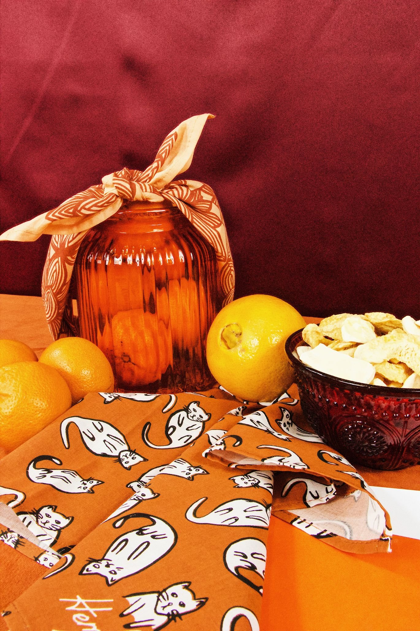
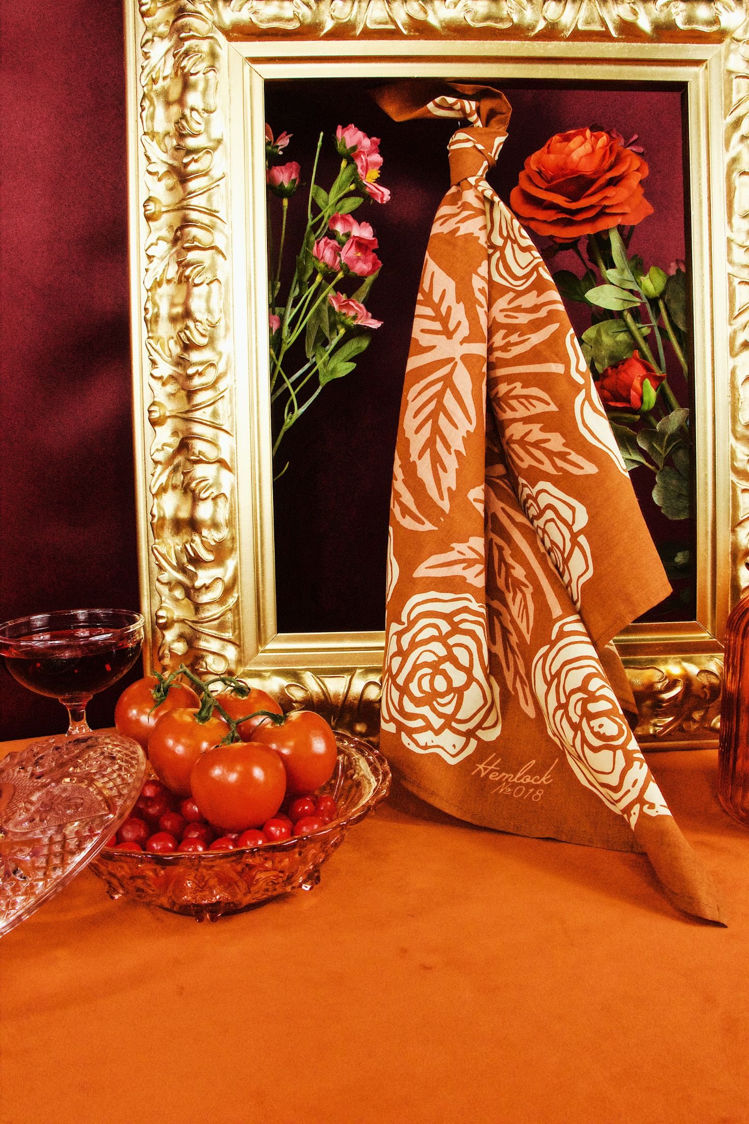
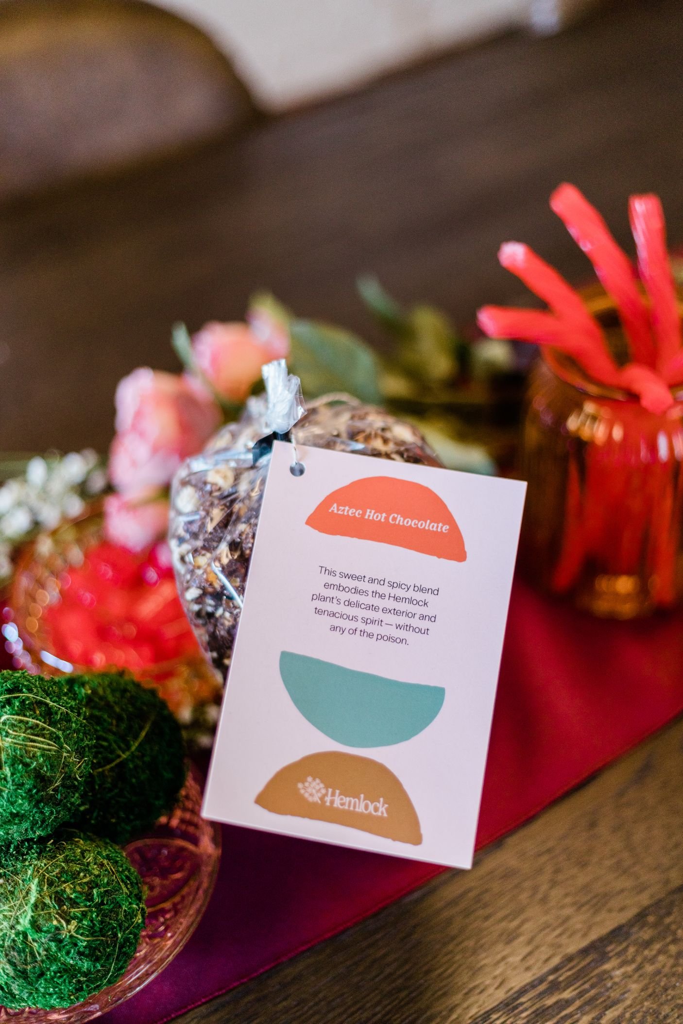
Hemlock took our recommendations to heart for its series six launch, which featured custom packaging, branded stickers, and tiny bandana-wearing horses. Talk about delightful.


The big reveal
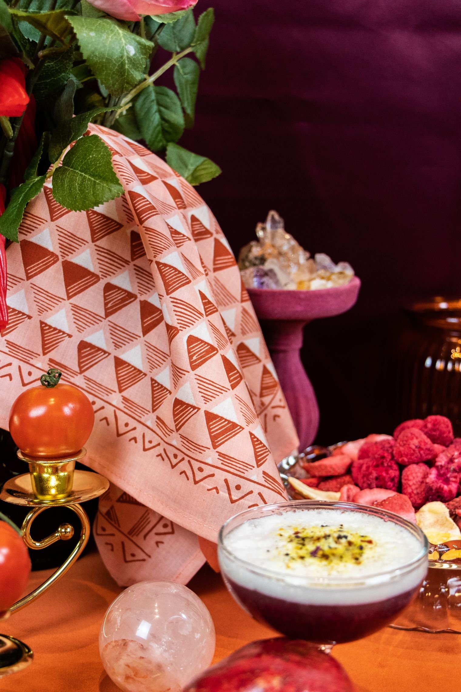
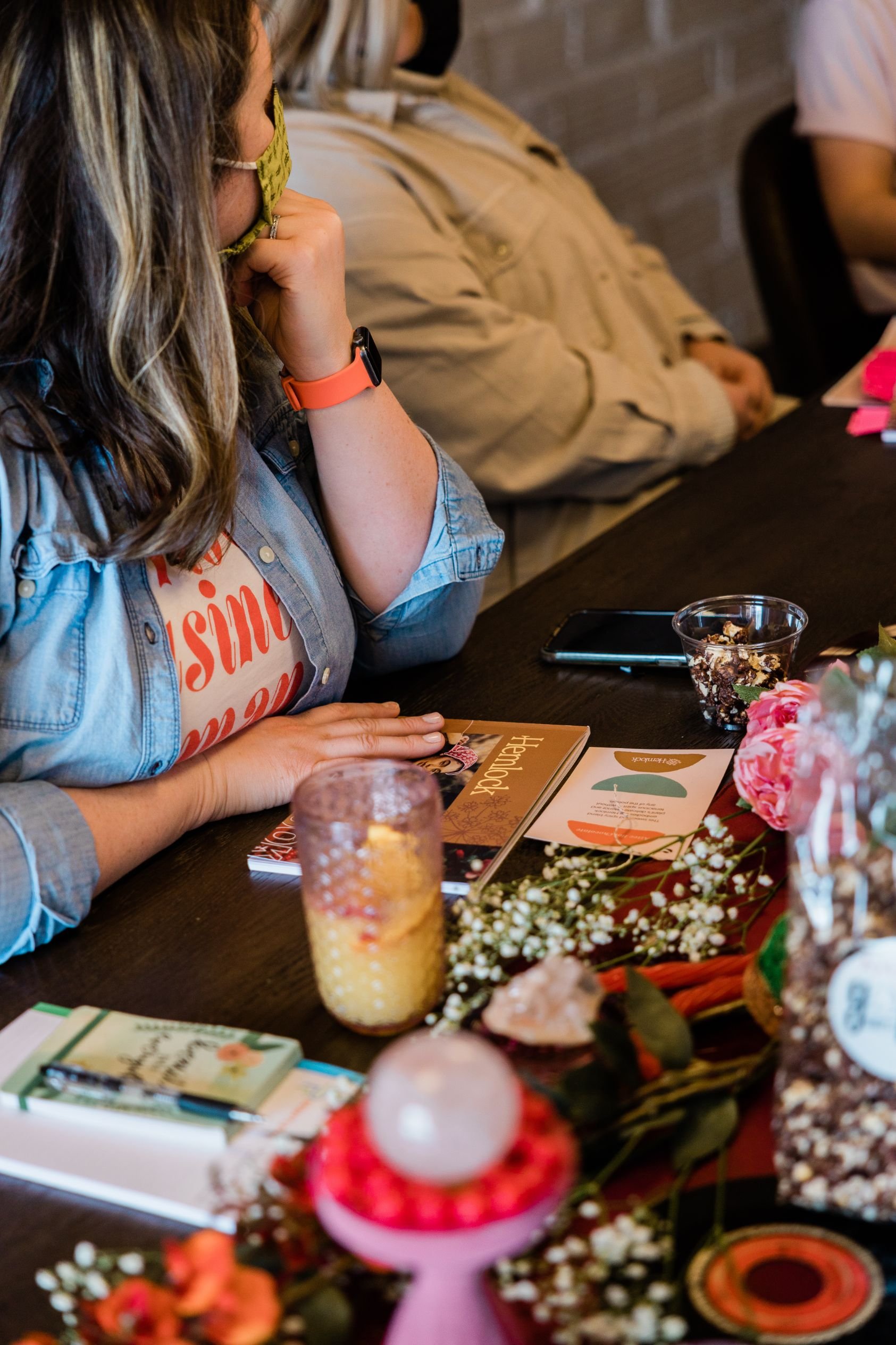
The Hemlock team could comprehend its new brand because it got to experience it. To share the new direction with the group, we hosted an immersive brand reveal and training. Every detail was meticulously chosen, from a custom playlist to a bespoke cocktail menu, to create a branded ambiance and lasting impression. The conversational presentation was the perfect end to Hemlock’s adventure with Hoot — and the beginning of its solo endeavors.
Brand growth doesn’t have to feel directionless and unsustainable. Our team is here to help.
““What you all did for us, which was help us put words and flesh on the bones of the Hemlock brand, was invaluable. The way you handed it to us and communicated it made for such an easy process to take your concepts and make them our own and run with them. Thank you every single one of you. You’ve created something awesome in the world and given us the foundation and tools to really go out and run with it. It’s a delight to put our new brand into practice.””